The network for creativity
Join 1.25M professional creatives like you
Connect with clients, get discovered, and run your business 100% commission-free
Creatives on Contra have earned over $150M and we are just getting started
Back to feedPost
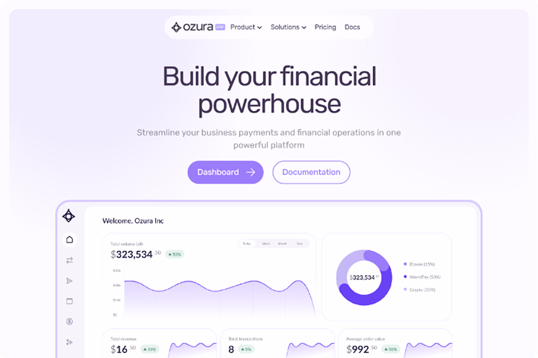
The design strategically employs contrast to guide the user's attention, most notably through a striking dark-themed block positioned about two-thirds down the page. Against the otherwise airy backdrop of white and pale lavender, this deep charcoal section creates a sharp visual break that instantly draws the eye to its core message: "Build and customize your payment platform." This high-contrast area acts as a powerful focal point, breaking the scrolling rhythm to emphasize a key secondary call-to-action. Beyond this large dark block, the design also utilizes vibrant purple buttons throughout the lighter sections, providing sharp, localized contrast that makes the primary interactive elements pop and clearly signals where the user should click next.
The network for creativity
Join 1.25M professional creatives like you
Connect with clients, get discovered, and run your business 100% commission-free
Creatives on Contra have earned over $150M and we are just getting started
Related posts
30 minutes with Claude. Started from a static Figma. Ended with auto-scrolling testimonials, hover gradient, a "Read on X" pill that slides up.
None of that was in the design file.
The first generation is free. The fine-tuning is the work.
gradient is so smooth and clean. great
Big menu for my next framer template
Great work
A minimalist brand mark designed for a private stay in the Peruvian jungle. This symbol merges the concept of a key with architectural stairs, representing the access to a unique and remote experience.
It bridges clean, modern lines with the natural beauty of a rainforest escape.
Amazing 😍
Trending
Claude
Claude has entered the design space. How are you using Claude Design?
Contra University
Learn from expert creatives how to earn more using next-gen AI tools.
creativeaiflow
Creative AI workflows are evolving. What tools do you use, and what are their strengths and weaknesses?
portfolioreview
The best portfolios tell a story, not just show a grid. Share yours for feedback.
freelancerlife
Freelancer life is wins, pivots, and everything in between. What’s yours right now?