The network for creativity
Join 1.25M professional creatives like you
Connect with clients, get discovered, and run your business 100% commission-free
Creatives on Contra have earned over $150M and we are just getting started
Back to feedPost


The network for creativity
Join 1.25M professional creatives like you
Connect with clients, get discovered, and run your business 100% commission-free
Creatives on Contra have earned over $150M and we are just getting started

Challenges
View all


Related posts

Feeling Blue? 💙💙💙
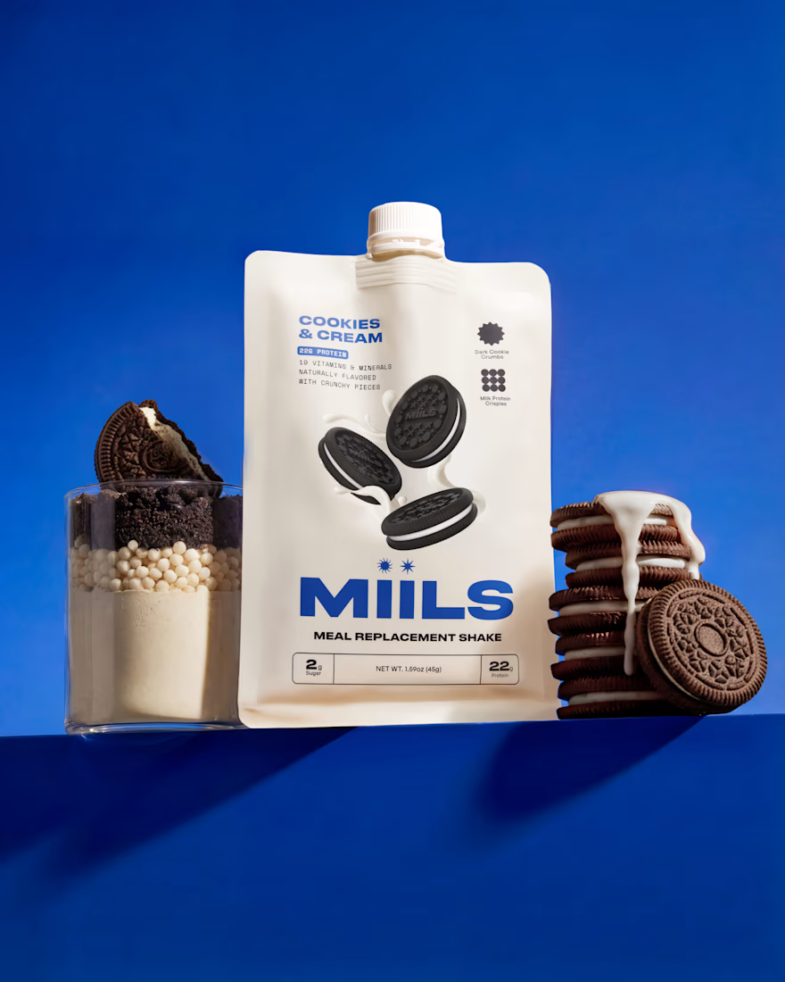
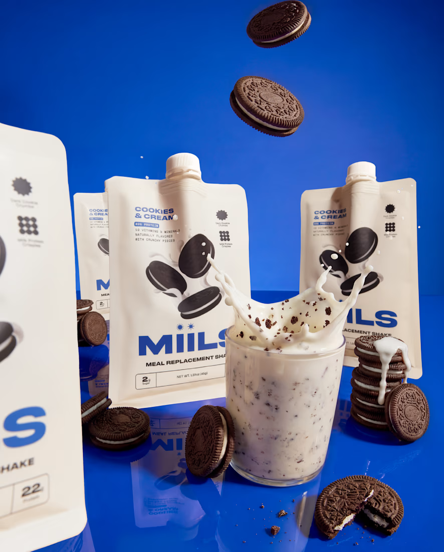
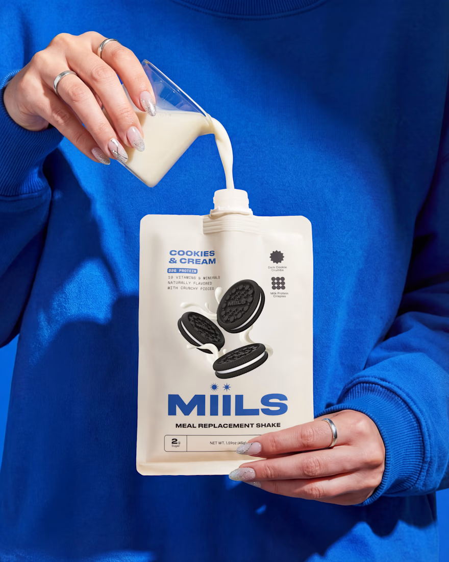
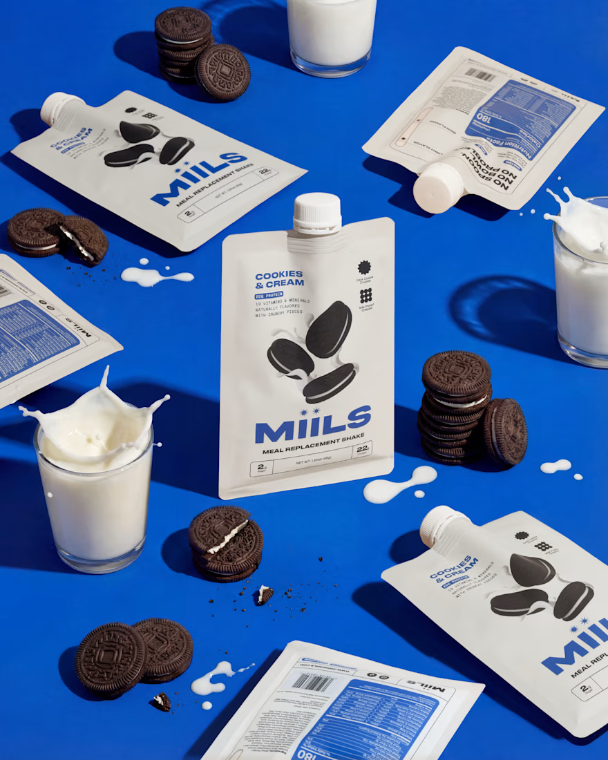
Launch photography for MIILS' new Cookies & Cream flavor. Studio photography + AI production working together to get every pour and crumble just right 🍪🥛


Curious about the workflow behind these highlights. Which parts of the project used AI video, and which needed more hands-on editing or motion work?

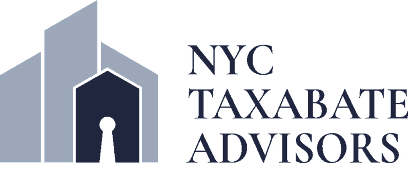
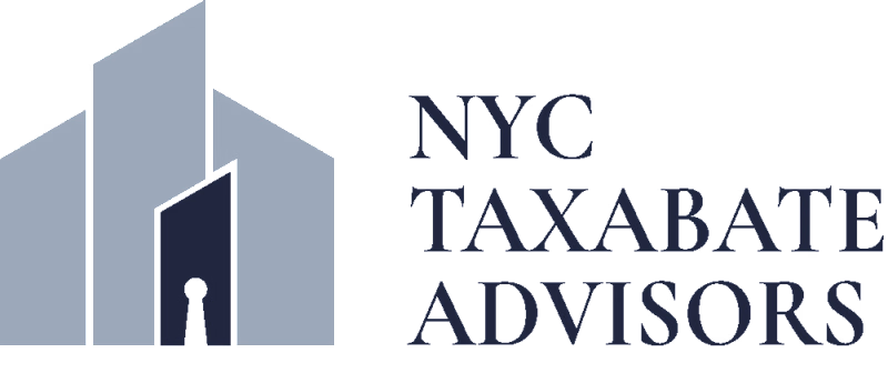
Two logo concepts for the same brief.
Both built around the same idea which is unlocking hidden value for New York co-op and condo boards who are owed tax savings they've never claimed.
One leaned architectural and place-specific, a NYC skyline with a keyhole as negative space in the primary building. One went cleaner and more minimal, exploring the lock and key metaphor directly.
The client chose the skyline. I agreed. When your entire audience lives in New York City buildings, the skyline earns its place.
Which would you have chosen? A or B?
6 voted
60%
4 voted
40%
10 votes
Closed

I'd have gone with the skyline too, tying the mark straight to the audience it's speaking to is hard to beat. Was the keyhole negative space something you nailed early, or did it take a few passes to read clearly at a small size?