The network for creativity
Join 1.25M professional creatives like you
Connect with clients, get discovered, and run your business 100% commission-free
Creatives on Contra have earned over $150M and we are just getting started
Back to feedPost
Taste Test

First time trying this feature out! I’ve cycled through both of these, but I’m curious which one actually stops your scroll. Which thumbnail do you prefer for this project?
12 voted
26%

35 voted
74%

47 votes
Closed

I love current one 🙌🏻
Thank you 🙌

I love current one
Thank you!

The current one looks a little weird to me. Am I the only one?
Thank you for your feedback! Why do you feel the old one fits better than the current one?

The one on the right feels more familiar to users and explanatory
Thank you for your feedback!

The Current one for sure! The depth and lighting on that one are top-tier. It feels much more like a high-end product feature. Great evolution on the design!
Thank you!

I’d stick with the current one. It’s easier to immediately understand the project and the company, and it doesn’t feel overwhelming. The message comes across fast, which is what really stops the scroll.
Thank you so much for the feedback, I feel the same!

The current one wins for me here. I accidentally voted for the old one
No worries. Thank you!

Current one👍🏻
Thank you!

Clean design with solid copy is literally the dream combo. When both work together like this the whole thing just feels right. Beautiful work on this one.

ngl, this is kinda dope

Strong design overall

Look cool

very professional work
Thank you!
The network for creativity
Join 1.25M professional creatives like you
Connect with clients, get discovered, and run your business 100% commission-free
Creatives on Contra have earned over $150M and we are just getting started





Related posts

Dark or light: which SaaS homepage makes you scroll?
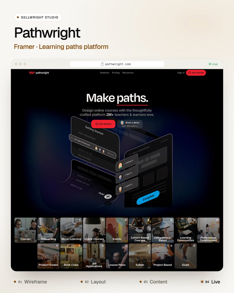
A: Pathwright (Framer), guided learning paths for teachers and teams.
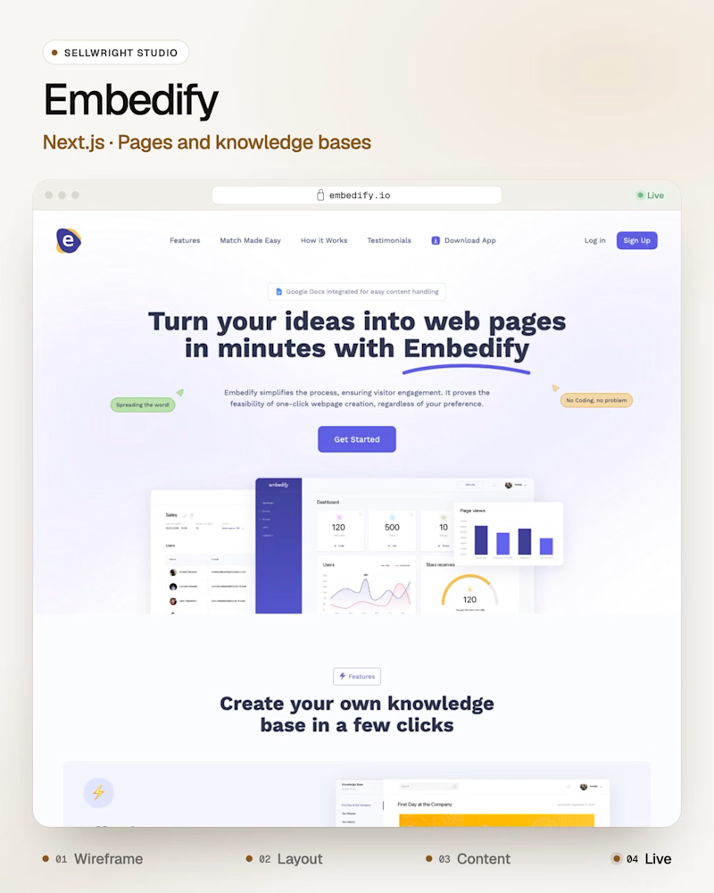
B: Embedify (Next.js), a tool that turns ideas into web pages and knowledge bases.
Both heroes have one job: show the product before the first scroll.
Which one gets you there first, and why?
Live: pathwright.com · embedify.io
More builds: instagram.com/sellwrightstudio · youtube.com/@sellwrightstudio
3 voted
50%
3 voted
50%
6 votes
Closed

I’d go with B! A clean, visual layout can make a product feel more engaging while keeping the message clear.

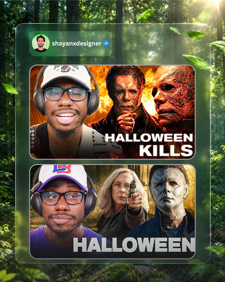
Recent Thumbnail Designs for @billybinges | Shayan Imran.

Very nice


Stunning