The network for creativity
Join 1.25M professional creatives like you
Connect with clients, get discovered, and run your business 100% commission-free
Creatives on Contra have earned over $150M and we are just getting started
Back to feedPost

You don’t need a finished design brief to start a LinkedIn visual.
If your idea is still sitting in a Notion page, a rough draft, or even a few messy notes, we can start there :)
What helps me most is a little context:
Who is this for?
What should they understand?
What do you want them to do next?
If you have brand colours, existing designs, or a reference you like, send those too.
And if you share a reference, tell me what you like about it. Maybe it’s the layout or the way it explains a difficult idea.
That helps me understand your direction before I start designing.
From there, we can figure out what the idea actually needs.
A carousel.
An infographic.
A simple LinkedIn visual.
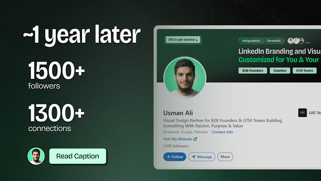
I recently crossed 1,500+ followers on LinkedIn, and I’m continuing to share the work, lessons, and designs I’m building along the way.
If you’re a founder, coach, or small business building your presence on LinkedIn and need help turning your ideas into simple visuals, you can find my LinkedIn visual design service here on Contra.


The network for creativity
Join 1.25M professional creatives like you
Connect with clients, get discovered, and run your business 100% commission-free
Creatives on Contra have earned over $150M and we are just getting started





Related posts

How minimal can a fintech website get before it starts losing personality?
Version 01 of a recent Verlo Finance exploration.
Focused on strong type, clarity and keeping everything else out of the way.
Would you keep it this minimal?


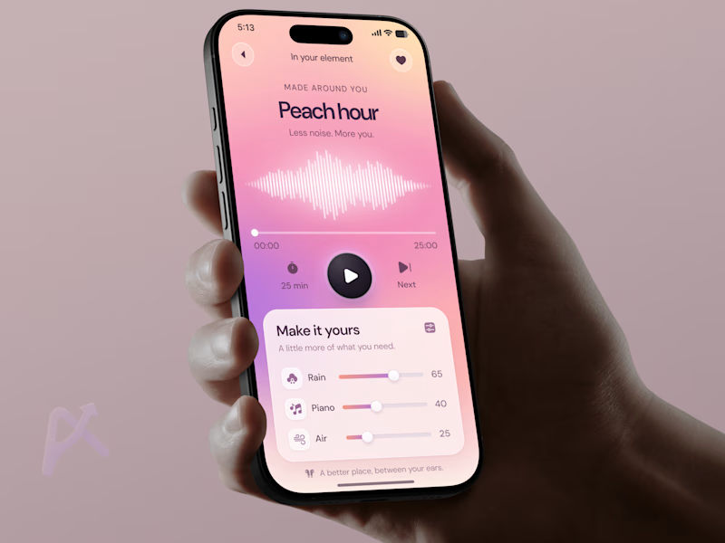
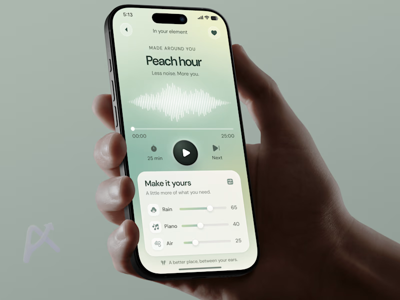
🧪 TASTY TEST Which version would you press play on after a long day?Same wellness player. Same controls. Two moods.
🍑 A · Peach Glow
Peach, pink, and lilac. Warm and playful
🌿 B · Sage Calm
Sage, mint, Soft and airy
Both let you mix rain, piano, and air. But the palette sets an expectation before you hear anything.
💡 Growth Insight: The listening experience starts before the sound does.
My hypothesis: matching the palette to how users want to feel could encourage them to start. I’d test time to first play and session start rate.
Which feels like your kind of reset? 🍑 A or 🌿 B?
Follow for the next Tasty Test.
👉 Building a wellness app? Book a mobile app strategy session
https://calendly.com/asol_design/book-diagnostic-call-linkedin-clone
#MobileAppDesign #WellnessApp #AsolDesign

13 voted
42%
18 voted
58%
31 votes
Closed

sage calm..🎉

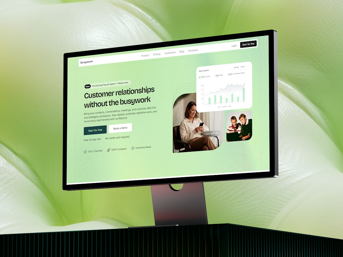
Busywork | SaaS landing page design
Busywork brings customer data, conversations, AI, and workflows together.
The design challenge was therefore less about showing everything the product can do and more about creating a clear narrative around why the product matters.
The result is a concept focused on progressive storytelling, helping visitors move from problem → product → capabilities → value → action.

Outstanding