The network for creativity
Join 1.25M professional creatives like you
Connect with clients, get discovered, and run your business 100% commission-free
Creatives on Contra have earned over $150M and we are just getting started
Back to feedPost

Mondays shouldn’t start with three status meetings.
That was the thinking behind Cadence, a team planning tool, and its landing page. I wanted the site to feel like the product: calm, clear, everything in rhythm.
So: a live timeline in the hero, a bento grid for features, one yellow accent to lead the eye, and black blocks only where something really matters.
Built in Framer, with the motion polished in Jitter so every scroll feels smooth.
Goal: make it feel easy. Let me know if it does 👇


mondays shouldnt start with three status meetings.. felt that one personally
The network for creativity
Join 1.25M professional creatives like you
Connect with clients, get discovered, and run your business 100% commission-free
Creatives on Contra have earned over $150M and we are just getting started



Related posts

New here, so I'm slowly filling in my portfolio and getting to know the place. So far I like it.
Here's an extract from Software Intelligence, a Framer site I designed and built a few months ago for an enterprise data consulting startup.
The visual idea mirrors what they do with data: compact blocks that animate, break apart and recompose, like charts taking shape. Few effects, all consistent, everything managed through the CMS.
If you have a minute, take a look at the full case study.
I'd love to know what you think, especially whether the motion supports the content or ends up overpowering it.


You're very welcome, Francesco — glad the note landed. The motion in that extract really does the heavy lifting for the content, so keep sharing your work here. Looking forward to seeing what's next from you. ✌️

Really liked how these designs turned out!
Explored a concept for AI SaaS product, focusing on a clean interface and a simple, intuitive chat experience.
Tried two different layout variation for the hero section.
Which would you like?
13 voted
57%
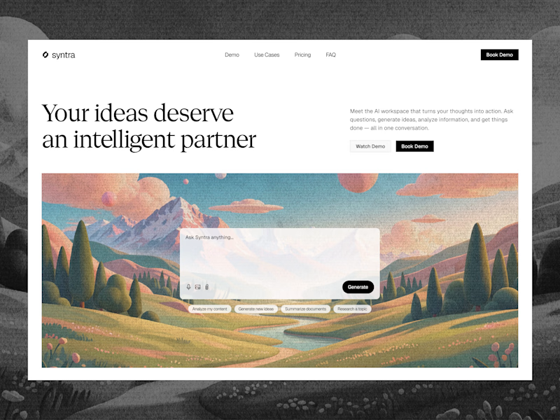
10 voted
43%
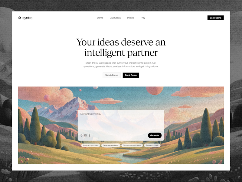
23 votes
Closed

Really clean concept! 👏
I like the second layout more — the headline "Your ideas deserve an intelligent partner" + the chat preview below makes the AI feel real and easy to use immediately. The first one is also clean, but this one sells the product faster.
I also design SaaS...

My new portfolio is live ✦
Built from scratch in Framer. Bold, a bit retro, and 100% me.
🔗 https://micaeladl.xyz
FRAMER -> Let's connect!


So cool!!