The network for creativity
Join 1.25M professional creatives like you
Connect with clients, get discovered, and run your business 100% commission-free
Creatives on Contra have earned over $150M and we are just getting started
Back to feedPost

The composition is intentionally asymmetrical, using scale and overlap to create hierarchy and draw focus to the primary interface. Typography plays a central role, acting not just as labeling but as a structural element that interacts with the visual layer to create tension and balance.
A neutral, slightly cool color palette was chosen to reinforce a modern, system-driven aesthetic while avoiding visual noise. Subtle grid accents and depth through shadowing help anchor the layout, giving it a sense of precision and intentionality.


The network for creativity
Join 1.25M professional creatives like you
Connect with clients, get discovered, and run your business 100% commission-free
Creatives on Contra have earned over $150M and we are just getting started



Related posts




We are testing two ways to browse a large template library.
Load More
Users initially see 9 cards. After clicking the button, 9 more are added while the previous results remain visible. Browsing feels continuous, but the page gradually becomes longer.
Pagination
The catalog is divided into numbered groups. When users select the next page, the current 9 cards are replaced with a new set. They can jump to a specific part of the catalog and easily return to where they were.
Load More creates a smoother browsing experience, while pagination offers greater control.
Which option would you choose for a template library?

17 voted
68%
8 voted
32%
25 votes
Closed

Load more

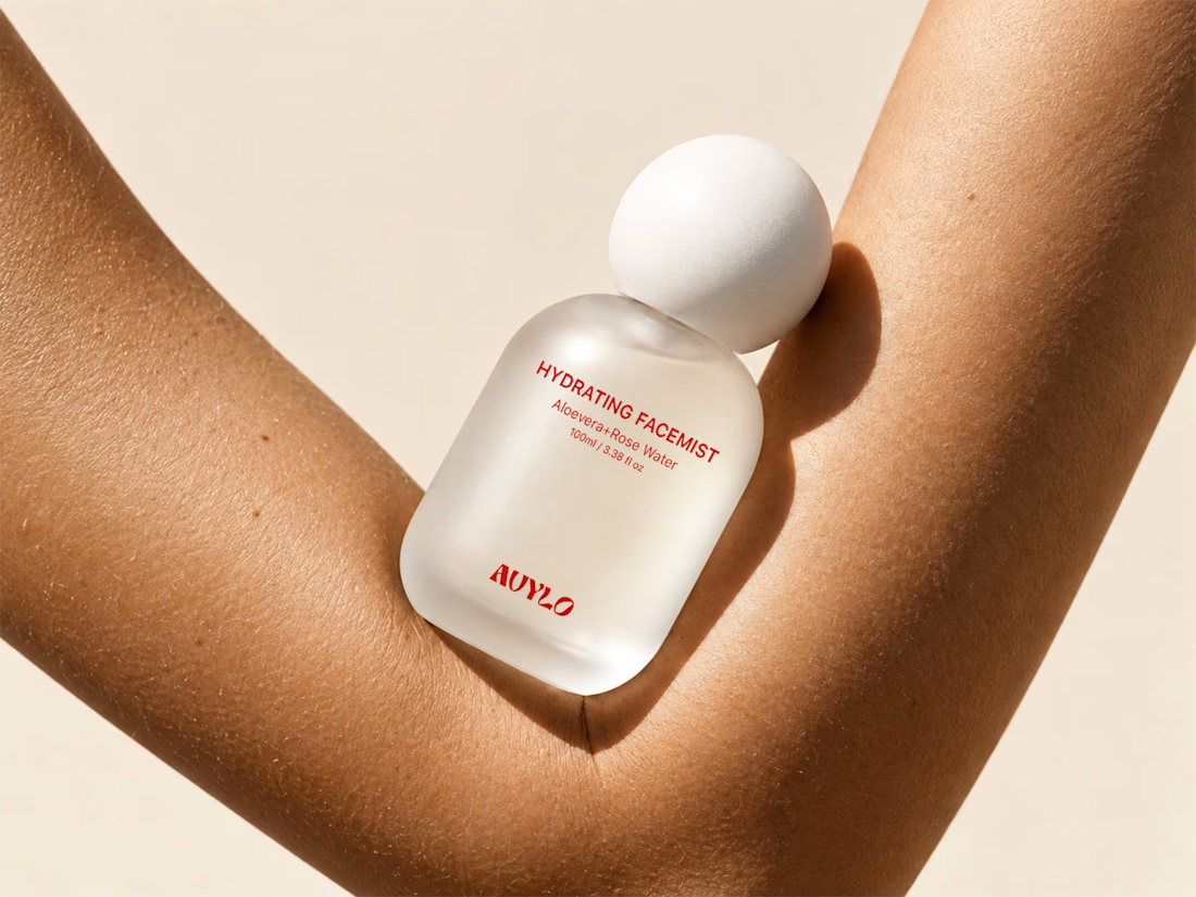
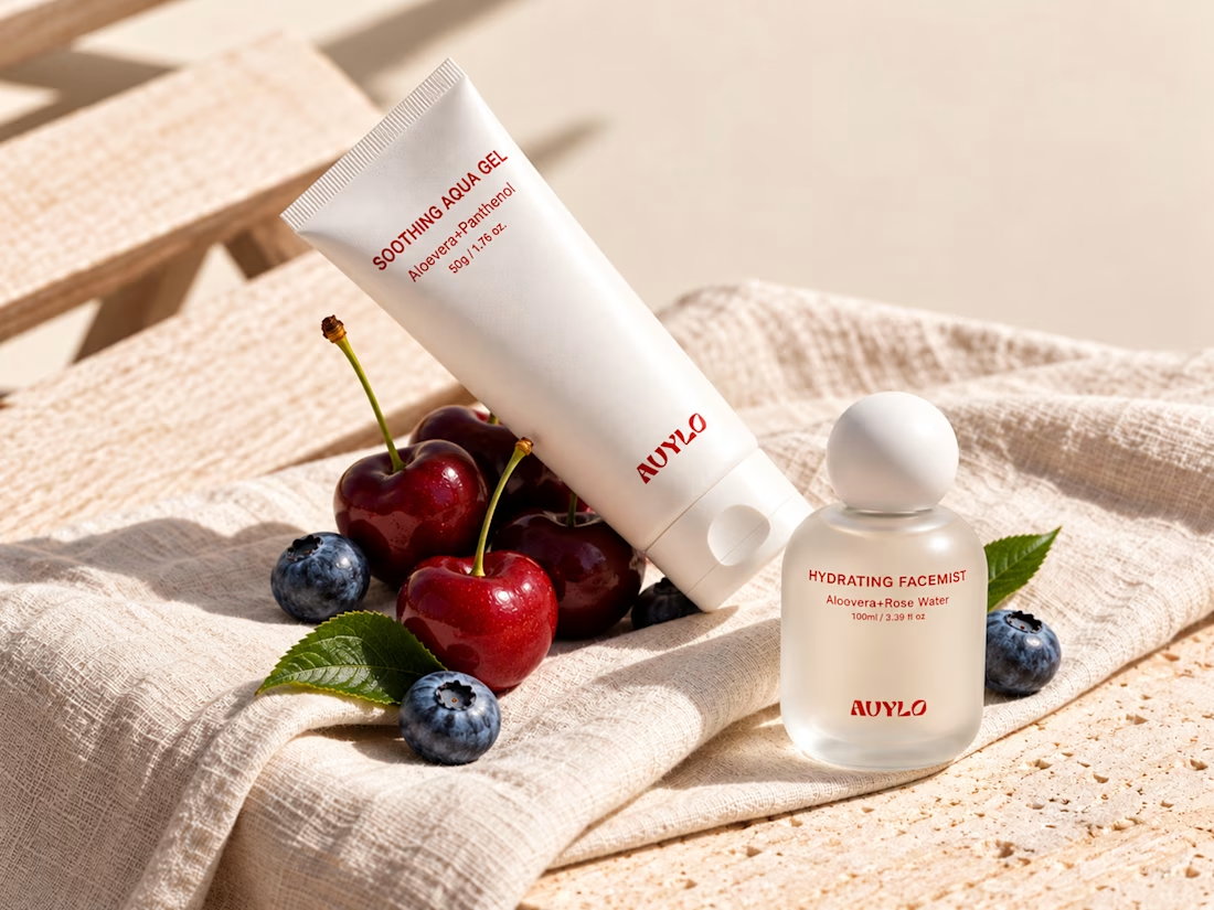
AVYLO Skin Care Packaging Design





Good job