The network for creativity
Join 1.25M professional creatives like you
Connect with clients, get discovered, and run your business 100% commission-free
Creatives on Contra have earned over $150M and we are just getting started
Back to feedPost

Ever feel like everyone else has it figured out… except you?
I designed a Life Direction Assessment to help you discover your strengths, identify growth areas, and explore career paths or hobbies that truly fit you.
This is my first submission for the Figma Makeathon by Contra x Figma 🚀https://making-erase-71449385.figma.site
The network for creativity
Join 1.25M professional creatives like you
Connect with clients, get discovered, and run your business 100% commission-free
Creatives on Contra have earned over $150M and we are just getting started


Related posts

Ever postponed delivering to a client because you couldn’t figure out what was missing in your designs? 🥹
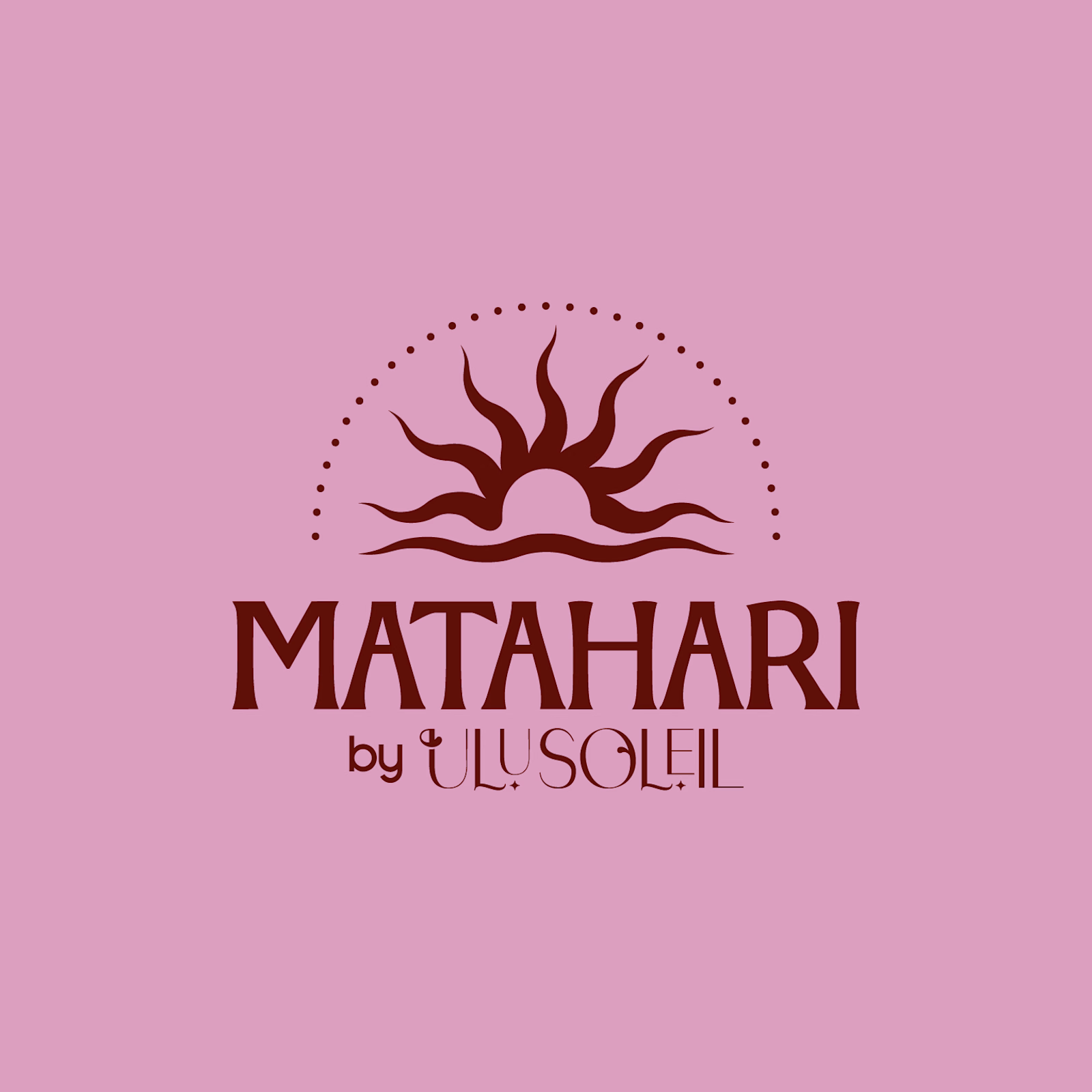
Earlier this year, I worked on Matahari, a secondary brand under Ulu Soleil. Every direction looked good, but none of them felt right, and I was getting frustrated. 😩
I stepped away.
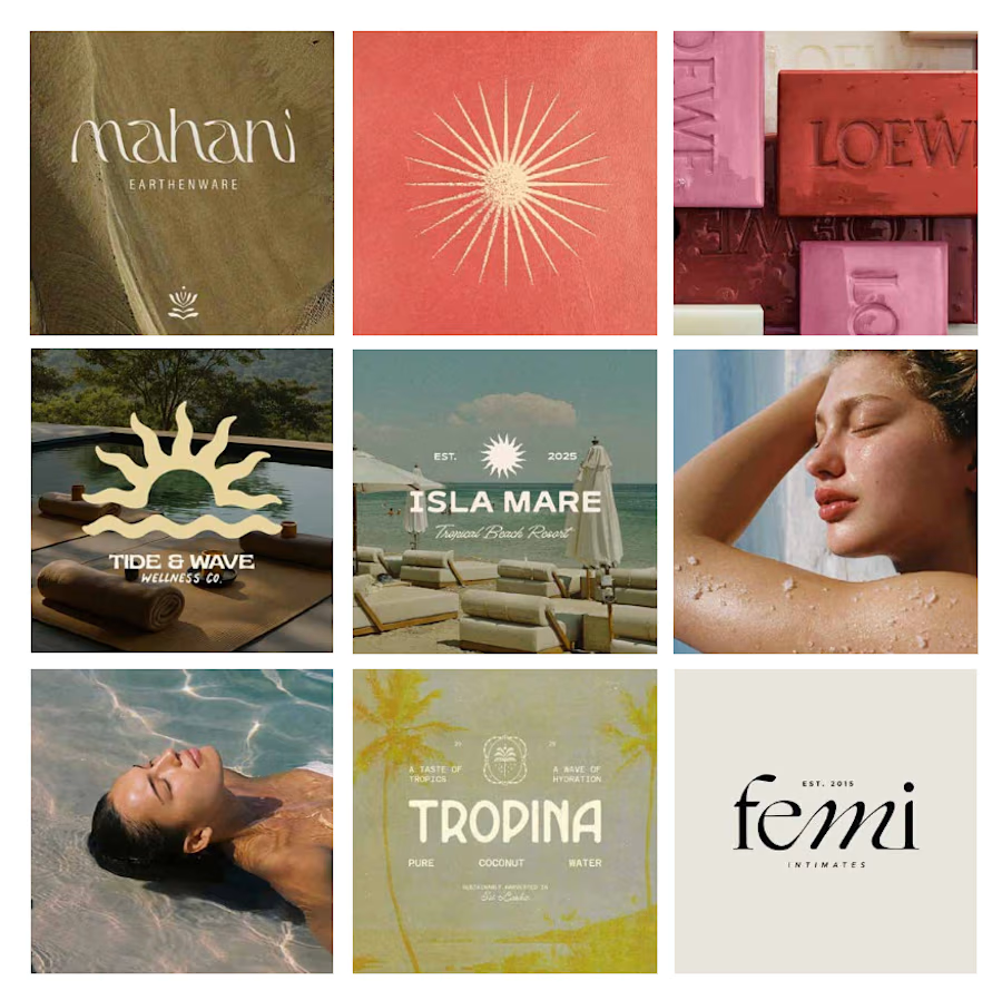
Coming back with fresh eyes, I stopped trying to rescue every original idea and started a moodboard from scratch focused on what was ACTUALLY working.
What started as a few logo explorations turned into testing typefaces, adjusting letterforms and refining proportions to find the balance between personality and simplicity.
Here’s where it started vs. where it ended up.
What’s the hardest part of logo design for you: the initial concept or the final refinements?


What’s the one project you keep promising yourself you’ll “get back to”? 👀
This was mine. An eyewear concept I started a while ago: dark water, wet hair, one bold black frame. I had the mood and a few stills, but nothing that moved.
Why I stopped: client work took over.
What got it moving again: the urge to see it finished ⚡
💫 All made with FLORA. If you want to give it a try, I have a 25% discount for you: https://refer.flora.ai/julia-calabrese
What’s sitting in your “almost done” folder? Drop it below, or finish it and tag me. I’d love to see it!


Just wrapped up my fourth UX & Conversion Copywriting concept on Contra! 🎓
Creator platforms often lose new users right after sign-up, not because the product lacks features, but because landing on an empty dashboard triggers instant "blank-canvas paralysis."
For this self-initiated SkillForge concept, I focused on turning curious visitors into published creators:
• Outcome-First Landing Page: Led with speed-to-value ("Turn What You Know Into Income—In One Afternoon") paired with zero-risk microcopy ("Free until you make your first sale").
• Guided Empty-State UX: Replaced dead-end "No products yet" screens with a welcoming 3-step studio prompt and format selector.
• Confidence-Boosting Microcopy: Added an inline pricing tip right inside the publish flow to eliminate second-guessing before launch.
Check out the full case study on my profile and let me know: what’s your favorite example of great empty-state UX copy? 👇

Tackling blank canvas paralysis right at the landing page level is a smart angle, most onboarding fixes only start inside the dashboard. Nice consistency on four concepts already, Dan.