The network for creativity
Join 1.25M professional creatives like you
Connect with clients, get discovered, and run your business 100% commission-free
Creatives on Contra have earned over $150M and we are just getting started
Back to feedPost

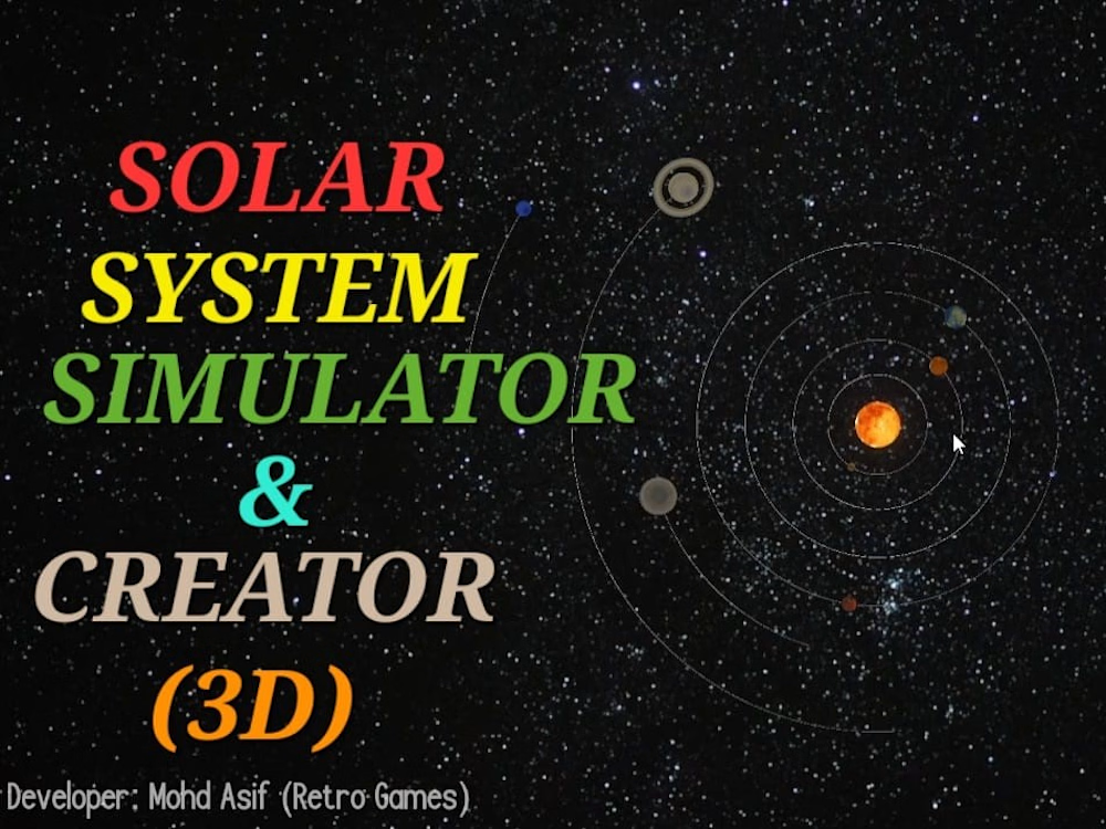
I created the Solar System Simulator & Creator a few years ago. Recently, I worked on a new update, adding more features to this asset. This asset is now available on my product page: https://contra.com/products/dXBBBSA0-solar-system-simulator-and-creator-3-d
Go to the above link to check out the product, where you will get all the information about this asset. This asset is for Unity and for those who have any use for a solar system in their project.

The network for creativity
Join 1.25M professional creatives like you
Connect with clients, get discovered, and run your business 100% commission-free
Creatives on Contra have earned over $150M and we are just getting started



Related posts

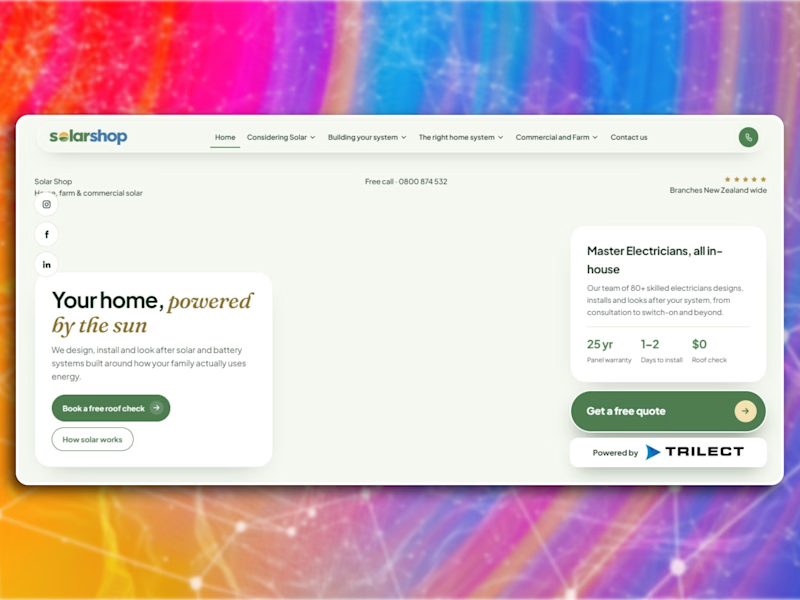
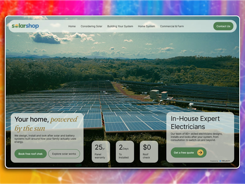
Which hero would actually make you book a free roof check?
Redesigned the hero section for Solarshop, a New Zealand solar company.
The original had everything it needed but nothing was working together. Stats were floating around, two cards just sitting on top of a photo, no clear place for your eye to land.
So I kept the same general layout but actually made it do something. Full bleed photo, cards anchored to the bottom corners, stats moved inside the left card where they actually support the headline. Typography got more contrast too, the golden italic reads properly now.
The goal was to make it feel more premium without losing that local, approachable feel they had going.
What would you have changed?

0 voted
0%
3 voted
100%
3 votes
Closed

The "After" layout feels so much more cohesive. Two quick catches, the primary CTA has a small typo and the headline says Your home, powered by the sun but the background image shows a massive industrial solar farm rather than residential rooftops.


A few years back, I worked on this skateboard project. I can't believe I've now actually brought it to life with Claude Opus 5.5 🤯
Claude took my 3D model from Blender and refined it, then took the Board Builder UI I designed in Figma and built it live in 3D. Pick a deck and the print appears, pick trucks and they drop right onto the bolts, pick wheels and they slide on along the axles.
For the deck graphics, I generated the art with GPT Image 2.5 and added it onto the 3D board. Just look at how CLEAN it all is. The textures, the lighting from my Blender scene, the shine on the prints. It honestly feels like a full Blender render.
I tweaked the render prompts a few times to get it perfect, but this was all done with Claude Opus 5.5.
Totally insane.


