The network for creativity
Join 1.25M professional creatives like you
Connect with clients, get discovered, and run your business 100% commission-free
Creatives on Contra have earned over $150M and we are just getting started
Back to feedPost

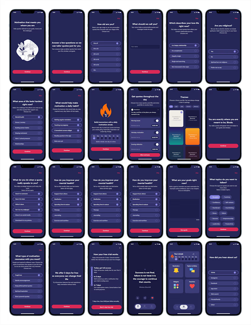
Unpopular opinion: 24 onboarding screens is not too many.
It's too many if they're collecting data you never use.
It's exactly right if every answer shapes what the user sees next their theme, their notification cadence, their quote categories, their goals.
Length isn't the problem. Irrelevance is.
The network for creativity
Join 1.25M professional creatives like you
Connect with clients, get discovered, and run your business 100% commission-free
Creatives on Contra have earned over $150M and we are just getting started







Related posts

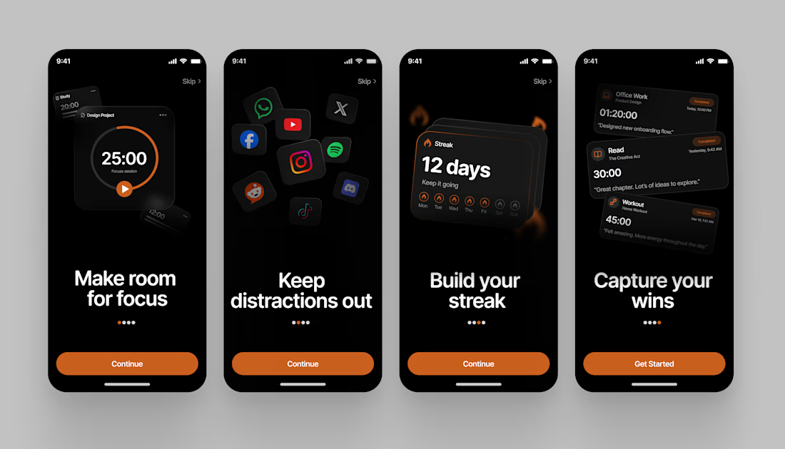
Redesigning Melt, a focus app built to help you stay on track and avoid distractions.
Here's the Onboarding screen flow

Great App design Avesh specially how you show it❤️❤️
Great job Avesh congrats 🎉🎉🎉

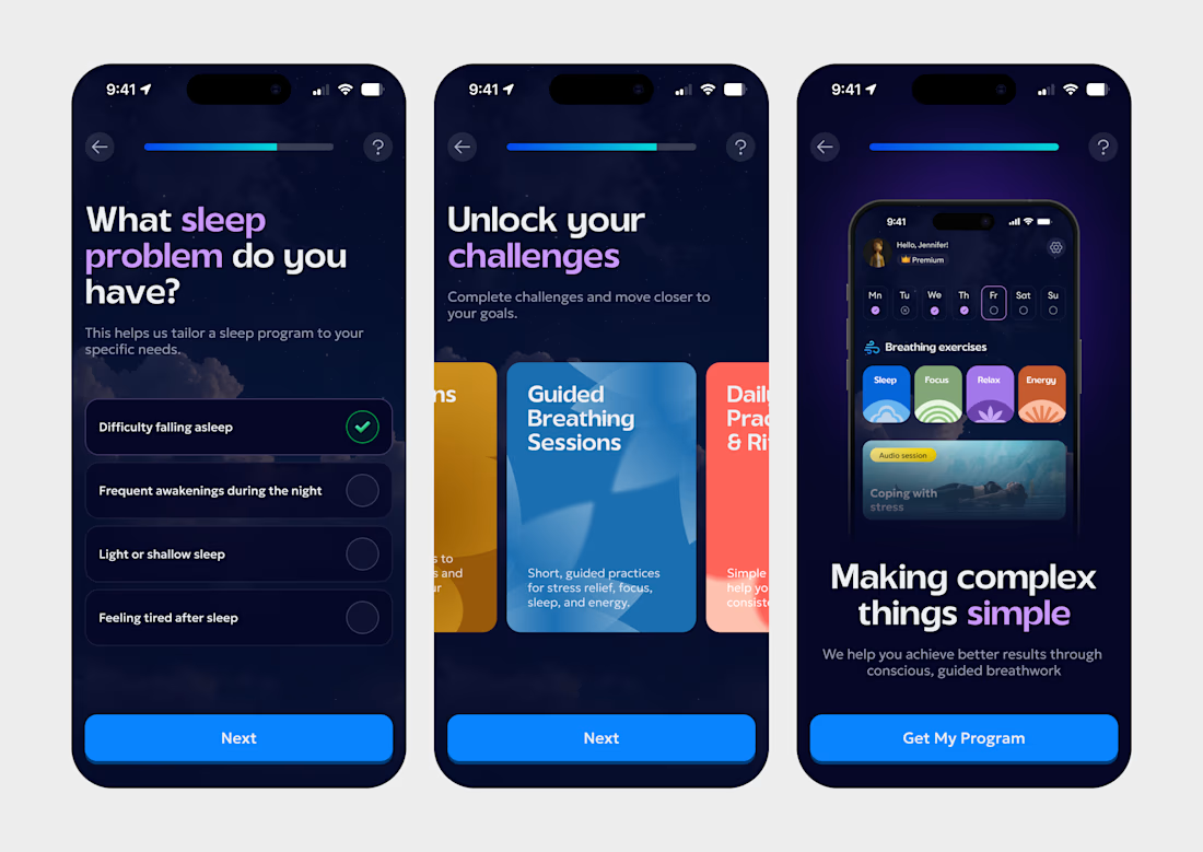
Designed a piece of onboarding for a breathwork app and I love how it flows.
Onboarding in wellness apps has one real business job: get people to the paywall already convinced. Every screen here was built around that.
The first screen asks what’s actually wrong with your sleep. Beyond personalization, it gets the user to name their problem, and someone who just admitted they can’t fall asleep is a lot more open to a solution.
The second shows what they’re getting with swipeable session cards. That’s the value pitch, made visual before any price shows up.
The last screen previews the real home screen with streaks and a Premium badge. By the time they tap “Get My Program,” they’ve already pictured themselves using the app, which makes the subscription step feel like the next step instead of a wall.


getting people to tick their own sleep problem before any pricing shows up is sneaky good. i would steal that for a lead form

A user signs up for your software. Then what?
If your onboarding emails don't guide them toward their first meaningful action, they may never discover the value of your product.
I created a 5-email onboarding sequence for Task Flow, a B2B SaaS project, designed to guide users from signup to feature adoption and eventually a paid upgrade.
The sequence covers:
Welcome and quick wins
Feature adoption
Social proof
Objection handling
Upgrade prompts
You can check out the TaskFlow project on my profile to see how I approach SaaS email copywriting.
If you're working on onboarding emails for your SaaS product, feel free to message me.