The network for creativity
Join 1.25M professional creatives like you
Connect with clients, get discovered, and run your business 100% commission-free
Creatives on Contra have earned over $150M and we are just getting started
Back to feedPost

Recent work from our team.


The network for creativity
Join 1.25M professional creatives like you
Connect with clients, get discovered, and run your business 100% commission-free
Creatives on Contra have earned over $150M and we are just getting started



Related posts

Visual Experiment
A compilation of recent visual tests, focusing on atmospheric lighting, fast-paced rhythm, and high-contrast color treatment. Designed to explore the boundaries between cinematic realism and abstract motion.
Everything handled from initial style framing to final color grading and typography integration.
Tools: After Effects, DaVinci Resolve
Created by Johan Vane


The lighting and color treatment create a strong atmosphere.

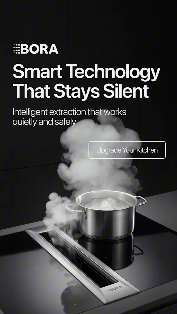
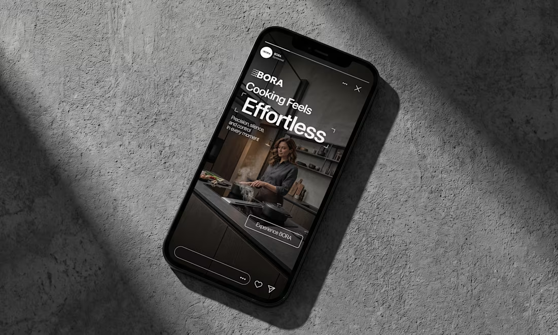
BORA – Ad Creative Concept
Most kitchen appliance ads sell you the warm family dinner. I wanted to try the opposite.
Built this BORA concept as a portfolio piece, treating the product like architecture instead of tech – dark marble, concrete, no hands, no food styling. Just a pot, steam, and silence.
The steam does all the movement in the motion piece. Typography stays out of the way – one line, low CTA, nothing fighting the composition. Turns out when you strip out the lifestyle, the price point sells itself.




Motion Graphics for a new product launch.

the freeze protection card is a nice touch. is this for a real app or a concept?