The network for creativity
Join 1.25M professional creatives like you
Connect with clients, get discovered, and run your business 100% commission-free
Creatives on Contra have earned over $150M and we are just getting started
Back to feedPost
Borcelle — a modern website designed and developed for a professional cleaning company.
The project focused on creating a clean, trustworthy digital presence that clearly presents the company’s services and makes it easy for potential customers to understand their options and take the next step.
The website combines intuitive navigation, responsive design, clear service presentation, and strategically placed calls to action to create a simple and conversion-focused customer experience.


cleaning company sites are never this clean lol

Going dark and moody for a cleaning company is a bold move, most competitors in this space default to bright and sterile to signal clean. What made you confident it would still read as trustworthy rather than moody for its own sake?


That was definitely something we considered. We focused on balancing the darker palette with clean layouts, strong typography, clear messaging, and real service imagery. The goal wasn’t to make it “moody,” but to create a more premium and professional feel while still making the company approachable and trustworthy.


SLEEK

Cleaning and property maintenance sites almost always go bright and clinical, so the dark palette here genuinely stands out in the category. Was that a hard sell to the client, or did they already want to break from the usual playbook when they came to you?
Thank you! The client was actually very open to doing something different from the typical cleaning industry look. It was also important for us to show that the company goes beyond standard cleaning and offers a wider range of property maintenance services. We wanted the website...
That's a good insight, clients in "boring" industries are often more open to a different look than agencies assume going in. Beyond the dark palette, what else in the site signals that wider service range, is it mostly the copy or did the service page structure itself change too?
Definitely both. The copy helps communicate the wider range of services, but the service page structure was also changed to make that range much clearer.Instead of presenting everything as one traditional cleaning service, we separated the different services and gave each one...

Great work

Stunning

The dark UI looks super sleek and clean Veronika. For the see it in action before/after cards what do you think about triggering the slider/reveal on hover instead of requiring a manual drag? It could make browsing through the transformations feel effortless on desktop.
Thank you! I actually think that could work really well. From a UX perspective, the hover interaction gives users an immediate visual response and creates a small moment of curiosity without making them figure out how to use the slider first.I’d probably keep the manual drag as...

Love the modern typography and layout balance. How much custom CMS structure is baked into this template?
Thank you! The CMS structure is fairly customized. We set it up so the client can manage the main content — images, text, categories and other page-specific details — without having to touch the layout itself.
The goal was to keep the editing experience simple for the client...
The network for creativity
Join 1.25M professional creatives like you
Connect with clients, get discovered, and run your business 100% commission-free
Creatives on Contra have earned over $150M and we are just getting started





Related posts

Cleann🔥

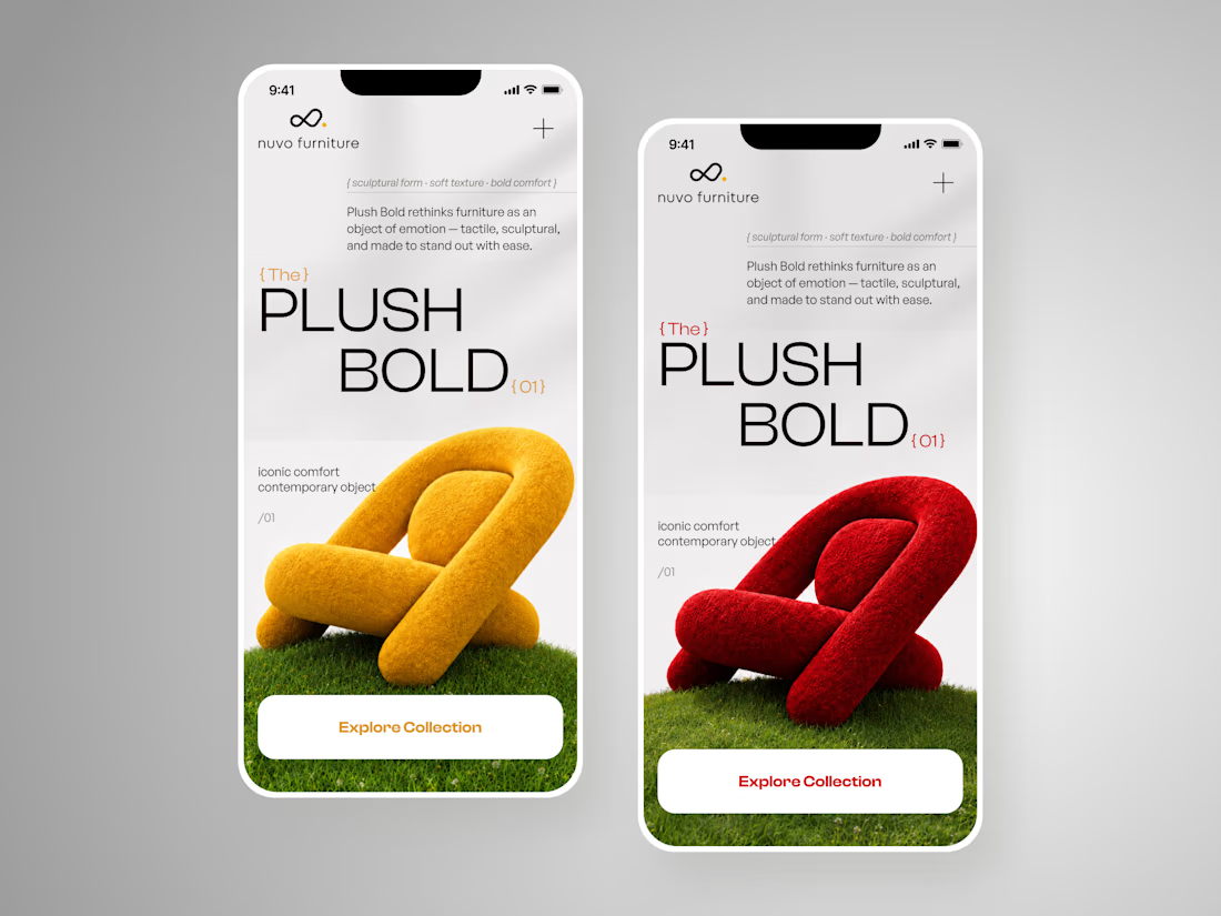
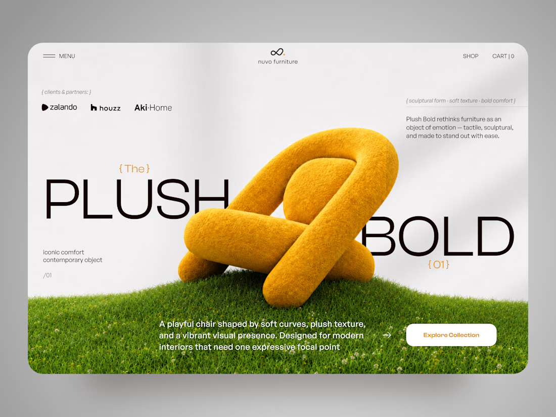
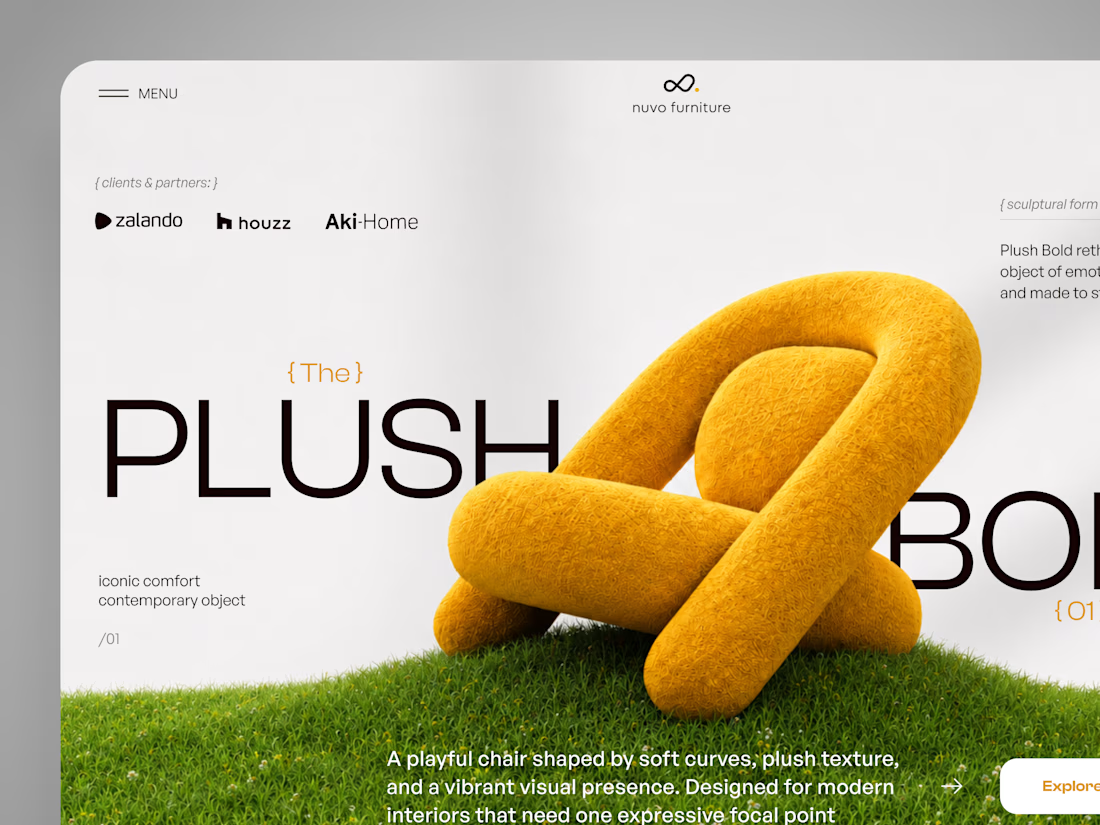
NUVO Furniture — Sculptural Furniture E-commerce Concept 🪑✨
NUVO is a contemporary furniture website concept built around one idea: let the product become the experience.
At the center of the concept is Plush Bold — an expressive statement chair designed to feel more like a...

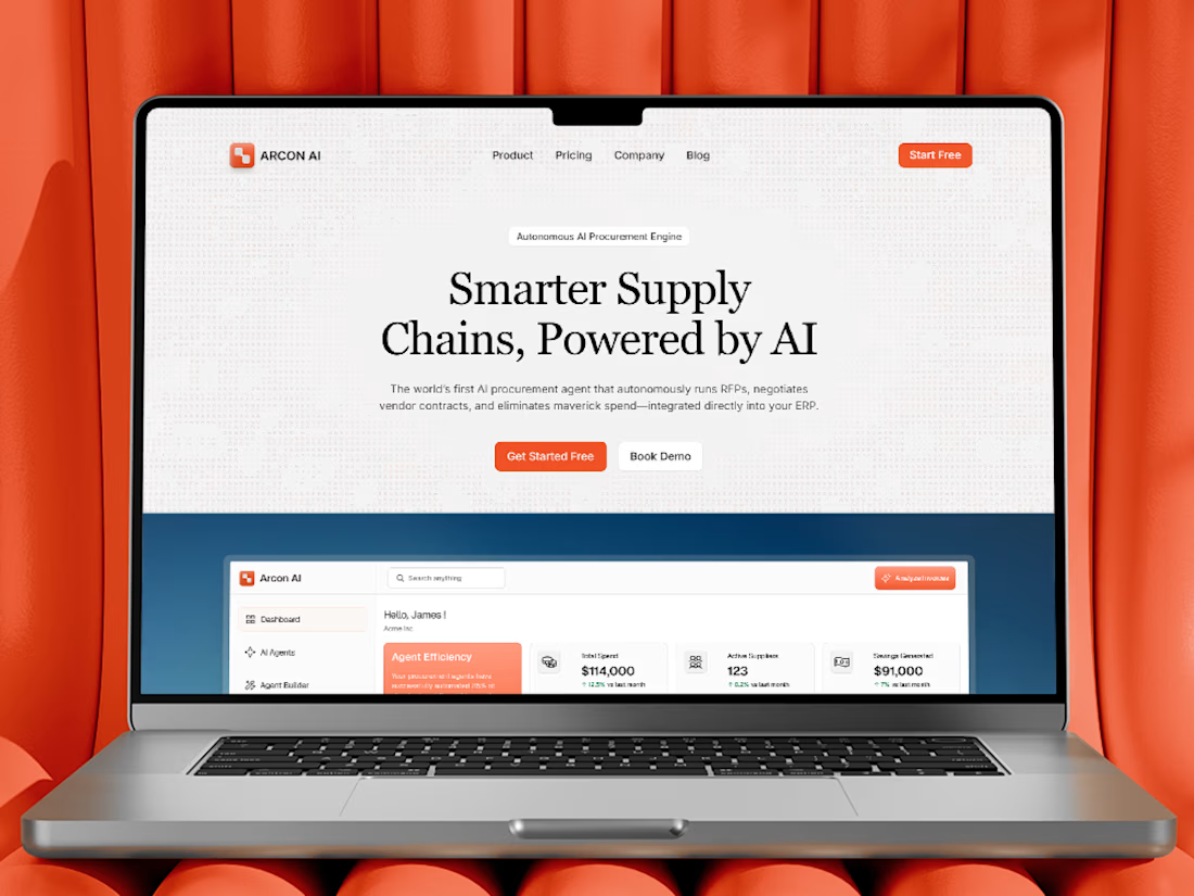
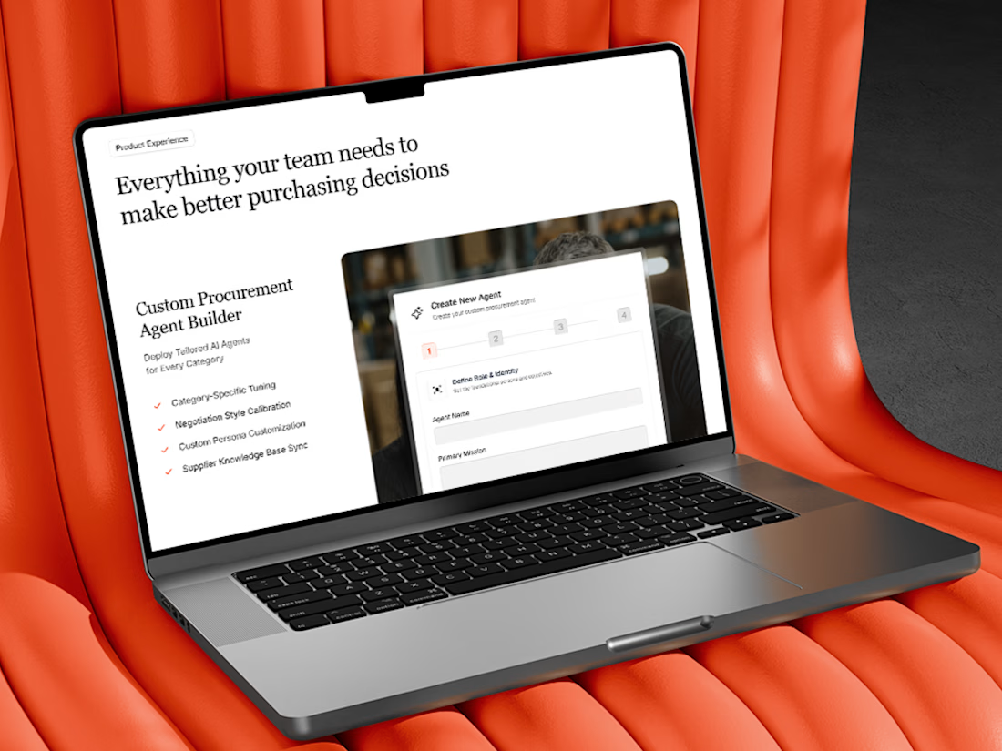
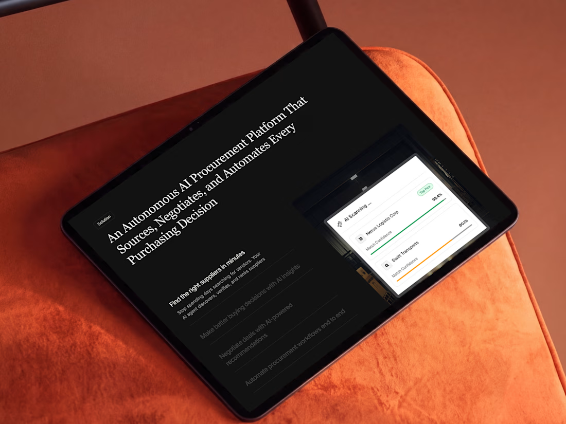
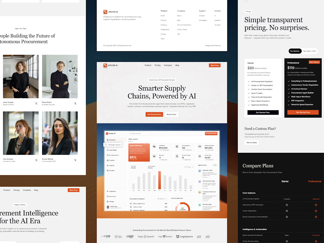
Free AI Framer template we designed for B2B SaaS.
Arcon AI is a premium Framer template built for AI startups, procurement platforms, enterprise SaaS, AI agents, workflow automation, supply chain technology, and B2B software. Designed with a modern enterprise aesthetic, it helps you launch a professional website that builds trust, showcases your product, and drives conversions.
Get it for free: https://www.framer.com/marketplace/templates/arconai/


Lovely work

Hero section of one my new templates. Preview it live to see the animations.
Relay is HTML or React you actually own.
Hand it to your AI assistant and it already knows how the thing is built.
Starting at $29
https://no-code.supply/templates/relay
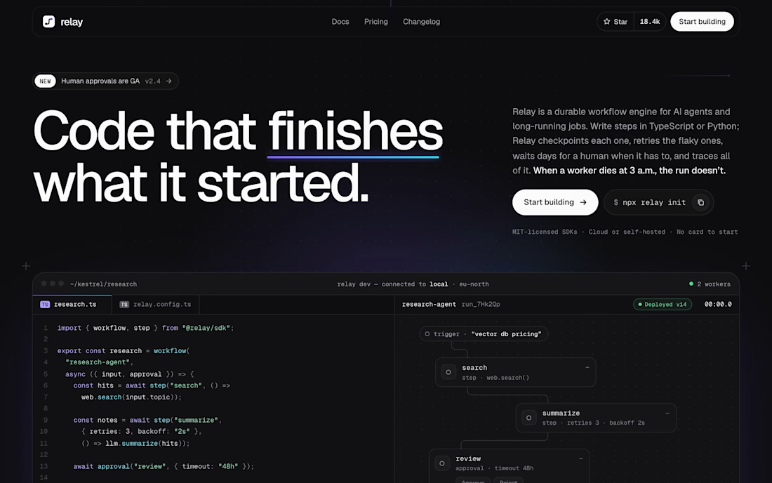

"Code that finishes what it started" is a great headline. Love that it's real HTML/React you own and not locked into a builder.