The network for creativity
Join 1.25M professional creatives like you
Connect with clients, get discovered, and run your business 100% commission-free
Creatives on Contra have earned over $150M and we are just getting started
Back to feedPost

Have you ever chosen a more expensive product...
...even when you knew a cheaper one would do the same job?
Most of us have.
Not because the product was necessarily better.
Because it felt more trustworthy.
Every buying decision starts long before someone compares features.
It starts with signals.
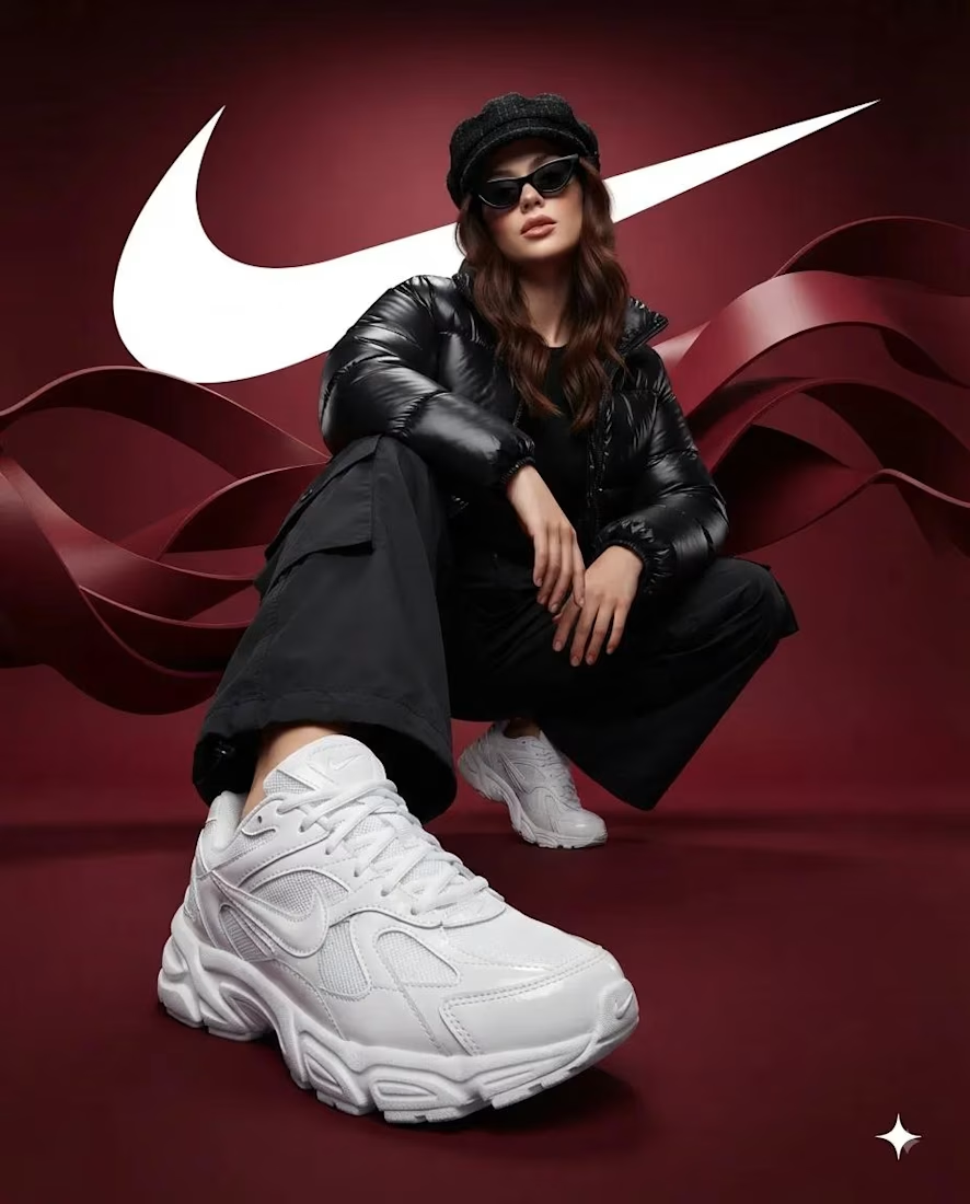
A professional website.
Consistent branding.
Clear messaging.
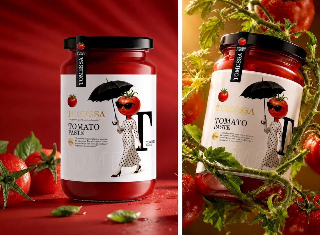
Thoughtful packaging.
Confident communication.
None of these guarantee a better product.
But they shape how people perceive the product before they experience it.
That's why branding isn't about making something look expensive.
It's about reducing uncertainty.
When people trust your brand, they stop asking,
"Why should I choose you?"
They start asking,
"How do I get started?"
The network for creativity
Join 1.25M professional creatives like you
Connect with clients, get discovered, and run your business 100% commission-free
Creatives on Contra have earned over $150M and we are just getting started
Challenges
View all


Related posts



A little excerpt from the brand guidelines for a recent project

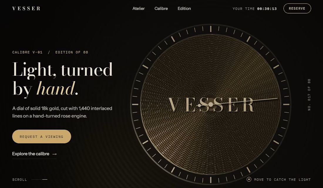
If your product is premium and your website isn’t, customers believe the website.
VESSER is a concept I built to show the difference.
Checkout my previous post for video.

🚀 Brands & Business Owners — Need More Sales, Leads & Views?