The network for creativity
Join 1.25M professional creatives like you
Connect with clients, get discovered, and run your business 100% commission-free
Creatives on Contra have earned over $150M and we are just getting started
Back to feedPost

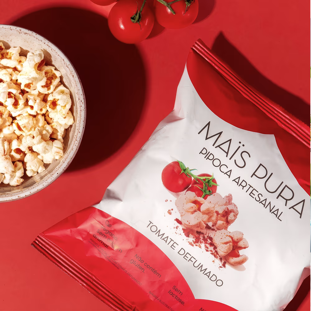
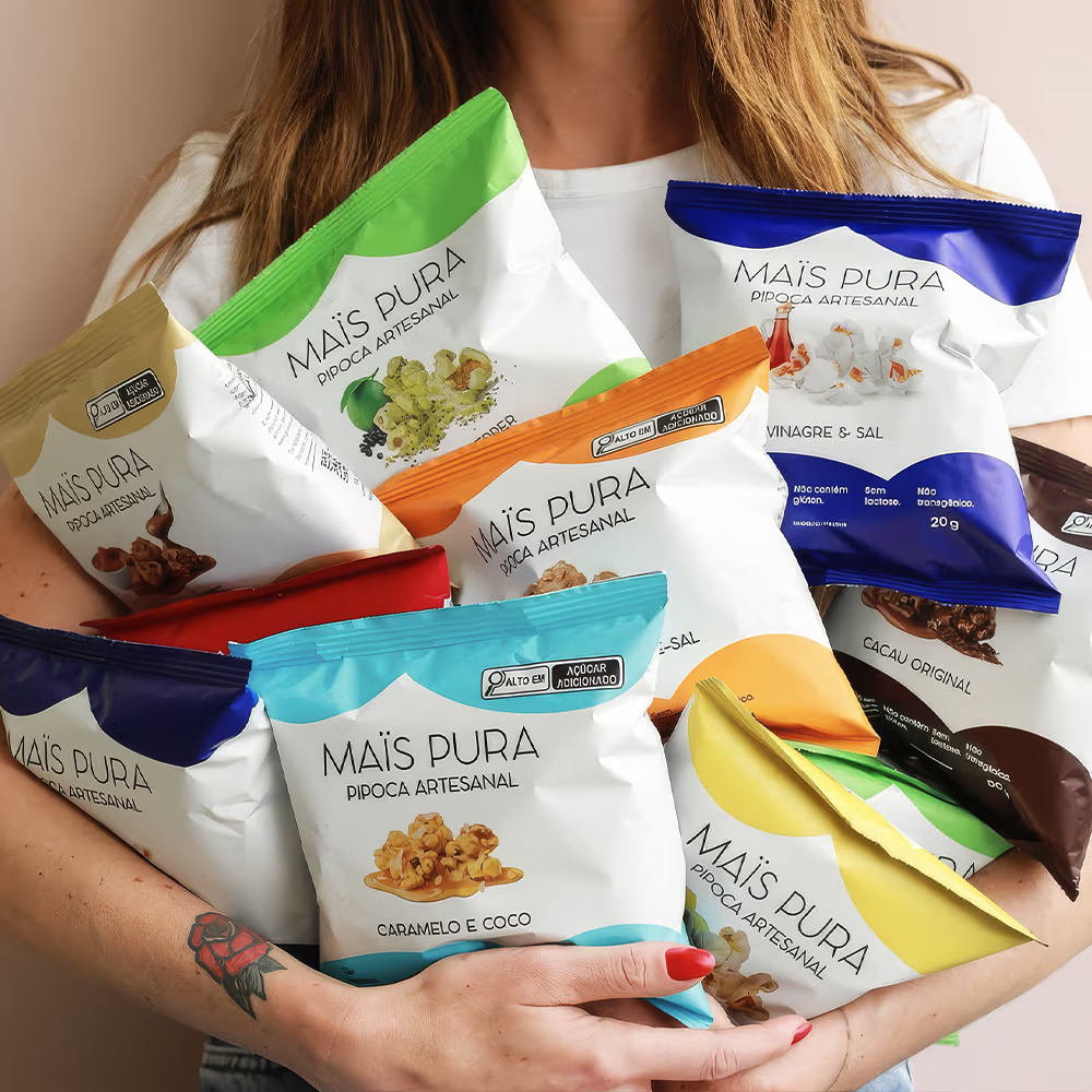
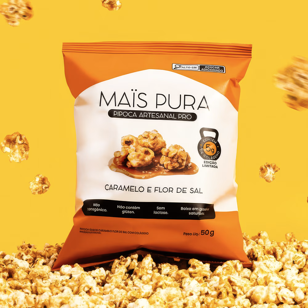
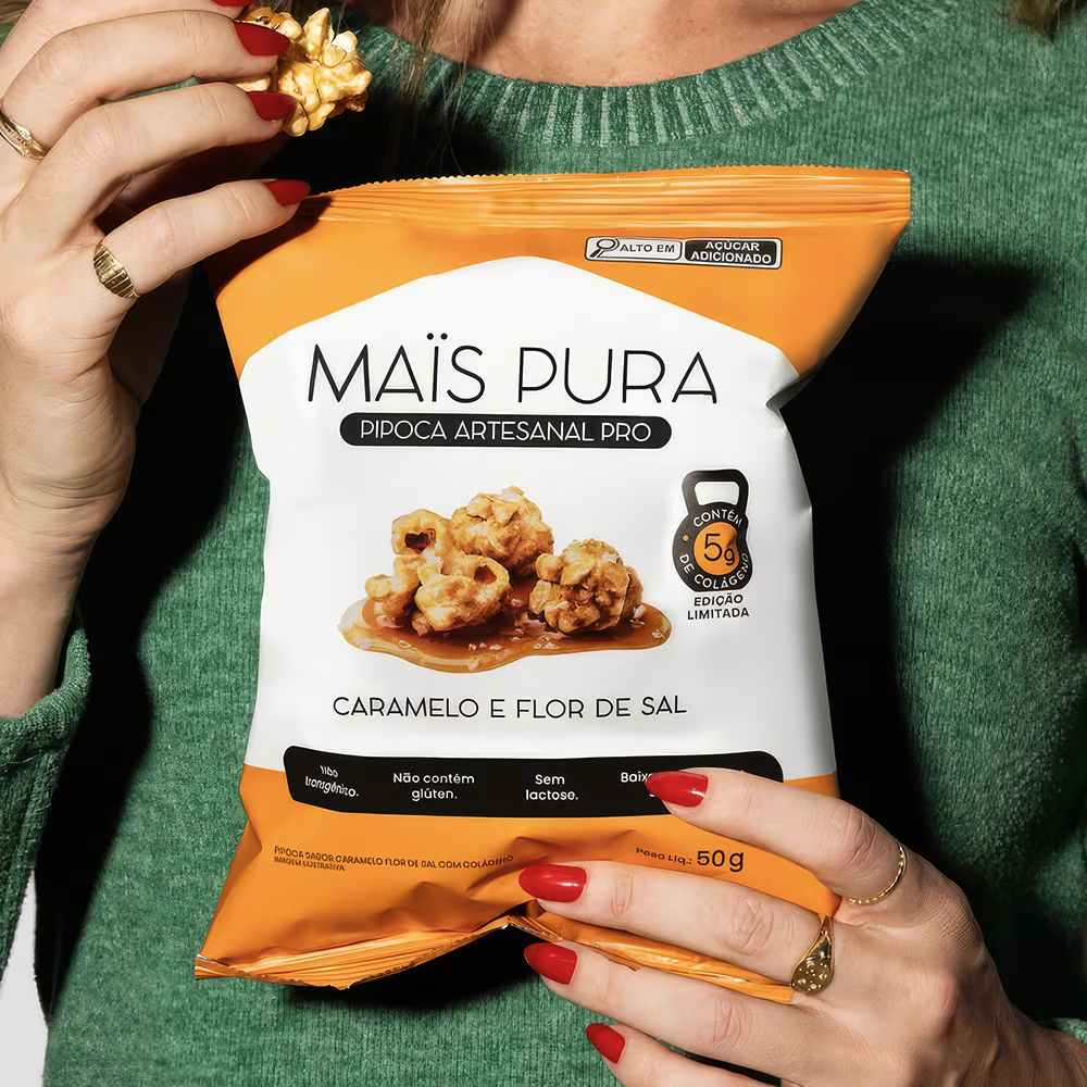
MAISPURA was created to transform popcorn into a premium, healthy, and desirable snack. The project’s challenge was to break away from the category’s traditional visual codes often cluttered with excessive graphics and build a contemporary identity that highlights ingredient quality, flavor sophistication, and brand transparency.
The design employs a minimalist aesthetic featuring ample white space, elegant typography, and a clean layout that places the product at the heart of the communication. Each flavor is identified by a consistent color-coding system, creating a scalable visual family that is instantly recognizable at the point of sale. The carefully crafted imagery highlights the indulgent nature of the ingredients while maintaining the perception of a natural, artisanal product.
Nutritional information and functional attributes are organized within a clear hierarchy, ensuring readability and building trust. The result is packaging that elevates the category’s perceived value, differentiates the brand on the shelf, and instantly communicates MAISPURA’s positioning: an artisanal popcorn that combines pleasure, quality, and well-being into a sophisticated visual experience.


The network for creativity
Join 1.25M professional creatives like you
Connect with clients, get discovered, and run your business 100% commission-free
Creatives on Contra have earned over $150M and we are just getting started



Related posts

Hey Everyone! I've been a little quiet on here lately, but I'm finally back with lots of amazing branding and packaging design case studies which I was working behind the scenes.
Keep an eye out for lots of verified case studies coming your way. 👀
For now, here’s a little peek at some of the work I’ve created lately for a contemporary Italian cafe in Lecce.
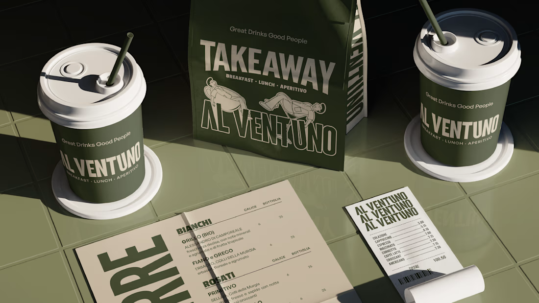
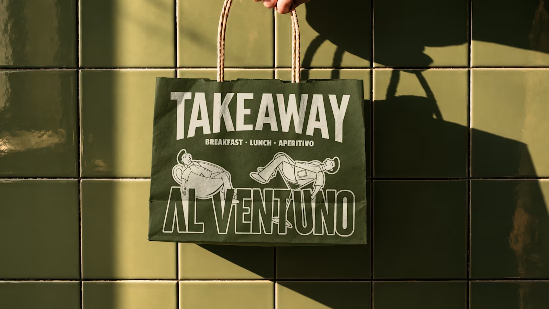
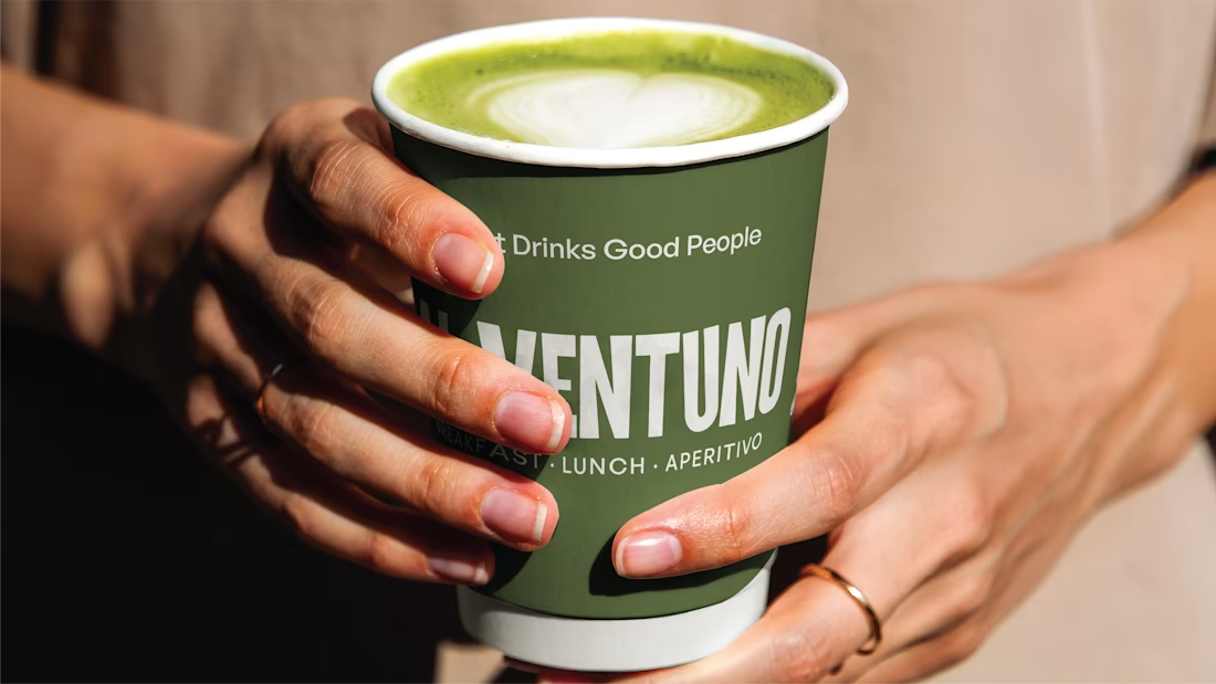

Love it! Great work!


🎉 It’s live! I’ve finally updated my design portfolio:
👉
This space has been a long time coming, a reflection of the stories, systems, and identities I’ve been lucky to shape across wellness, healthcare, community & events!
It’s still evolving (aren’t we all?), and I’ll be adding more projects soon, but I’m excited to finally share a fresh look at my work and creative direction!

Congratulations on the new portfolio, Kajal! The grid of bold reds, magenta and cobalt mockups, with that confident serif G repeating throughout, makes the whole identity feel energetic yet cohesive. What guided the way you sequenced your wellness and healthcare projects?

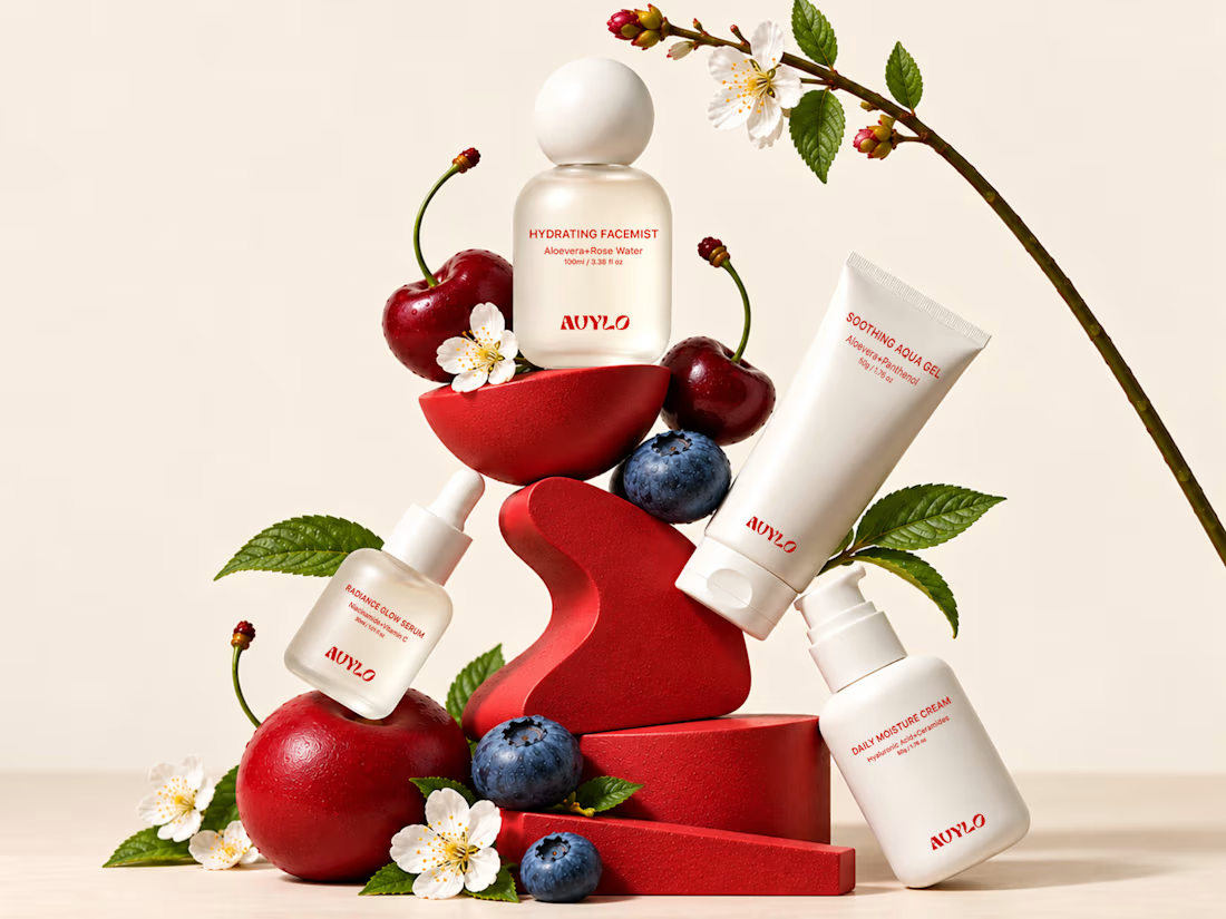
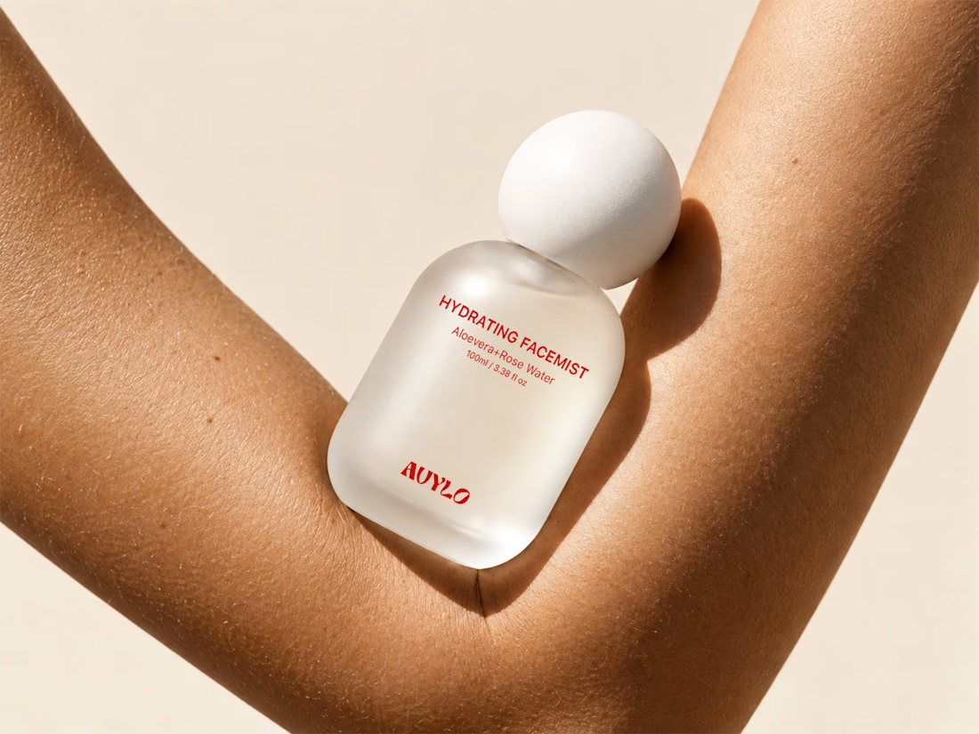
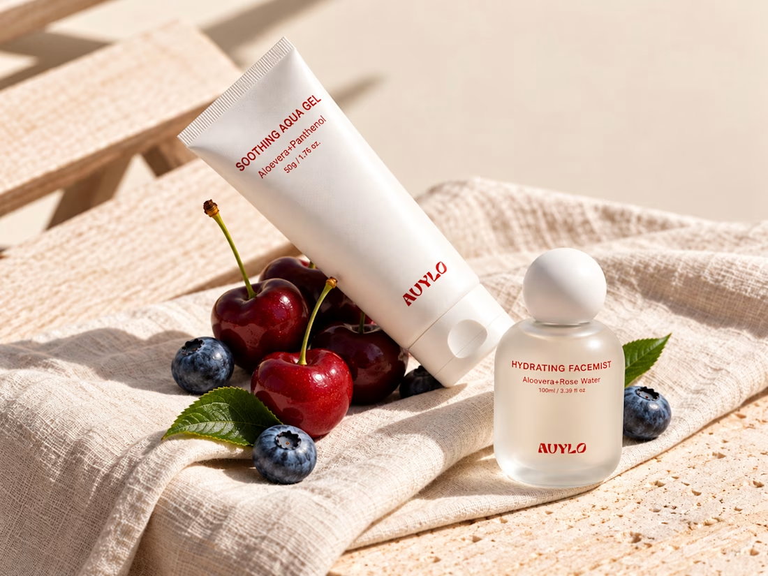
AVYLO Skin Care Packaging Design


Good job