The network for creativity
Join 1.25M professional creatives like you
Connect with clients, get discovered, and run your business 100% commission-free
Creatives on Contra have earned over $150M and we are just getting started
Back to feedPost
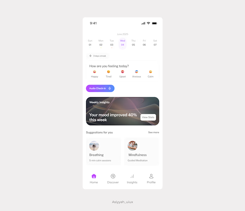
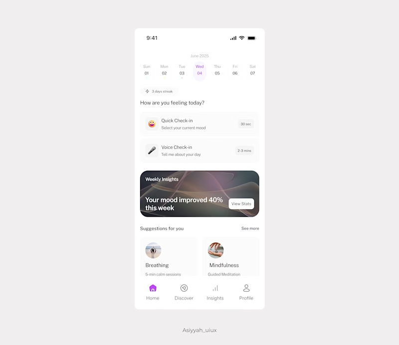
Taste Test

Exploring two approaches for a mental health app home screen:
Option A: direct emoji selection with a button for audio check-in.
Option B: a two-card layout—quick check-in (30s prompt) & audio check-in as separate actions.
Which feels clearer and more intuitive to you, and why?
0 voted
0%
1 voted
100%
1 vote
Closed
The network for creativity
Join 1.25M professional creatives like you
Connect with clients, get discovered, and run your business 100% commission-free
Creatives on Contra have earned over $150M and we are just getting started
Related posts

If you could only pick 1 interaction for your website...
What would you pick?


22 voted
76%
7 voted
24%
29 votes
Closed

I’d go with the dark/light toggle. It’s simple but adds real value to user experience, especially for accessibility. Flashlight hover looks cool, but usability always wins for me.

Here is my submission: "Mood Desk" An interactive 3D cozy
home office where a floating orb shifts the room between
four atmospheres: Focus, Chill, Creative, and Nature.
Each mood transforms lighting, window view, screen colors,
and particle effects.
Built 100% in Omma via AI prompts.
I hope you like it! 😊

I need your help, which one would you choose A or B?
My only concern with B would be too much white space in the default state 🤔

44 voted
49%
45 voted
51%
89 votes
Closed

B looks like a much better animation with easing, A reminds me the early days of pure CSS hover effects, then designers needed to use javascript plugins/codes to create smoother animations, now it's a few clicks in Framer :))


Trending


Notion
Notion isn’t just where you work, it’s starting to work for you. What agents are you building?
portfolioreview
The best portfolios tell a story, not just show a grid. Share yours for feedback.
brandguidelines
Brand guidelines are becoming living systems, not static documents. What are you building for your clients?
aivideo
AI video tools are moving at warp speed. Which ones are you experimenting with?
freelancerlife
Freelancer life is wins, pivots, and everything in between. What’s yours right now?