The network for creativity
Join 1.25M professional creatives like you
Connect with clients, get discovered, and run your business 100% commission-free
Creatives on Contra have earned over $150M and we are just getting started
Back to feedPost

The network for creativity
Join 1.25M professional creatives like you
Connect with clients, get discovered, and run your business 100% commission-free
Creatives on Contra have earned over $150M and we are just getting started








Related posts

More from ARDA®, a look at the desktop experience.
A, editorial approach to presenting architecture, built around typography, grid and imagery.


When u realize, there are websites with crazy animation but simple web like this has more conversations rate

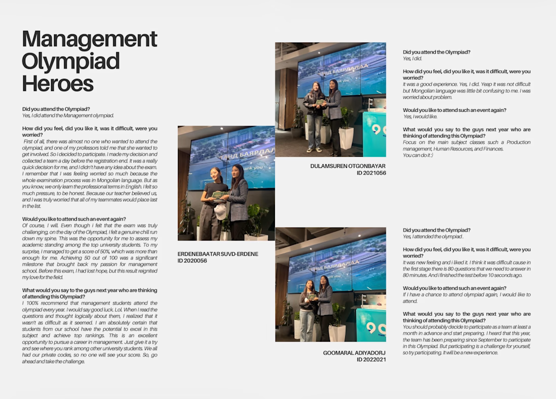
Editorial Layout Design | Management Olympiad Heroes
Designed and formatted an editorial-style publication featuring interviews and event photography from the Management Olympiad. Focused on clear typography, structured text layout, image placement, and a consistent visual hierarchy to create a clean and professional result.
Skills: Editorial Design, Page Layout, Typography, Photo Editing, Print Design.



From a grid to a complete studio website.
FRAME 019 is live. I built it around bold type, editorial imagery and one changeable accent, then connected the details: CMS case studies, a full-screen menu and interactive process tabs.
A quick walkthrough of the finished build below.
13 page layouts. 6 sample projects. Desktop to mobile.
Available now for $10.
FIRSTFRAME is coming soon: a planned 3-day free launch offer. The coupon is NOT active yet. I'll share the confirmed dates when it's ready.
Which detail would you make your own?
#Framer #WebDesign #FramerTemplates


Limiting the design to one changeable accent color makes it surprisingly effective for client handoffs. It lets buyers rebrand the identity without unraveling the entire layout system.