The network for creativity
Join 1.25M professional creatives like you
Connect with clients, get discovered, and run your business 100% commission-free
Creatives on Contra have earned over $150M and we are just getting started
Back to feedPost

Turned one of my written pieces into a visual video slideshow format. Content writing isn't just about blocks of text—it's about how ideas flow and connect visually, too!

The network for creativity
Join 1.25M professional creatives like you
Connect with clients, get discovered, and run your business 100% commission-free
Creatives on Contra have earned over $150M and we are just getting started





Related posts

Here’s my Video.js skin submission: KON — a pocket-sized edit deck for Video.js v10.
What if watching a film felt less like using a video player and more like operating a beautifully crafted piece of hardware?
That’s the idea behind KON.
Turn the jog dial to scrub through a film. Find moments using a filmstrip built from the video’s own frames. Drag the coloured latches to rearrange your controls. Every interaction is designed to feel tactile, intentional, and satisfying.
But KON isn’t just about how it feels. Its layout adapts to the player: controls sit alongside the picture when there’s room, re-dock beneath it in portrait layouts, and collapse into a compact overlay in smaller players. Choose between Off-white and Graphite editions, each carrying the same carefully considered material details across light and dark environments.
And beneath the hardware-inspired design is a fully functional, accessible player skin: keyboard alternatives for tactile interactions, visible focus states, screen-reader announcements, and reduced-motion support.
Built on Video.js v10, KON is a working, reusable skin — not just a visual concept.
One of the most enjoyable parts of this project was bringing the whole concept to life — generating the visual design, creating the video, and seeing all those little details come together into something that feels like a real piece of hardware.
Give it a try: Play the film. Turn the dial. Rearrange the controls. Then resize the player and watch the whole interface adapt.
Explore the full experience:
https://lab.behzad.me/kon-videojs-skin/workbench/
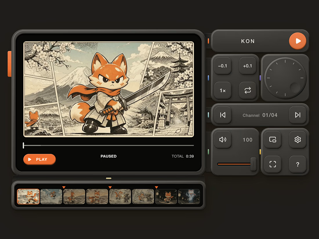
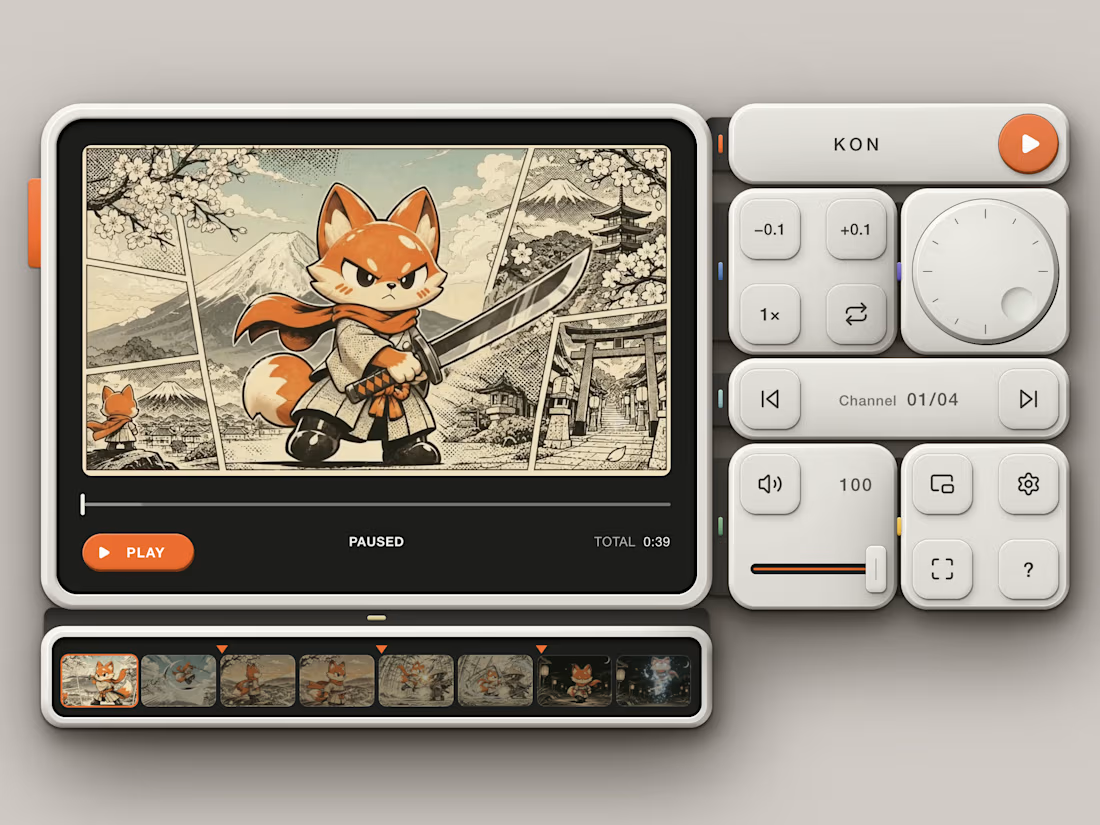
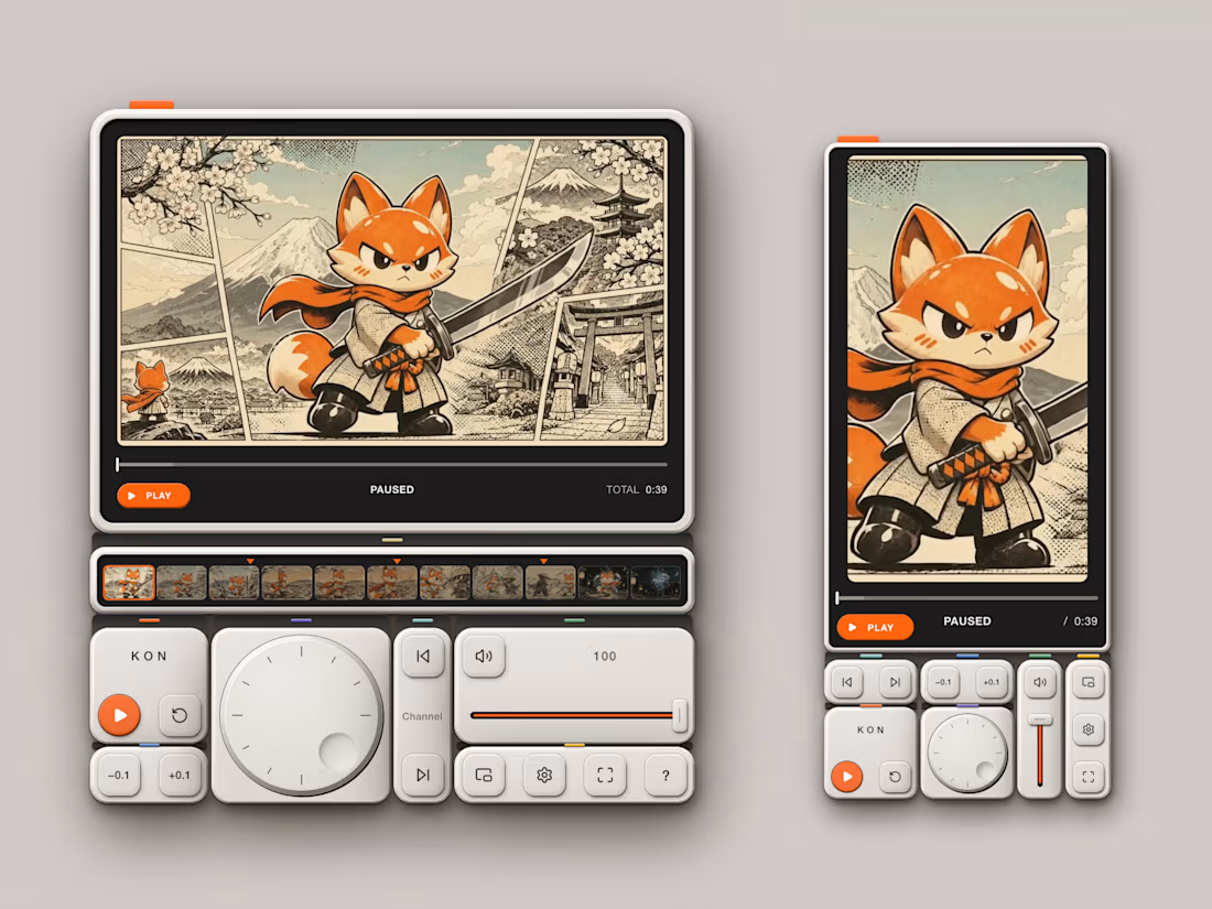

The jog dial is the detail that sells it — scrubbing as a physical gesture makes the player feel like a tool, not a window. The pocket-sized edit deck framing is clever too. This is the kind of skin that makes people want to touch the video.

Fresh visuals that make you feel the crunch! 🍎✨
Designed this commercial Apple Juice Ad Poster focusing on bold typography, natural product reflections, and rich color contrast to make the product pop right off the screen.
Need scroll-stopping social media ads or product posters for your brand? Let’s create something refreshing together! 📩 DM to book your project.
#GraphicDesign #PosterDesign #ProductPoster #CanvaTutorial #BeverageDesign #SocialMediaAds #CommercialDesign #CanvaDesign #AppleJuice #AdvertisingDesign #FreelanceDesigner #CreativeDirection


The glass and apple slice overlapping the JUICE letters give it real depth. Is the ORDER NOW button small on purpose, or would you try it a bit bigger?

09 XL — From a Portrait to a Visual Story.
This one started with a simple black-and-white portrait, but I wanted to give it a little more personality. I began experimenting with contrast, grain, and shadows to build a raw, almost cinematic atmosphere.
Then came the fun part — playing around with typography, adding the black strip across the eyes, and using minimal details like 09 and XL to give the composition a subtle editorial feel.
Once the poster came together, I placed it in a real-world bus stop mockup to see how it would live outside the screen.
A little experimentation, a few happy accidents, and lots of tiny adjustments later — this was the result.


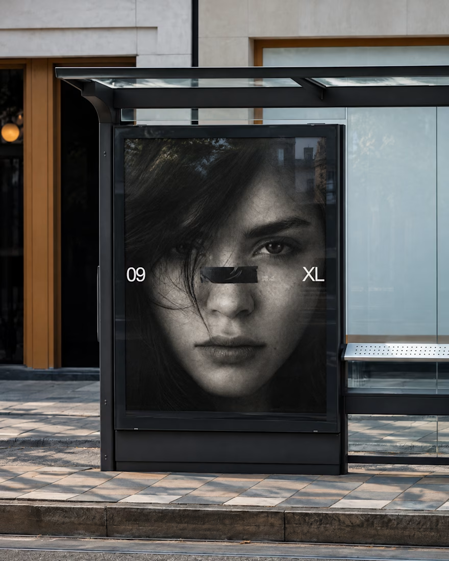
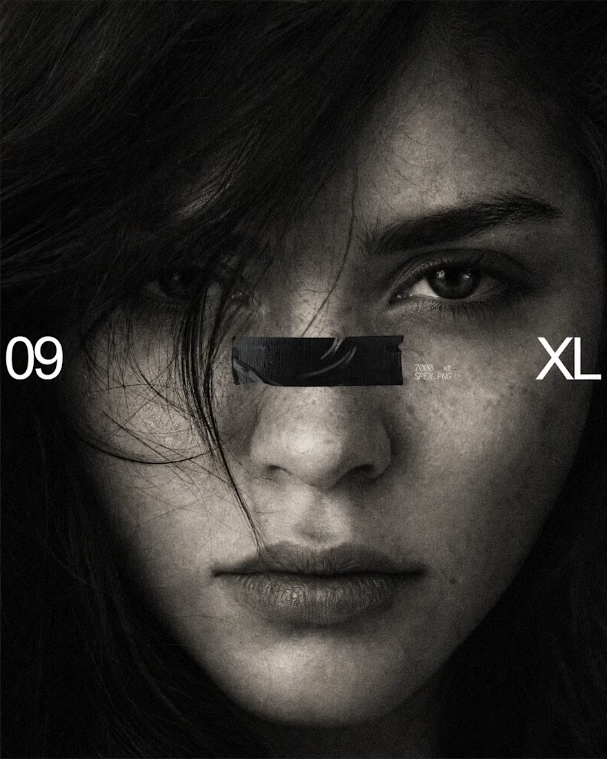
The black bar across the eyes with 09 and XL on the sides turns a simple portrait into a bold poster, and the bus stop mockup shows it works at street scale. Is the grain added in Photoshop or part of the original photo?