The network for creativity
Join 1.25M professional creatives like you
Connect with clients, get discovered, and run your business 100% commission-free
Creatives on Contra have earned over $150M and we are just getting started
Back to feedPost
Taste Test

Which one is the best to show as sample?
3 voted
43%
4 voted
57%
7 votes
Closed

Video 2

Video 1

Video 1 is more cinematic

Video 2 is nice
The network for creativity
Join 1.25M professional creatives like you
Connect with clients, get discovered, and run your business 100% commission-free
Creatives on Contra have earned over $150M and we are just getting started
Challenges
View all


Related posts

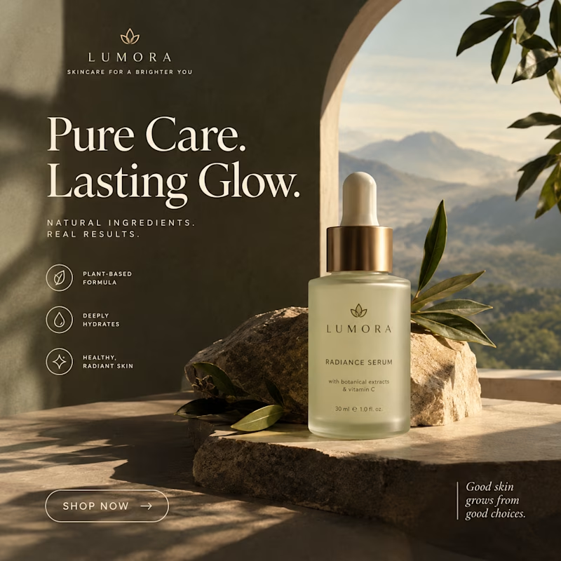
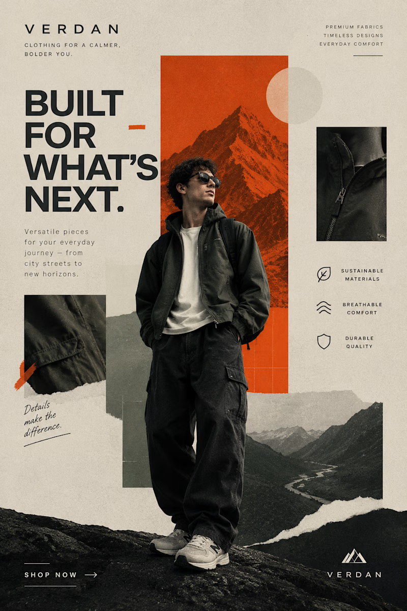
Two Brands. Two Completely Different Creative Directions. 🎨
A brand’s visual identity can change everything about how its products are perceived.
✨ Option A: Cinematic Minimalism — elegant, refined, and luxurious.
🔥 Option B: Modern Editorial Collage — bold, expressive, and adventurous.
Both styles tell a different story, but which one captures your attention?
Vote A or B in the poll and tell me what makes your choice stand out!
Need eye-catching advertisement designs for your brand, product, or social media campaign? I create custom ad creatives tailored to your brand’s identity, audience, and goals.
Have a project in mind? Explore my services on Contra and let's bring your ideas to life.
1 voted
14%
6 voted
86%
7 votes
Closed


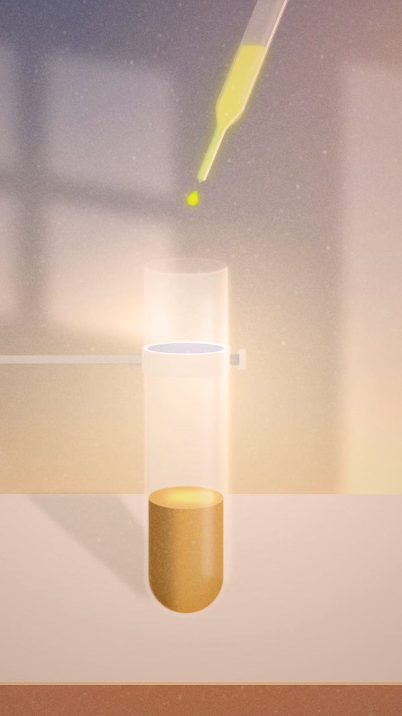
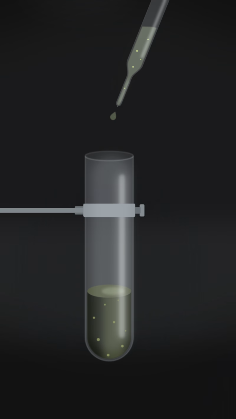
One lab experiment, two completely different moods. 🧪 Which one do you think fits best?

6 voted
67%
3 voted
33%
9 votes
Closed

A looks great!


Which palette would you keep?
The first sets deep navy glows top and bottom, bending around a pale ice band. The title racks into focus in oxblood serif, ANIMATED fades in beside GRAPHICS, and the letters keep tracking slowly apart.
The second runs the same move in crimson on blush, the title switched to amber, the glows softer at their edges so the whole frame sits warmer.
One reads like deep space. The other reads like a red carpet.
👇 #motiondesign #typography #aftereffects
4 voted
67%
2 voted
33%
6 votes
Closed

Deep field is more powerful ❤️