The network for creativity
Join 1.25M professional creatives like you
Connect with clients, get discovered, and run your business 100% commission-free
Creatives on Contra have earned over $150M and we are just getting started
Back to feedPost
Taste Test

Some early concepts for a home insurance agency brand combining a Goldfinch bird and a birdhouse.
Which one do you guys like?
1 voted
20%
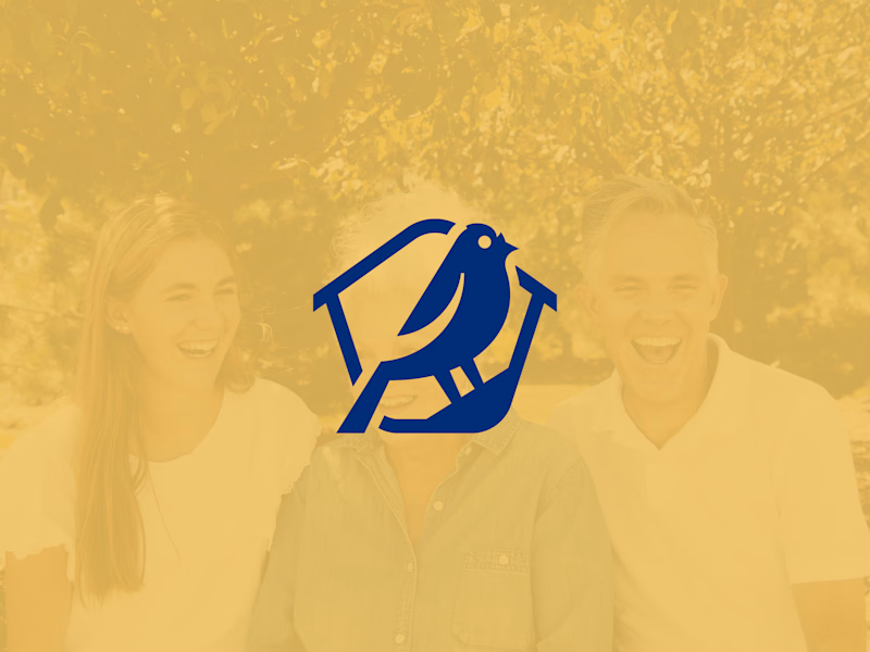
4 voted
80%
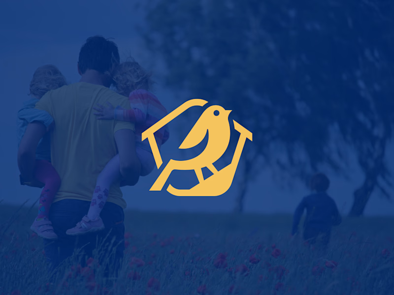
5 votes
Closed


I vote for youthful. First, this reflect 'goldfinch' bird original color. second, If i see closely shape of the head fully rounded which reduce tiny unnecessary detail on the blue one.
I respect the gap size between the bird and the house shape. This is quite strong execution. Congratulation! really inspiring!
The network for creativity
Join 1.25M professional creatives like you
Connect with clients, get discovered, and run your business 100% commission-free
Creatives on Contra have earned over $150M and we are just getting started







Related posts



Beautyy

Recovery Brand Identity / Logo & Visual Direction
A new identity project for a recovery-focused brand that wanted to move away from the conventional clinical look of its category.
The direction combines clinical credibility with a more modern, movement- and performance-driven visual language.
First look at the logo. Full identity coming next.
Logo design and creative direction by Lepisov Branding
Social media Branding: collab with Mike Creative Mints


Policy Comparison Carousel
Built for insurance comparisons and product explainers,
this carousel presents three plans
with animated ratings and feature
reveals that guide viewers
through the information.
.
.
Replace the logos, policy details, scores, and colors
to showcase another set of plans while keeping the same motion.