The network for creativity
Join 1.25M professional creatives like you
Connect with clients, get discovered, and run your business 100% commission-free
Creatives on Contra have earned over $150M and we are just getting started


The network for creativity
Join 1.25M professional creatives like you
Connect with clients, get discovered, and run your business 100% commission-free
Creatives on Contra have earned over $150M and we are just getting started








Related posts

How can branding make people feel part of a community?
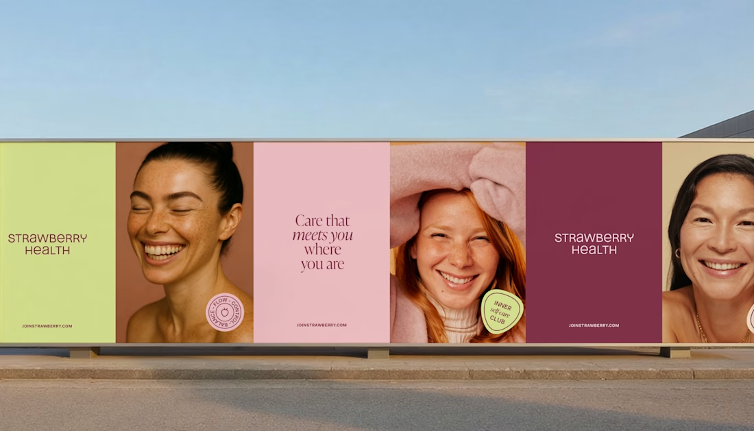
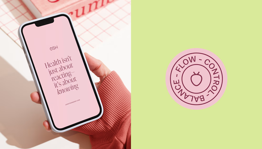
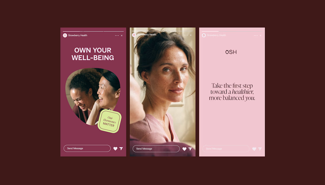
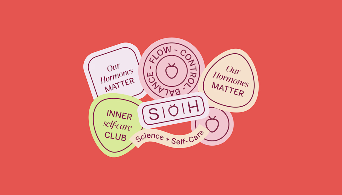
When working on Strawberry Health, we explored how visual identity could make women’s health feel more approachable and collective.
One of the ways was through supporting brand elements: stickers, badges and phrases that could live beyond the logo and become expressions of belonging.
These elements turned the identity into something people could interact with, share and make their own.
It’s a small detail, but I think it’s an important part of building brands around communities: the identity shouldn’t only identify the brand. It should give people something to identify with.

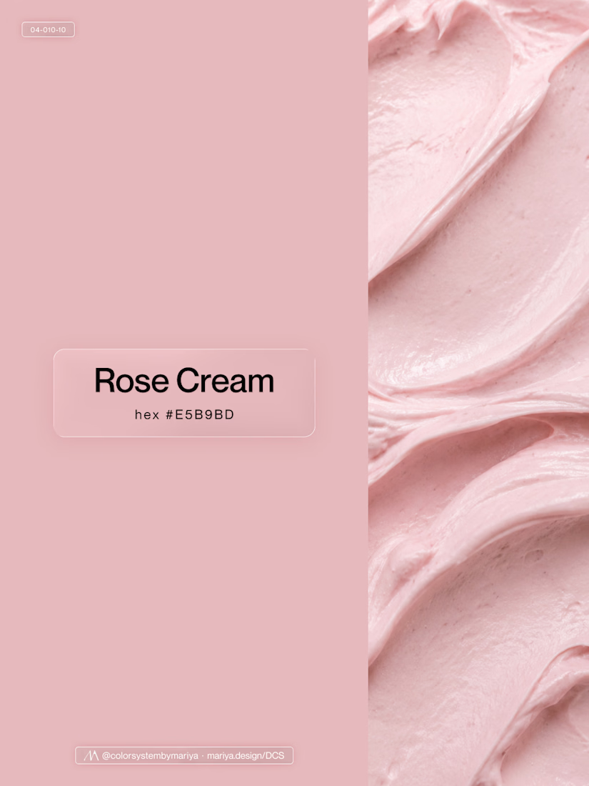
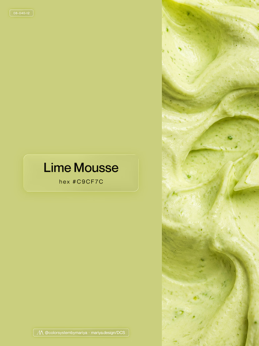
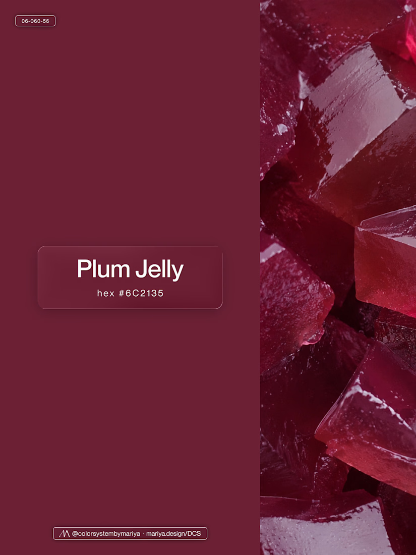
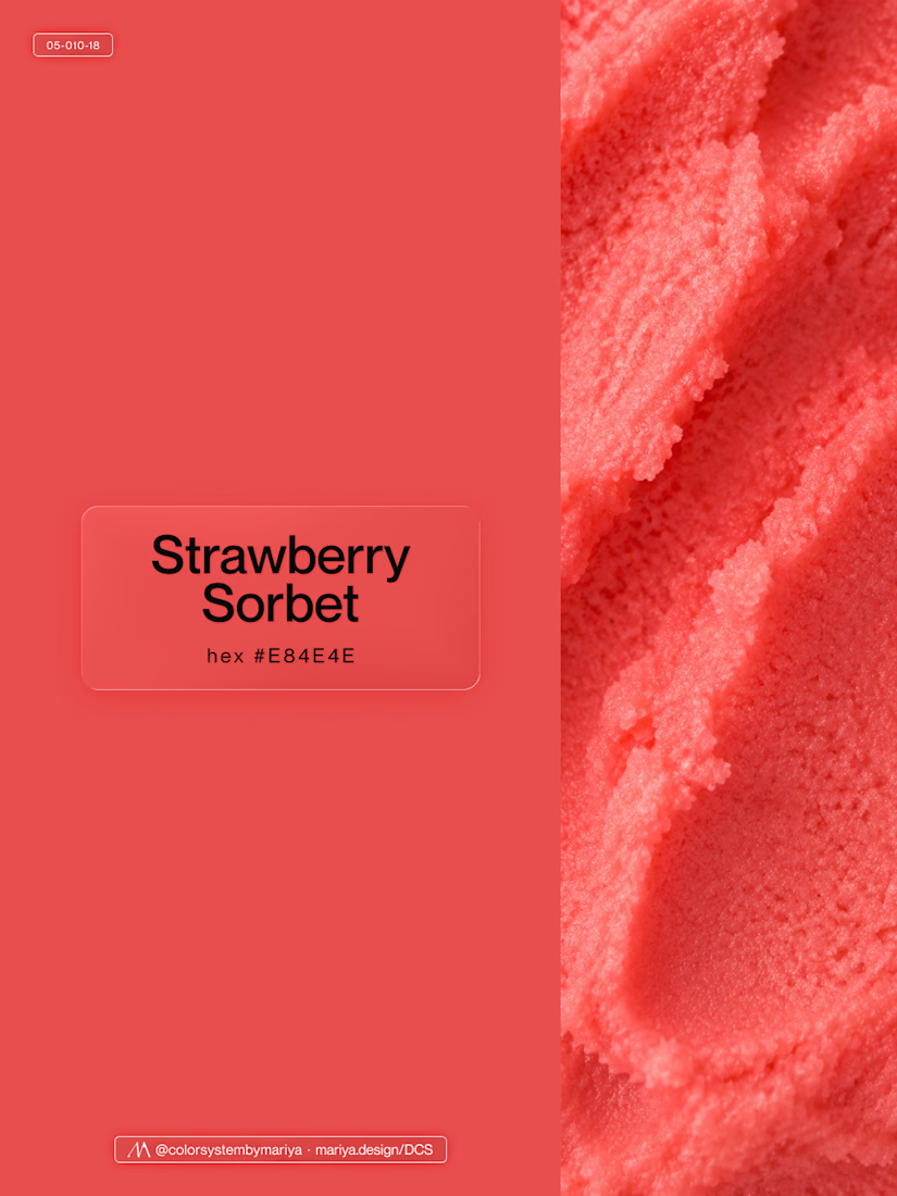
Love, love, love the colors. My mind goes: Rose Cream, Lime Mousse and Plum, hmmmm, which Plum... Plum Jelly. And of course, Strawberry Sorbet.
Let me match the vibe using my delicious swatches 😊


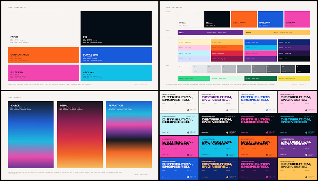
Spektra's founder had a practical question during the identity work: if the team needed green one day, would there be a green that belonged?
So I defined every color in the system, including green, with shades and pairings for each. When that day comes, the green is already there.


✈️ What if booking a flight was actually fun?
I wanted to make the whole experience feel less like filling out a form and more like playing with an interface.
Turn your sound ON and give it a watch 🎧🔊.

THIS IS GREAT