The network for creativity
Join 1.25M professional creatives like you
Connect with clients, get discovered, and run your business 100% commission-free
Creatives on Contra have earned over $150M and we are just getting started
Back to feedPost

Stop making mobile shoppers scroll forever just to buy your product.
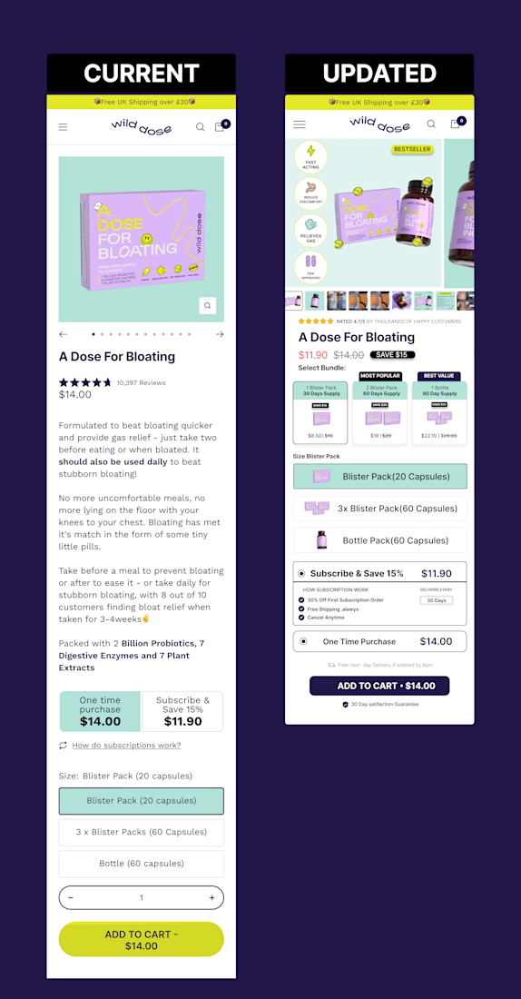
Look at this product page teardown for Wild Dose (Current vs. Updated):
On the left, the "Add to Cart" button is buried way down below heavy blocks of text and variant selectors. Shoppers have to scroll through a wall of text just to see the price and checkout.
Above-the-fold value: Clear bundle options and pricing right near the hero image.
Instant visual hierarchy: Badges, reviews, and interactive variant pills stacked logically.
Thumb-friendly CTA: The "Add to Cart" button is prominent without forcing an endless scroll.
If your mobile layout hides the checkout button, your conversion rate will suffer. Make buying effortless.


Great retouch. Definetrly more appealing and buyable. You removed the frictions nicely with a good design. Good work!
The network for creativity
Join 1.25M professional creatives like you
Connect with clients, get discovered, and run your business 100% commission-free
Creatives on Contra have earned over $150M and we are just getting started
Related posts

3 Shopify mistakes quietly killing your conversions in 2026:
Cluttered mobile checkout (fix: one-page + guest checkout)
Slow product images (fix: optimize + use Replo for custom sections)
No social proof above the fold
Which one are you guilty of? Drop it below 👇


Free CRO Audit for Your E-Commerce Store or Design
I’m currently analysing conversion drop-off points across e-commerce sites and UI layouts—with a focus on the homepage, product pages (PDPs), and checkout flows.
While developing a bespoke Shopify theme, I’ve been testing my own UX/CRO analytics tool. To gather more real-world data, I’m offering a free CRO audit for 5 stores or Figma designs.
What you’ll get:
– A concise breakdown highlighting key visual and UX friction points that are costing you conversions.
– 15+ actionable recommendations on what to tweak right now to boost your conversion rate.
If you’d like an audit, drop a link to your site or design in the comments or send me a DM. I'll be taking on the first 5 projects.
















Trending

Claude
Claude has entered the design space. How are you using Claude Design?

Contra University
Learn from expert creatives how to earn more using next-gen AI tools.
creativeaiflow
Creative AI workflows are evolving. What tools do you use, and what are their strengths and weaknesses?
freelancerlife
Freelancer life is wins, pivots, and everything in between. What’s yours right now?


