The network for creativity
Join 1.25M professional creatives like you
Connect with clients, get discovered, and run your business 100% commission-free
Creatives on Contra have earned over $150M and we are just getting started
Back to feedPost



The network for creativity
Join 1.25M professional creatives like you
Connect with clients, get discovered, and run your business 100% commission-free
Creatives on Contra have earned over $150M and we are just getting started




Related posts


cohestra’s journal in light and dark. which would you keep?
26 voted
41%
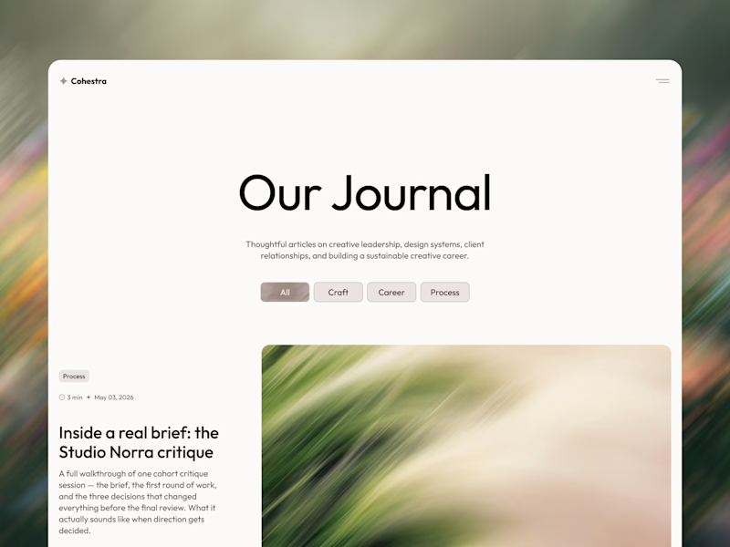
37 voted
59%
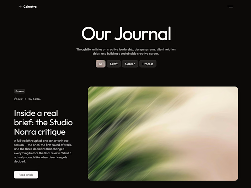
63 votes
Closed


light: more clear for me 🎉

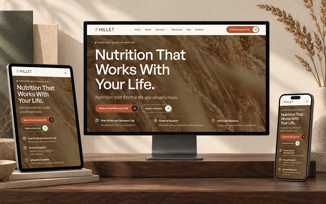
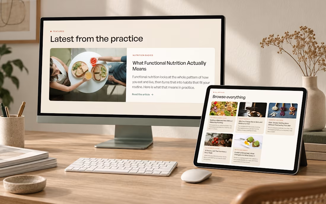
I just published a new @Framer template for nutritionists and health coaches.
Most wellness sites are either clinical and cold or sage green with leaf illustrations. I went warmer. Cream, wheat, terracotta, print magazine spacing.
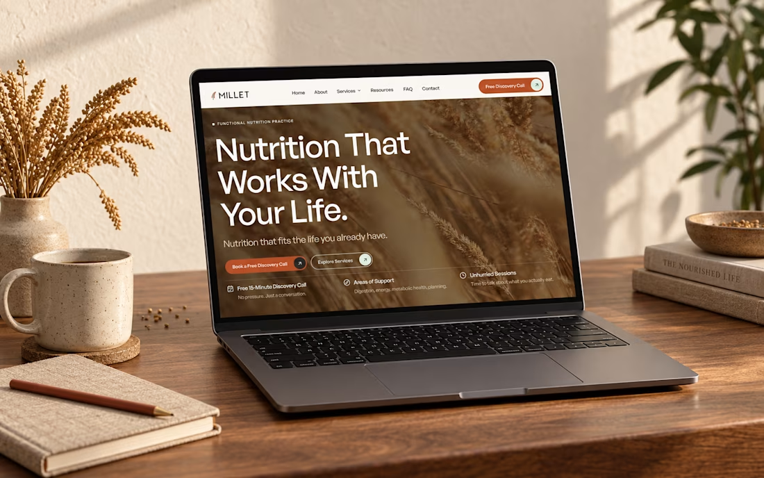


Looks Clean and Clear.


I don’t get how web designers complain about spending hours on one hero section.
I’ll easily go through 10+ iterations before I even know which directions are worth showing the client
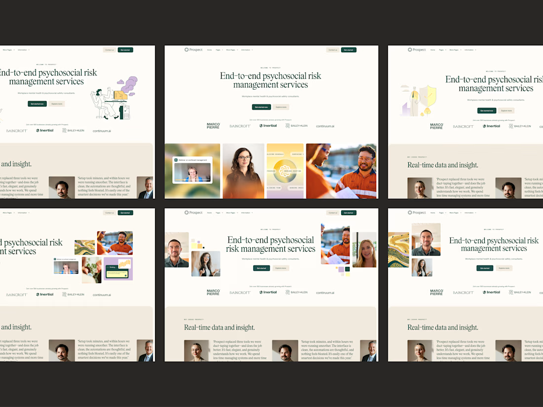

10+ iterations before the client sees anything is the unglamorous secret behind every calm site like this. A psychosocial risk brand has to feel trustworthy without going cold, and this nails that balance. The restraint is doing the heavy lifting.