The network for creativity
Join 1.25M professional creatives like you
Connect with clients, get discovered, and run your business 100% commission-free
Creatives on Contra have earned over $150M and we are just getting started
Back to feedPost

You can usually tell how a product was built by how it feels.
Some feel heavy too many steps, too many decisions, too many things trying to happen at once.
Others feel… obvious. Like there was never another way to do it.
That difference isn’t talent. It’s restraint.
Knowing what to build is important.
Knowing what to ignore is where most of the value is created.
I’ve been spending more time lately simplifying systems, removing layers, and making products feel the way they should’ve from the start.
It’s interesting how often the real solution is less, not more.
The network for creativity
Join 1.25M professional creatives like you
Connect with clients, get discovered, and run your business 100% commission-free
Creatives on Contra have earned over $150M and we are just getting started








Related posts


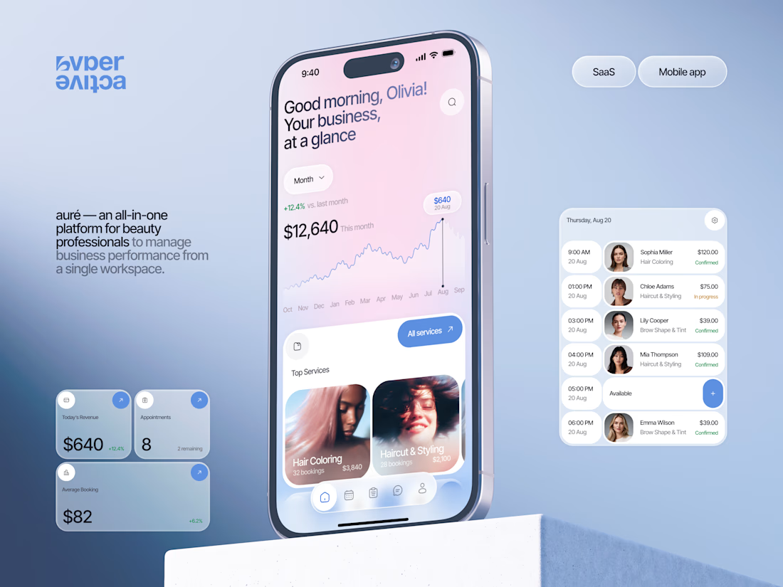
Finally wrapped up this project, and I’m excited to share the case study! 💅 A fresh product design concept for a beauty dashboard. Would love to hear your thoughts! ✨


A beauty dashboard is such a fun product design challenge, Oleksandra. The Good morning, Olivia! greeting in the header makes business metrics feel personal instead of clinical, which is exactly what a beauty professional would want.

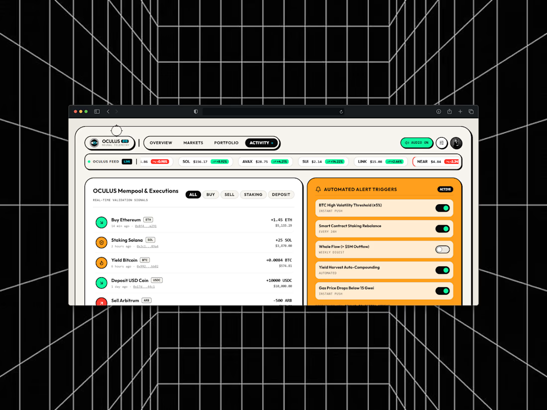
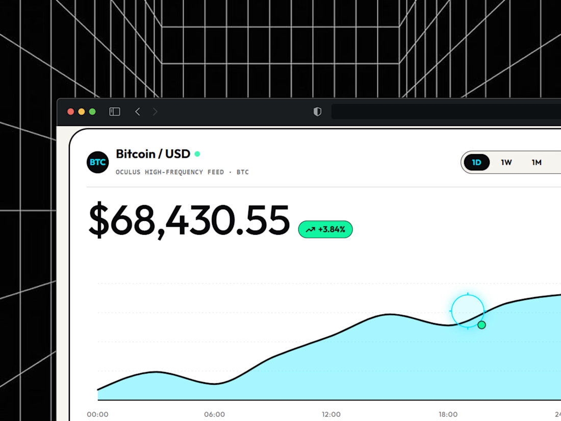
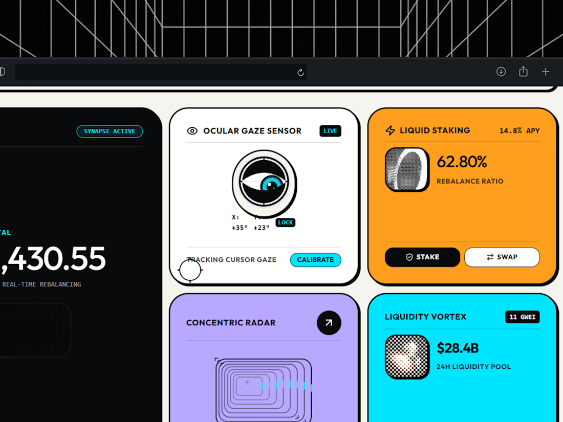
Designed Oculus, a crypto dashboard where every tile is double-outlined, flat and unapologetically colorful.
Warm paper canvas, ink black anchors, mono micro-type, and an eye that follows your cursor.
Built with GSAP + Framer Motion. Light mode only, on purpose.

light mode only, on purpose. respect.


Which feels more established to you?
22 voted
30%

52 voted
70%

74 votes
Closed