The network for creativity
Join 1.25M professional creatives like you
Connect with clients, get discovered, and run your business 100% commission-free
Creatives on Contra have earned over $150M and we are just getting started


The network for creativity
Join 1.25M professional creatives like you
Connect with clients, get discovered, and run your business 100% commission-free
Creatives on Contra have earned over $150M and we are just getting started

Challenges
View all


Related posts


aftrglo has been live for a month ✨
It's a browser-based tool with animated templates I'm building for designers and creatives who want to present their work online with motion, without having to do it from scratch.
Pick a template -> add your visuals -> play with the settings -> export
Here's what's happened in the first month:
• People are using the thing I made. Aaaa 🥹
Seeing aftrglo in other creatives' posts and projects has been such a joy.
• The feedback is coming in.
People are sharing their impressions, ideas, and wishes. I'm learning how aftrglo fits into their creative process.
• That feedback is helping it grow.
We've spotted a few bugs together, and I've been making fixes and updates along the way.
• The editor is getting a new look.
I've redesigned the controls to make the interface feel calmer and easier to navigate.
• Of course I made more templates 👀
Four new templates and updates to existing ones. More possibilities, while keeping the process simple.
Something that once felt like a distant little dream is now helping creatives with their work. They've told me, and I'm still taking that in.
I’m making it myself, while balancing a full-time job and a life I want to be present for. Progress happens in the time I have, and I’m proud of how it’s growing
Still very much in love with building this ✨


Luxury Lighting E-commerce Website Design for Modern Home Decor
A modern luxury lighting e-commerce website concept crafted to showcase premium statement pieces through a refined, immersive, and editorial-inspired digital experience. The design combines warm ambient lighting, bold typography, cinematic imagery, and clean minimalist layouts to create a sophisticated online presence for a high-end home decor brand. Every element is thoughtfully designed to enhance product storytelling, improve user engagement, and deliver a seamless shopping experience across all devices.


really nice design

Same data, two different ways to experience it 🤔
I explored two patient list layouts for a mental health platform: a card view and a table view.
Cards feel more visual and personal, but space is limited and adding more information can quickly make them crowded. For complex enterprise products, I often find tables more practical — they’re easier to scan, compare, sort, and can support more columns when users need greater visibility.
For this kind of workflow, I’m leaning toward the table view. Which would you choose — cards or table?
11 voted
55%
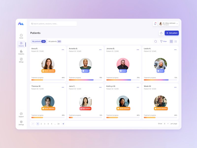
9 voted
45%
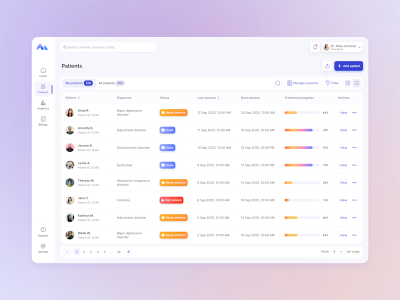
20 votes
Closed

For a mental-health patient list the choice isn't really card vs table — it's scan-speed vs context. The card wins the first meeting because the photo and name set the clinician's mental model before they touch the row, but the table is what holds up under the daily rhythm of...