The network for creativity
Join 1.25M professional creatives like you
Connect with clients, get discovered, and run your business 100% commission-free
Creatives on Contra have earned over $150M and we are just getting started
Back to feedPost

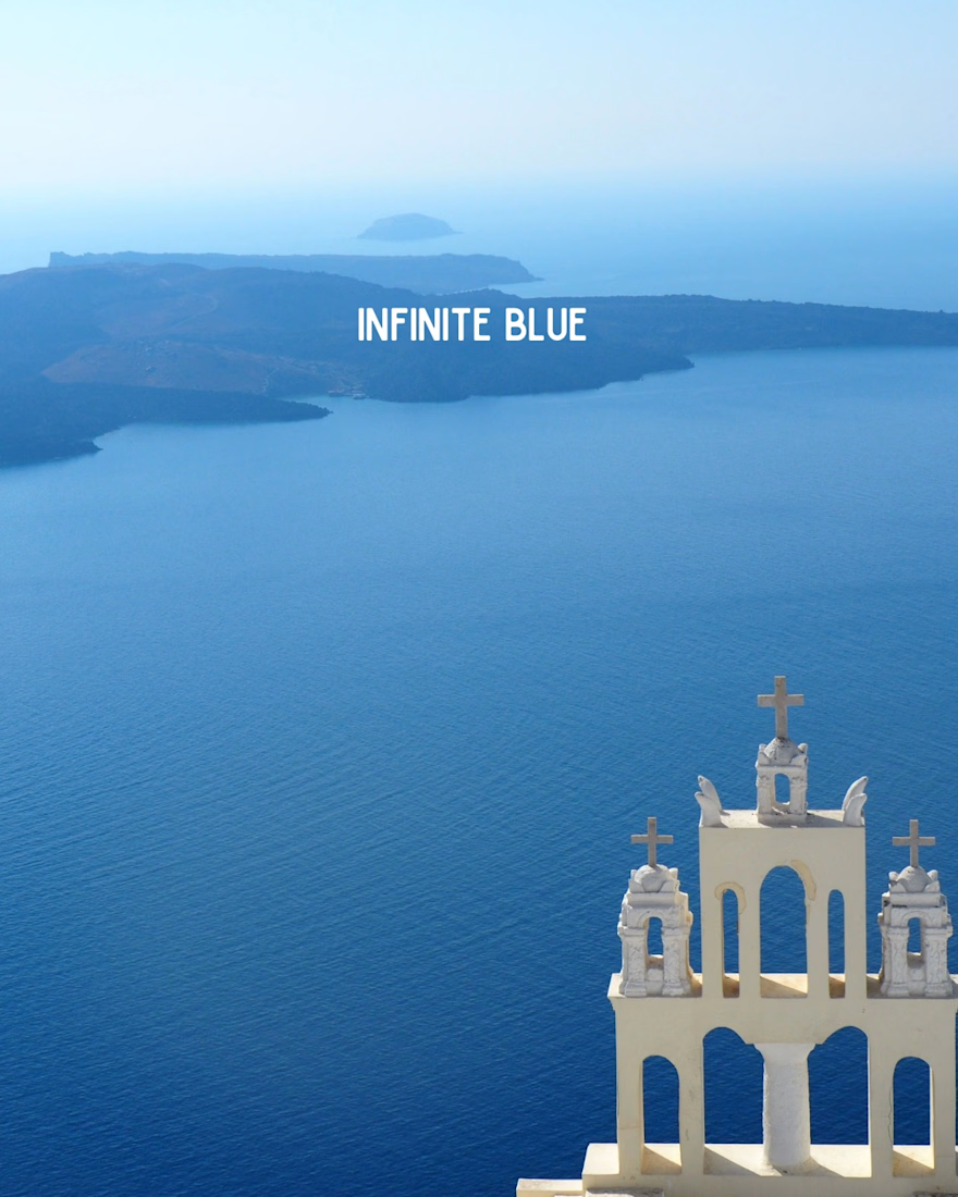
POV: You found your way to the Greek Islands 🇬🇷☀️
🏛️ Traditional villages
💙 Infinite blue
🤍 Whitewashed beauty
🌊 Island state of mind
Save this for your next Greek escape ✈️✨
The network for creativity
Join 1.25M professional creatives like you
Connect with clients, get discovered, and run your business 100% commission-free
Creatives on Contra have earned over $150M and we are just getting started

Challenges
View all


Related posts

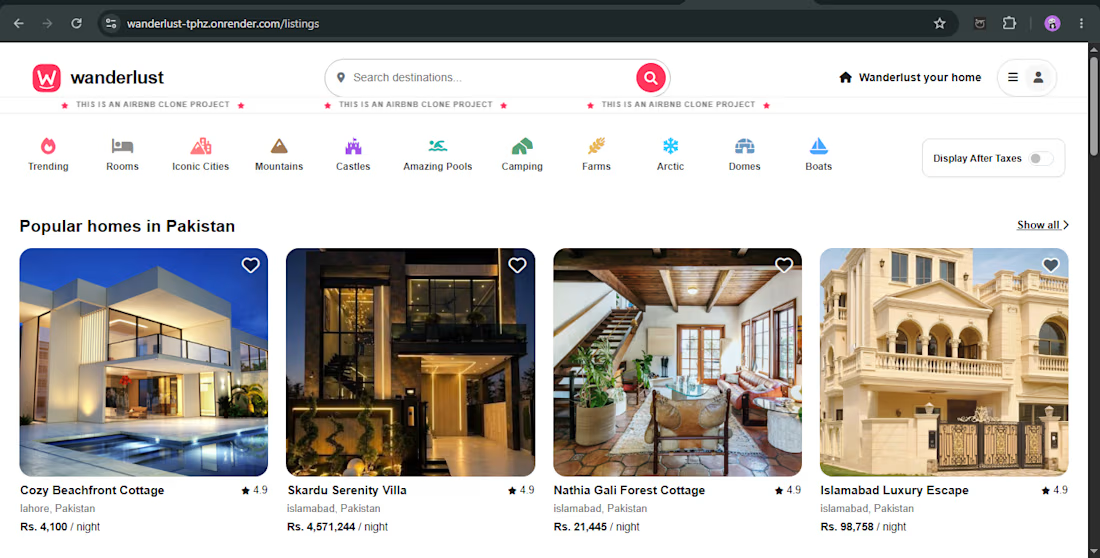
🚀 Introducing WanderLust — My Full-Stack Web Development Project
I built WanderLust, a full-stack booking web application using Node.js, Express.js, MongoDB, and EJS.
✨ Key features:
User authentication and authorization
Create, edit, and manage property listings
Reviews and booking functionality
Image uploads using Cloudinary
Interactive maps with Mapbox
Search and category filters
🛠️ Tech Stack: JavaScript, Node.js, Express.js, MongoDB, Mongoose, EJS, Passport.js, Cloudinary, and Mapbox.
This project helped me strengthen my backend development, database integration, authentication, and deployment skills.
I'm a junior full-stack developer interested in building useful web applications and collaborating on real-world projects.
🔗 Live Demo: https://wanderlust-tphz.onrender.com
💻 GitHub: https://github.com/Aabi-dev10/WanderLust
#FullStackDevelopment #MERNStack #JavaScript #WebDevelopment #NodeJS



did you build the reviews and booking flow first?

What if you stopped planning and just went with the vibe?
That thought sparked Elsewhere, a mood-led experience that turns how you feel, the time you have, and who you're with into ideas for what to do next. With playful visuals, an intuitive map, and Bobby, your moment-finder, the experience makes finding your next moment feel effortless.
You bring the vibe. Bobby finds the moment. All that's left is to go with it.
Concept Project: Rethinking discovery for travellers and everyday explorers, one mood at a time.


wow the UI and perfect interaction are really impressive.

Gladeye’s homepage is a dark 3D meadow made of thousands of tiny flowers. They drift, bloom, and shift in and out of focus as you move, behind a simple line about a regenerative future. It’s calm and quiet, and the visuals match the message.
Big shout-out to Gladeye for building this. The depth, the color, and the soft motion are beautiful. 👏
🔗 gladeye.com

