The network for creativity
Join 1.25M professional creatives like you
Connect with clients, get discovered, and run your business 100% commission-free
Creatives on Contra have earned over $150M and we are just getting started
Back to feedPost

@Contra HQ The new dashboard layouts and redesign looks good.
Awesome work done by the tech team 👍
The network for creativity
Join 1.25M professional creatives like you
Connect with clients, get discovered, and run your business 100% commission-free
Creatives on Contra have earned over $150M and we are just getting started

Challenges
View all


Related posts


technical dashboard
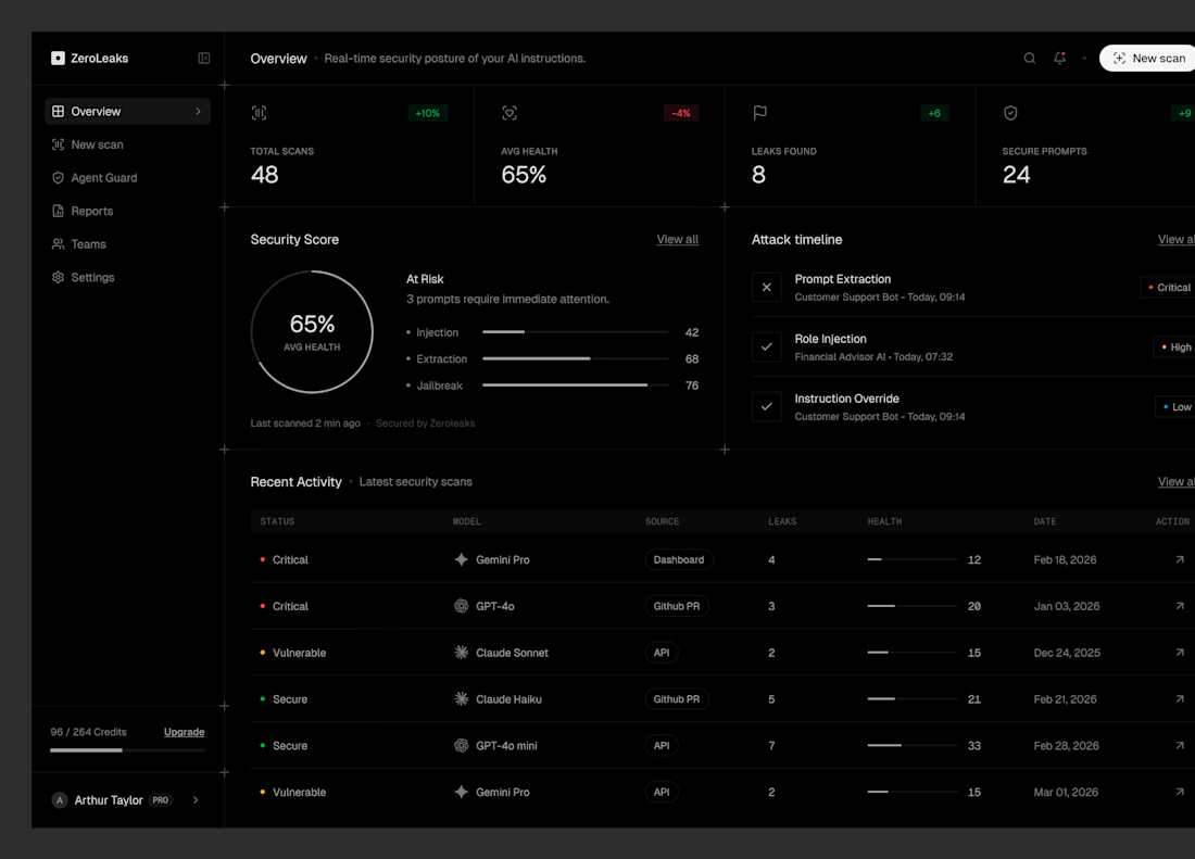


would actually use this lol. the customizable part is what runners care about

Chauffly | Product Design
As the Product Designer on Chauffly, I worked on designing the user experience and interface for a premium chauffeur and ride-booking platform.
My design work focused on the Super Admin dashboard and the customer-facing booking experience. For the Super Admin dashboard, I designed interface concepts for payment and transaction monitoring, corporate account management, event bookings, system settings, and platform-wide passenger and driver analytics.
I also explored the customer booking flow, including instant and scheduled rides, vehicle category selection, and the post-booking experience.
My focus was on structuring complex information into clear, intuitive interfaces, establishing effective navigation, and designing data-rich dashboards that support operational visibility and decision-making.
Role: Product Designer
Responsibilities: UI/UX Design, Dashboard Design, User Flows, Information Architecture, React UI Prototyping
Tools: Figma, React UI Prototyping, ChatGPT
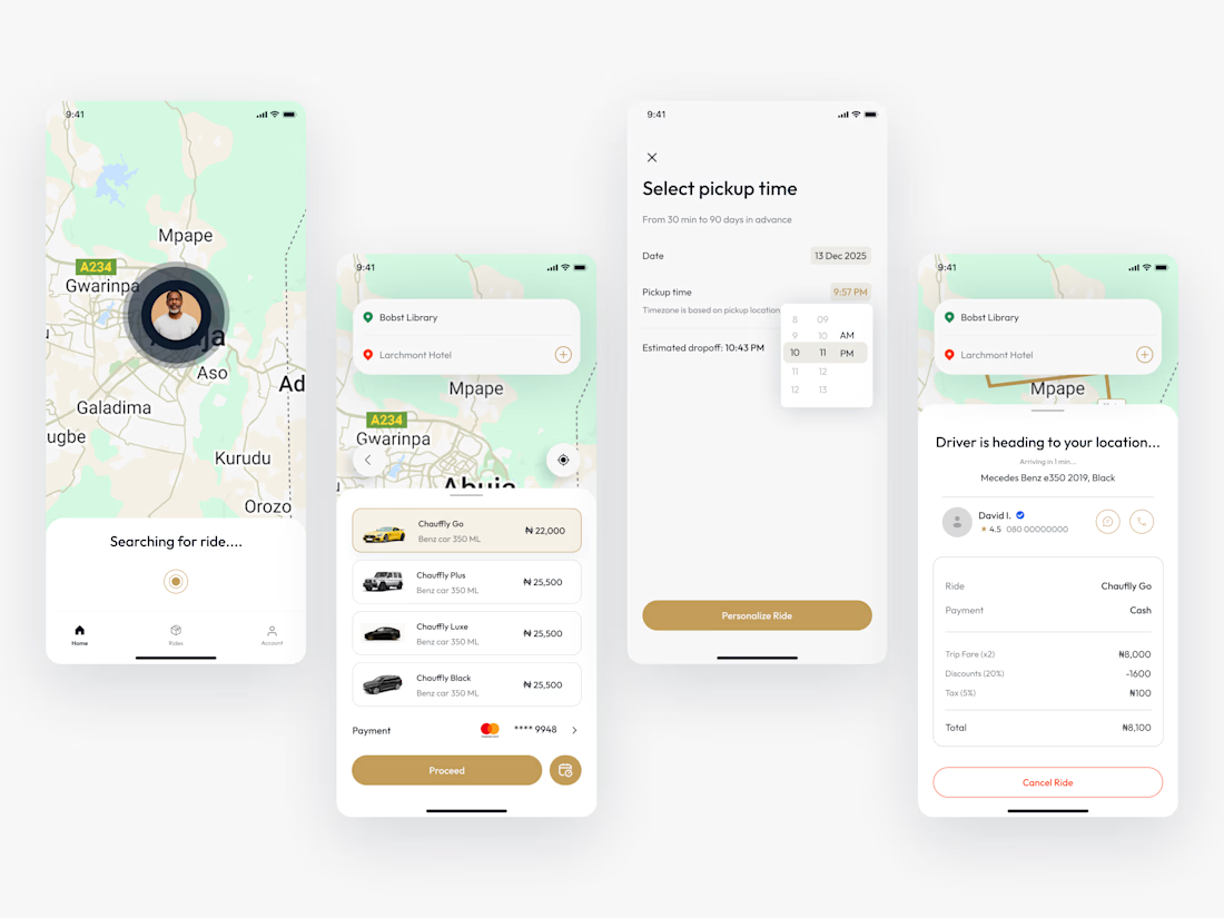

Designing dashboards for both corporate account management and real time transaction monitoring is tricky because those users need very different levels of detail. I’d be curious how you handled the navigation to keep the interface from becoming overwhelming for admins switching between these distinct tasks.