The network for creativity
Join 1.25M professional creatives like you
Connect with clients, get discovered, and run your business 100% commission-free
Creatives on Contra have earned over $150M and we are just getting started
Back to feedPost
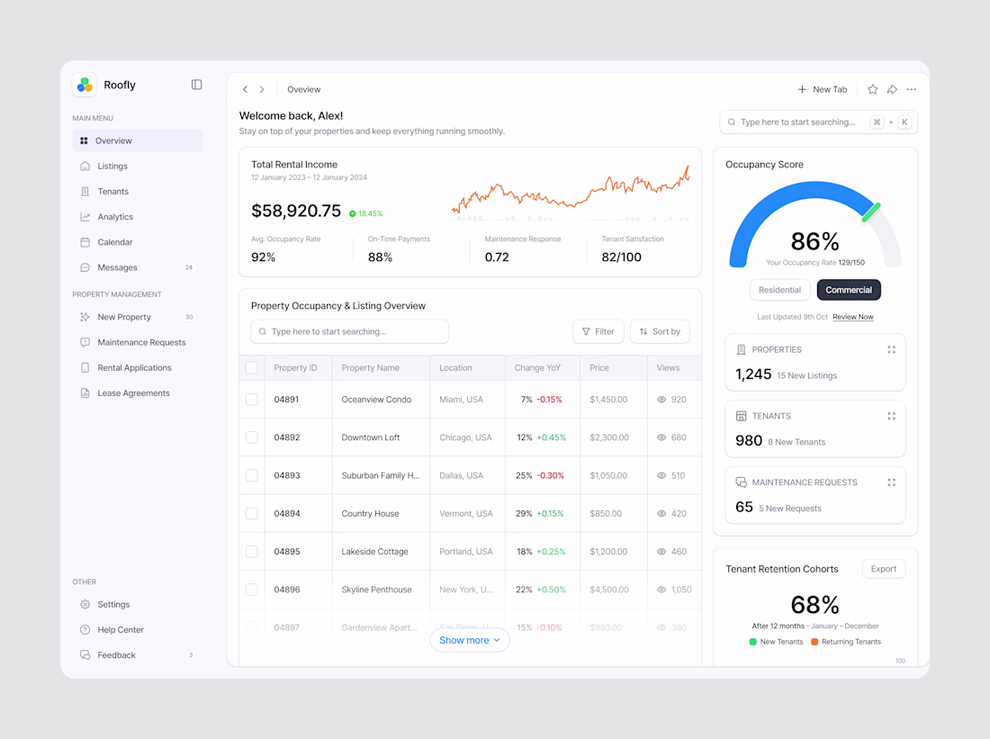
Clean & Intuitive Dashboard Design for Better Decisions
This dashboard was designed with a focus on clarity, usability, and speed, helping users understand data quickly and take action without friction.
A clean layout, clear visual hierarchy, and consistent spacing ensure users can navigate the dashboard effortlessly — even when managing complex data.
Why this dashboard works:
Neat, minimal UI reduces cognitive load
Clear data grouping improves readability
Consistent components create a smooth user flow
Responsive layout works across devices
Result:
A modern, easy-to-use dashboard that improves productivity, reduces user confusion, and helps teams make faster, more confident decisions.
The network for creativity
Join 1.25M professional creatives like you
Connect with clients, get discovered, and run your business 100% commission-free
Creatives on Contra have earned over $150M and we are just getting started
Trending
Claude
Claude has entered the design space. How are you using Claude Design?
Contra University
Learn from expert creatives how to earn more using next-gen AI tools.
fifaworldcup2026
The World Cup is here and the whole world's watching. How are you designing for the world stage?
creativeaiflow
Creative AI workflows are evolving. What tools do you use, and what are their strengths and weaknesses?
freelancerlife
Freelancer life is wins, pivots, and everything in between. What’s yours right now?