The network for creativity
Join 1.25M professional creatives like you
Connect with clients, get discovered, and run your business 100% commission-free
Creatives on Contra have earned over $150M and we are just getting started
Back to feedPost


The network for creativity
Join 1.25M professional creatives like you
Connect with clients, get discovered, and run your business 100% commission-free
Creatives on Contra have earned over $150M and we are just getting started





Related posts

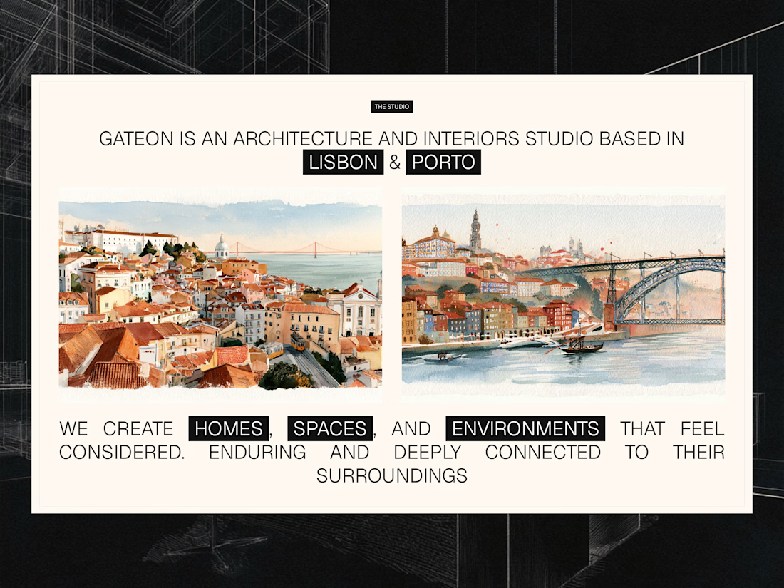
Studio section for Gateon, a interior design and architecture studio with bases in Lisbon and Porto



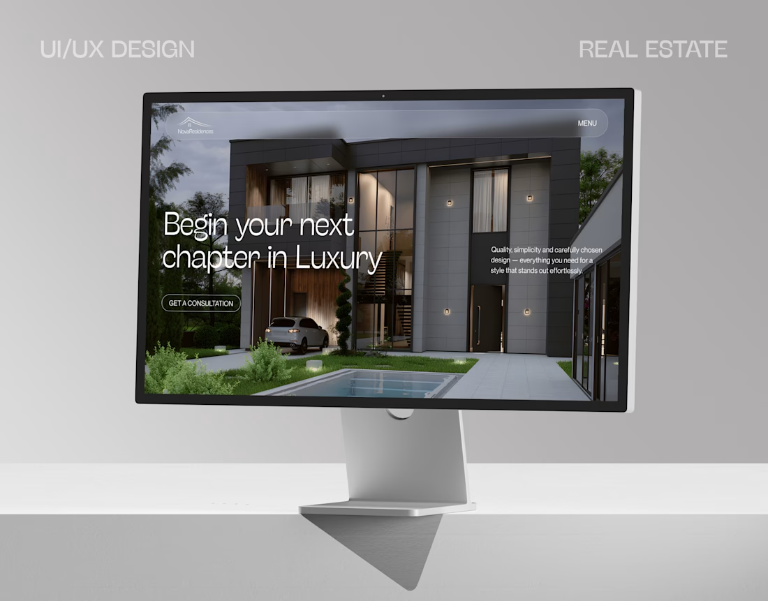
Nova Residences — Real Estate Website Concept
A modern UI/UX concept created for a premium real estate brand, focused on strong visual hierarchy, elegant typography and an immersive first impression.
The goal was to create a clean and sophisticated experience where the properties remain the main focus, while keeping the interface simple and easy to navigate.
Designed with a focus on:
Premium visual direction
Clear hierarchy & CTA placement
Minimal and modern UI
Strong hero section
Real estate-focused user experience Designed in Figma. Open to UI/UX Design, Web Design, Webflow & Framer projects.



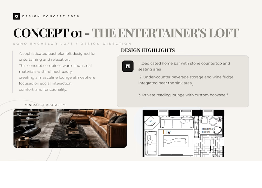
Soho Bachelor Loft – Interior Design & Furniture Concepts
Project description. Developed three interior design concepts for a Soho-style bachelor loft, including space planning, furniture layouts, furniture selection, pricing, quantities, material palettes, lighting direction, and itemized procurement budgets. I researched and selected the furniture and décor pieces, verified pricing from Canadian retailers, and organized clickable product links for client presentation while maintaining the existing architectural layout and structural elements.
Skills and deliverables