The network for creativity
Join 1.25M professional creatives like you
Connect with clients, get discovered, and run your business 100% commission-free
Creatives on Contra have earned over $150M and we are just getting started
Back to feedPost

What do you think about this sign up interaction, here we have the basic and the guided setup.
A or B?
#UI
The network for creativity
Join 1.25M professional creatives like you
Connect with clients, get discovered, and run your business 100% commission-free
Creatives on Contra have earned over $150M and we are just getting started











Related posts

Poster Club turns a simple event template into your own print. I built two working Flutter versions and recorded the same editing flow in each.
Print Room: calm, editorial, with a mounted canvas and bottom tools.
Cutout Playground: bold, playful, with loose prints and tools at the edge.
Which one would you rather use?
What made the difference?
Grab it for free:
https://contra.com/products/cUHBysMu-poster-club-free-flutter-ab-ui-kit


37 voted
60%
25 voted
40%
62 votes
Closed

Print Room looks great!!

Accidentally made app navigation look more satisfying than the actual music!😍
16 seconds of spatial audio, smooth transitions, and tactile UI motion. Testing how far you can stretch digital minimalism✨
Feedback and love from the design community are always appreciated🙌
UI DesignmotiongraphicsmobileappdesignuiuxdesignMotion DesignUX DesignAdobe After EffectsCinema 4DFigma


This is so satisfying Raheel! 🔥 You nailed that tactile UI motion - 16 seconds but it feels so premium! The spatial audio card with that depth + smooth transition from Home to Made for Spatial Audio is chef's kiss. Minimalism stretched perfectly without losing the Apple Music...

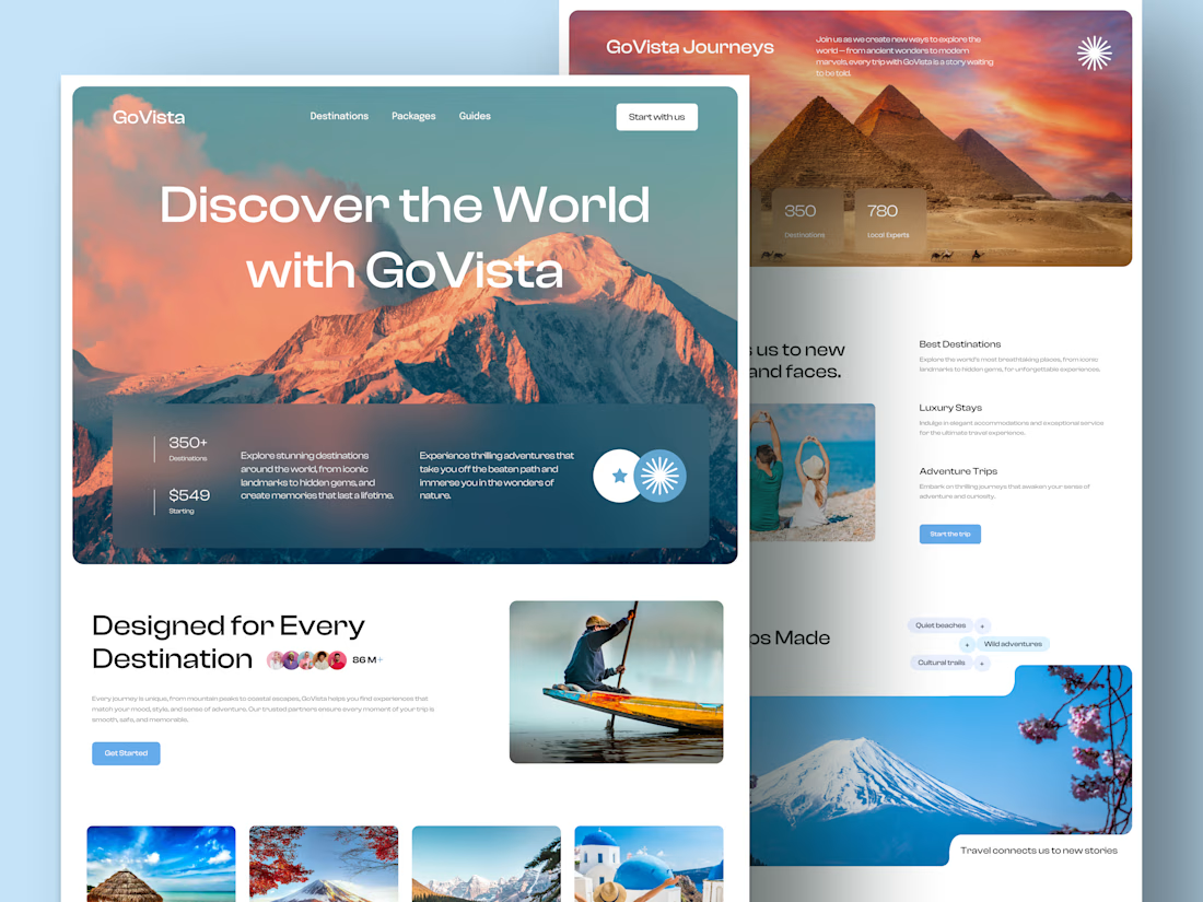
GoVista Journeys - A travel landing page designed to make people dream of their next destination.
A travel company based in Leicester, UK, needed a visually engaging landing page to showcase its destinations and travel experiences while its larger website was being prepared.
The goal was simple: make a strong first impression through beautiful travel imagery, a clean layout, and a design that makes people want to explore more.
Because in travel, the journey can begin long before the booking. ✈️
What catches your attention first on a travel website: the images, the destinations, or the overall design? 👇

I like this very much, very good concept