The network for creativity
Join 1.25M professional creatives like you
Connect with clients, get discovered, and run your business 100% commission-free
Creatives on Contra have earned over $150M and we are just getting started
Back to feedPost
Taste Test

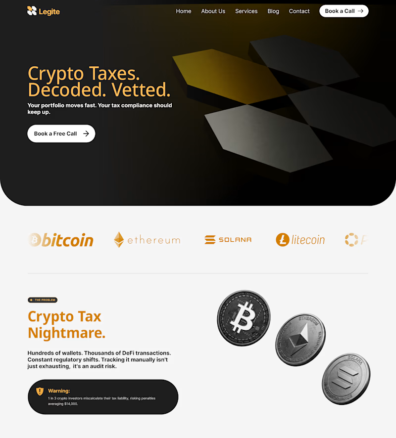
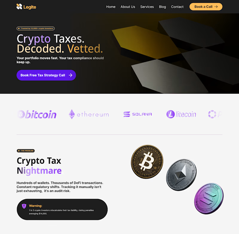
A Legal Crypto landing page, as someone who values white-space and high contrast, I'm stuck between these two.
Same content, different style approach, which to choose?


3 votes
Ends in 13h
The network for creativity
Join 1.25M professional creatives like you
Connect with clients, get discovered, and run your business 100% commission-free
Creatives on Contra have earned over $150M and we are just getting started

Challenges
View all


Related posts


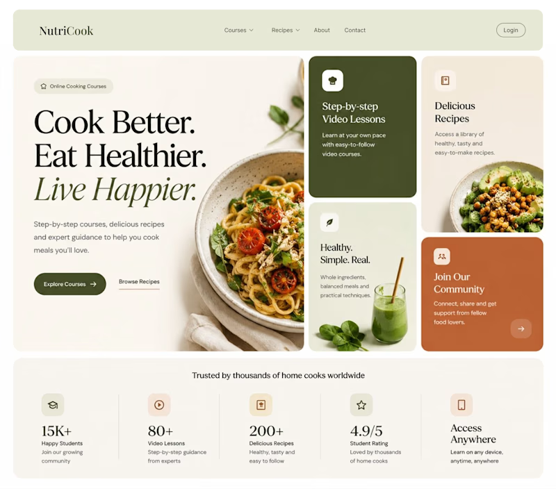
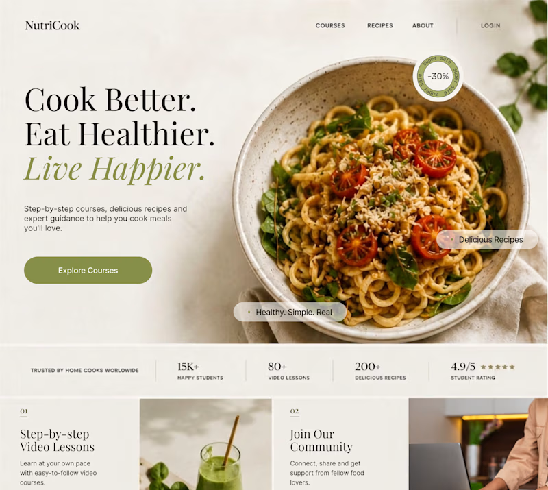
Same content. Two completely different vibes.
What happens when you keep the course content the same, but change the structure, typography, and color palette?
Two hero sections. One course. Two different visual experiences.
Which one would you choose? 1 or 2?
29 voted
41%
42 voted
59%
71 votes
Closed

Option 1 works well , the heirarchy and card layout on the hero is very smart

Which layout is better?
.
.
Curious which one wins? Follow along for more tests like this x.com/rightnextstep

20 voted
67%

10 voted
33%

30 votes
Closed
Hero 1 shows the hero text very well but you might need to work on the Hero CTA for "join the masterclass", I will probable miss it as a key action if I was a regular user

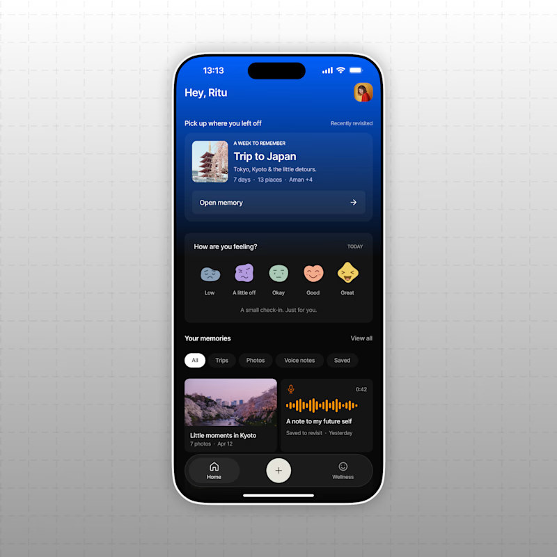
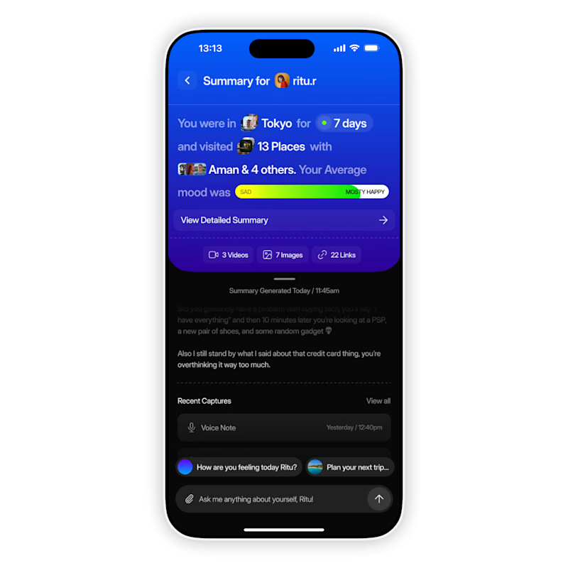
AI based memory rewinder app. Which design is better as Homescreen?
7 voted
88%
1 voted
12%
8 votes
Closed

The mood-capture direction feels more distinctive to me—the layered cards give the memory context real personality. I’d keep the summary drawer as a quick-glance fallback for returning users.