The network for creativity
Join 1.25M professional creatives like you
Connect with clients, get discovered, and run your business 100% commission-free
Creatives on Contra have earned over $150M and we are just getting started
Back to feedPost

Same email. Same list. 2 subject lines. 21 points of difference
1st version said what the email was about. 2nd made the reader feel they were already missing something. Same content inside. Completely different result.
Save this and check your last 5 subject lines. How many described the email instead of leaving a gap?
https://www.instagram.com/p/DdGqhmhidt3
#emailmarketing #subjectlines #openrate #emailcopy #evertherstudio

This is a great reminder. Subject lines really can change everything.
The network for creativity
Join 1.25M professional creatives like you
Connect with clients, get discovered, and run your business 100% commission-free
Creatives on Contra have earned over $150M and we are just getting started

Challenges
View all


Related posts
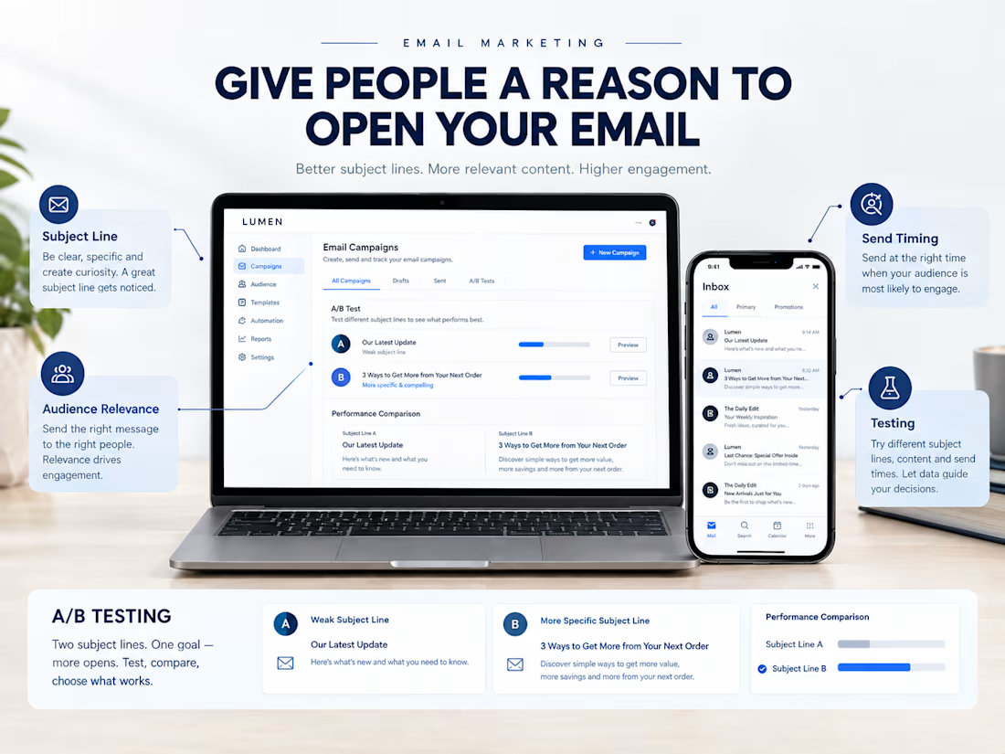
Your email might have a great offer, but if people don't open it, they may never see it.
Here are 4 things I pay attention to when planning an email campaign:
→ Subject line: Give people a clear reason to open.
→ Relevance: Make sure the email fits the audience.
→ Timing: Consider when your subscribers are most likely to engage.
→ Consistency: Build a predictable email experience without overwhelming people.
And don't forget to test different subject lines and review your results.
Sometimes, small improvements can make a difference.
Don't just focus on what your email says. Think about what makes someone want to open it.

Well said. Testing and understanding your audience can make email campaigns much more effective.

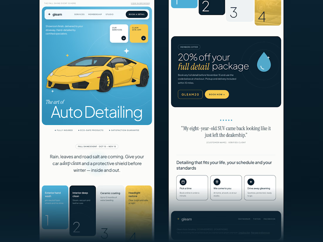
A little design experiment for a premium auto detailing brand
I wanted to bring a fresh, editorial feel to an industry that often leans on the same visual clichés. Clean layouts, bold typography, and a pop of sunshine yellow.
Now I’m curious: what’s the first thing that catches your eye? The color palette, the typography, or the overall layout? I’d love to hear your thoughts!
#ui #ux #uiux #emailmarketing #email


Words first or product first, which opening would you keep?
Same concept app, same brand, two different first seconds.
A opens on a bold question in big type. B drops you straight into the app planning a week.
We built six openings for one launch and these two are the furthest apart.
Which one stops your thumb?
https://contra.com/p/7XmrRUrA
https://givemeprompts.com

3 voted
60%
2 voted
40%
5 votes
Closed

Love A! ❤️