The network for creativity
Join 1.25M professional creatives like you
Connect with clients, get discovered, and run your business 100% commission-free
Creatives on Contra have earned over $150M and we are just getting started
Back to feedPost

What do you think about my dentist booking app? Any feedback is welcome :)
Website and booking: https://calmio-dental-care.lovable.app
Reception app: https://calmio-dental-care.lovable.app/admin (username admin, password admin)
@Lovable #lovablechallenge
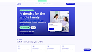
calmio-dental-care.lovable.app
Calmio Dental — A dentist for the whole family
Modern family dental care at two Bratislava clinics, bookable online in 2 minutes.

really like the sticky book button on mobile, and prices right on the service cards is a big trust thing for a dentist. one thing I noticed on phone: the "ask calmio" chat bubble sits right on top of the "book online in 2 minutes" line, so the best selling point gets covered
what changed the most out of everything? I always wonder if it's the layout or just finally telling people clearly what to do next

Really polished. The "Toothache? Same-day emergency slots" card is a great touch, it catches the highest-intent visitors right away. Two ideas from building a booking platform myself (Mahogo, live lesson booking): show the earliest open slot across both branches on the first...
The network for creativity
Join 1.25M professional creatives like you
Connect with clients, get discovered, and run your business 100% commission-free
Creatives on Contra have earned over $150M and we are just getting started





Related posts

Designed two versions of the Dermoscan website. Same product, two languages, same layout adapted for each market.
A — English version, clean and clinical
B — French version, same structure localized for a European audience
Curious from a design perspective: does anything feel off between the two, or does the layout hold up across both? 👇
4 voted
67%

2 voted
33%

6 votes
Closed
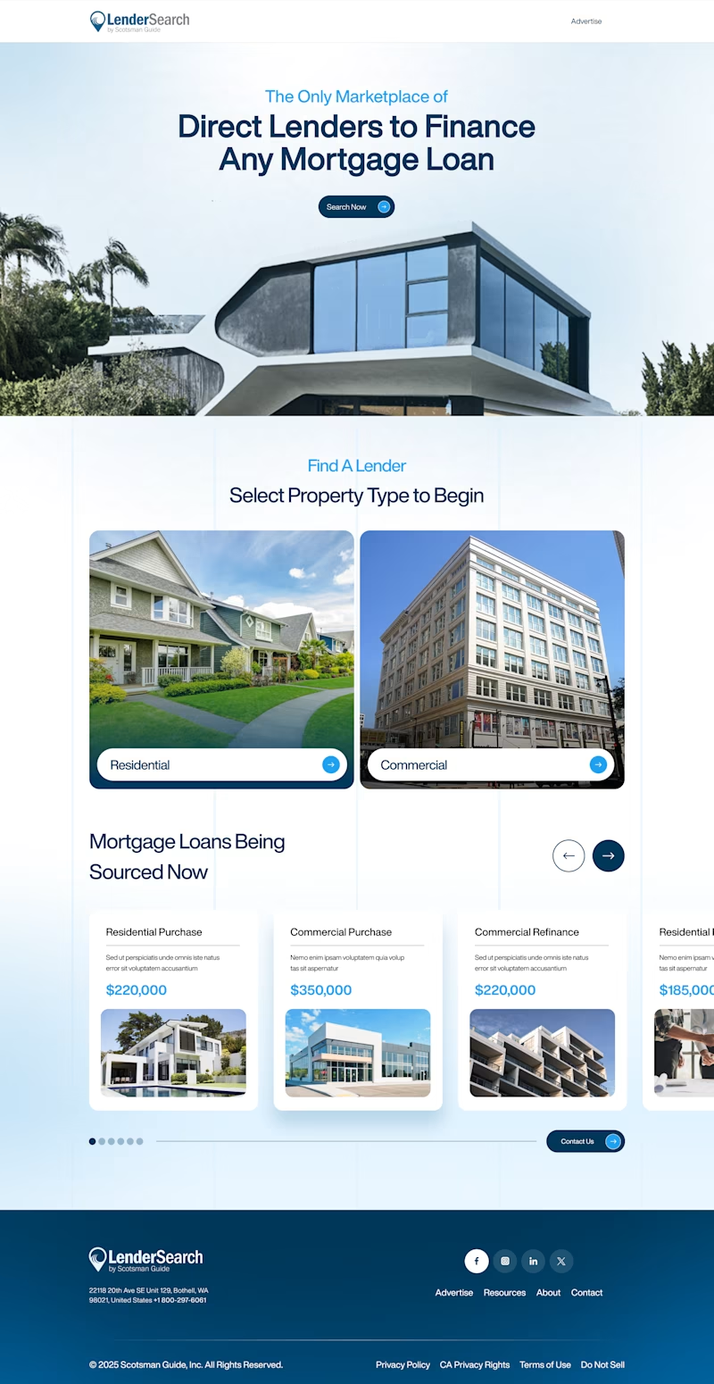
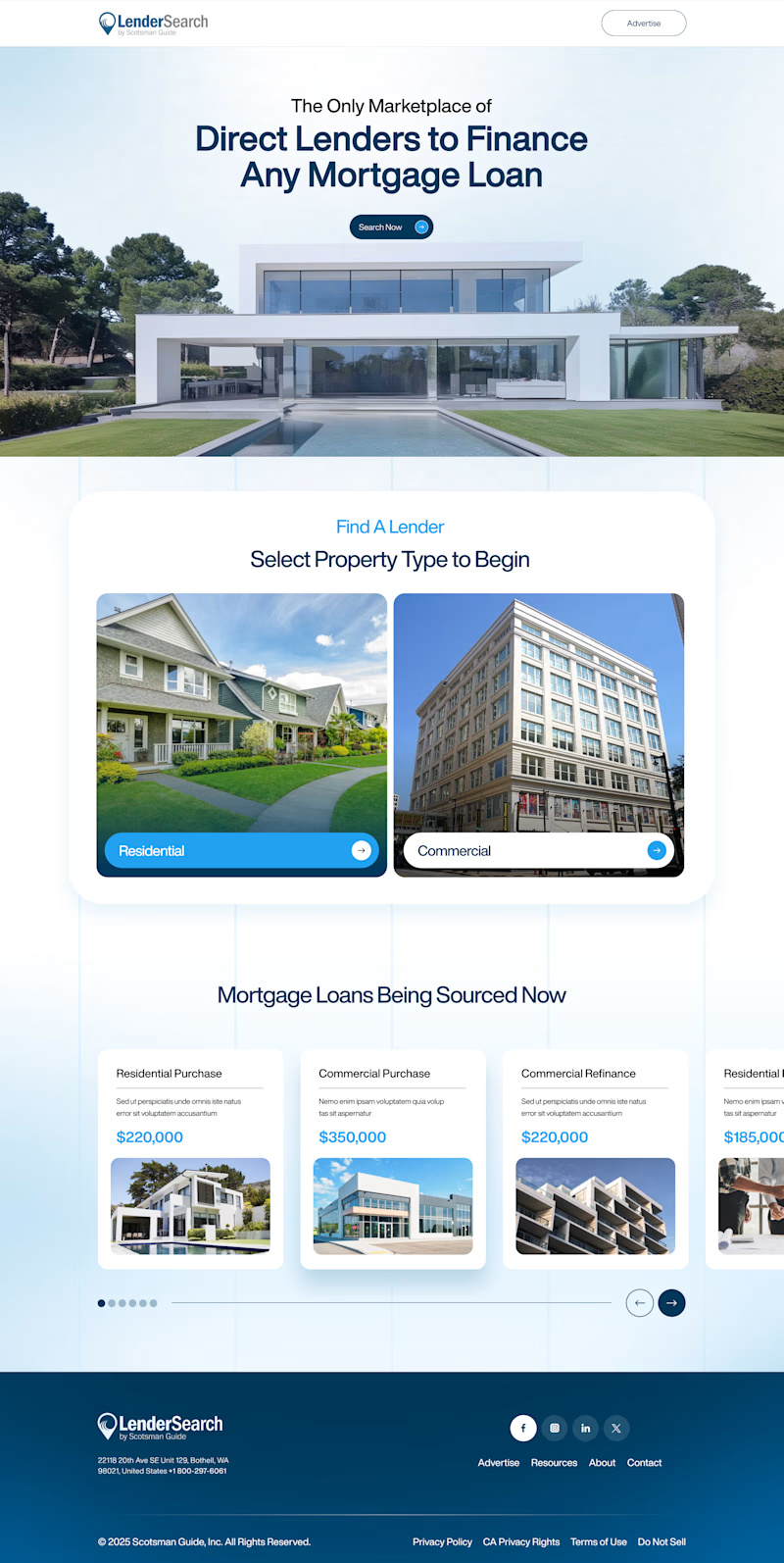
Two layout directions for LenderSearch, a mortgage marketplace by Scotsman Guide.
A: centered hero text, full-width property image, content sits in a lifted white card
B: hero image bleeds into the content section, layout feels more connected and continuous
Same product, different flow. Which one feels easier to trust with a mortgage decision? 👇
7 voted
47%
8 voted
53%
15 votes
Closed

Ceya Website Design & Development, 2025.
Ceya’s identity getting featured here, the website is now live in my portfolio too. 🟢 Same brand, next chapter: eight IT services in one clear structure, with green saved only for action.
Full case study 👉 https://serkanhursgunel.com


Stellar work!