The network for creativity
Join 1.25M professional creatives like you
Connect with clients, get discovered, and run your business 100% commission-free
Creatives on Contra have earned over $150M and we are just getting started
Back to feedPost

Designed and built this website for a legal service and property business using wordpress.
I focused on creating a clean, premium, and user-friendly experience that brings their legal and property services together in one place.
Built with attention to both design and functionality.


The network for creativity
Join 1.25M professional creatives like you
Connect with clients, get discovered, and run your business 100% commission-free
Creatives on Contra have earned over $150M and we are just getting started

Challenges
View all


Related posts

Working on the homepage for Still Blooming, a wedding and floral studio, I explored two different layout directions for the hero section. Same brand, same copy, just a different structure and visual rhythm.
Option 1 : Left Aligned. Text sits on the left with supporting content beside it, giving an editorial, asymmetrical feel.
Option 2 : Centered. Everything is stacked and centered, giving a clean, balanced, more classic hero layout.
Would love your honest UX/UI take which direction feels more elegant, functional, and true to a wedding/floral brand, and why?
22 voted
41%
32 voted
59%
54 votes
Closed

Great Design :)

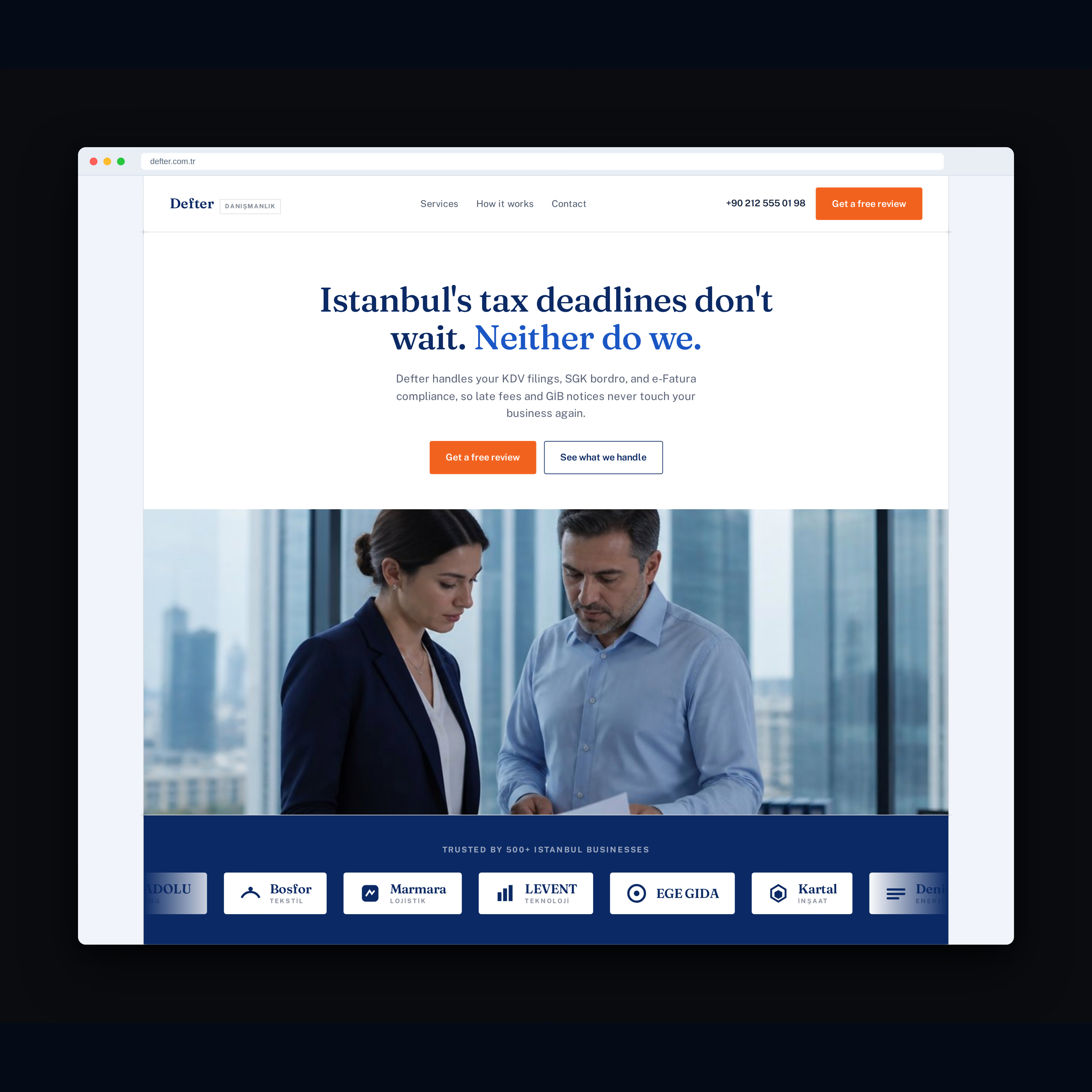
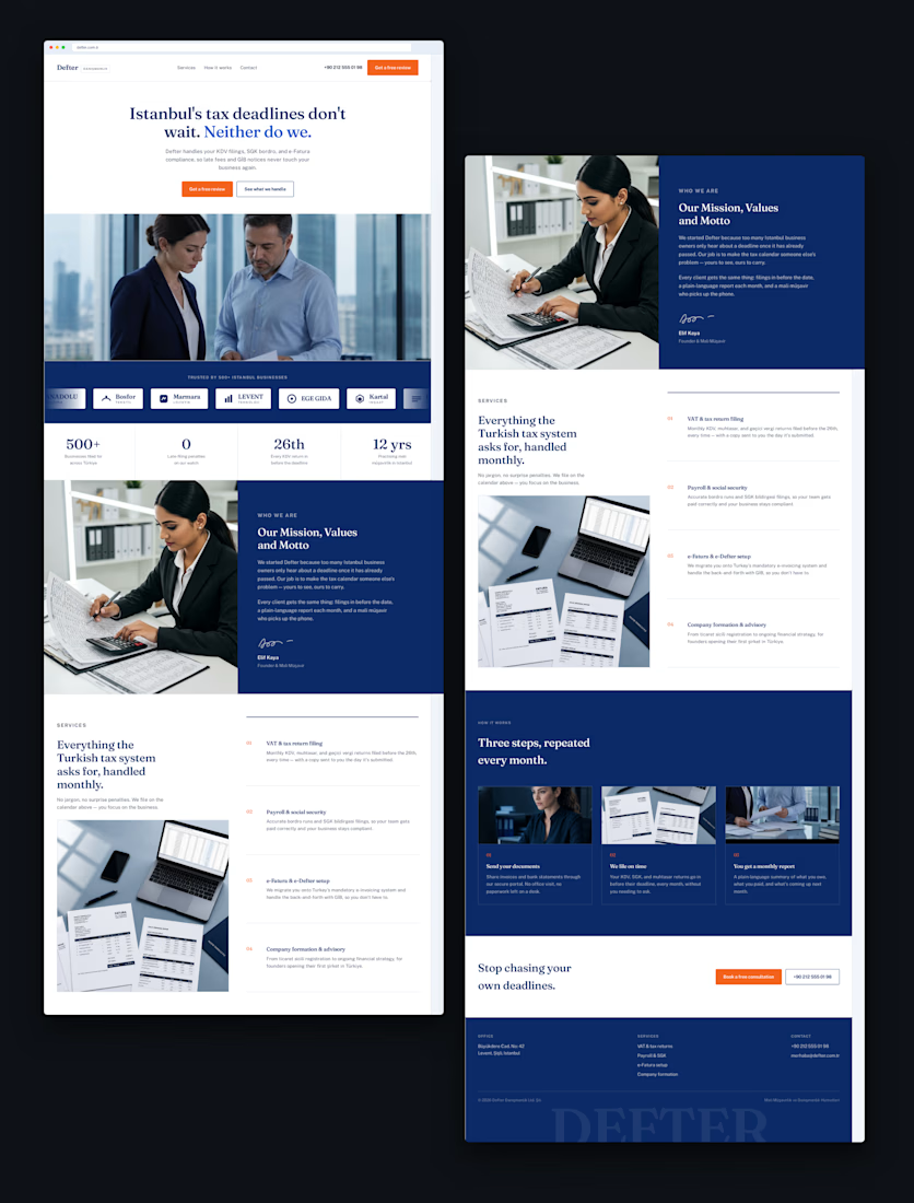
Recent work for Defter, an accounting firm in Istanbul.
The goal was simple: take a traditionally serious industry and create a website that feels modern, trustworthy, and premium.
Clean typography, strong visual hierarchy, and a bold navy + orange identity.
What do you think of the final design?

Looks good!

New Framer website is live now!!
Feel it here: https://realestatebeta.framer.ai/


It grabs my attention....Specially I love the header most!