The network for creativity
Join 1.25M professional creatives like you
Connect with clients, get discovered, and run your business 100% commission-free
Creatives on Contra have earned over $150M and we are just getting started
Back to feedPost

Transforming "Little Learners EDEC" into a Trusted Early Education Brand through Cohesive Visual Identity.
The Client & The Challenge
The Challenge
Little Learners EDEC needed a fresh visual identity to attract parents. Their existing branding felt outdated and lacked a professional yet playful feel required for an early learning centre.
The Solution
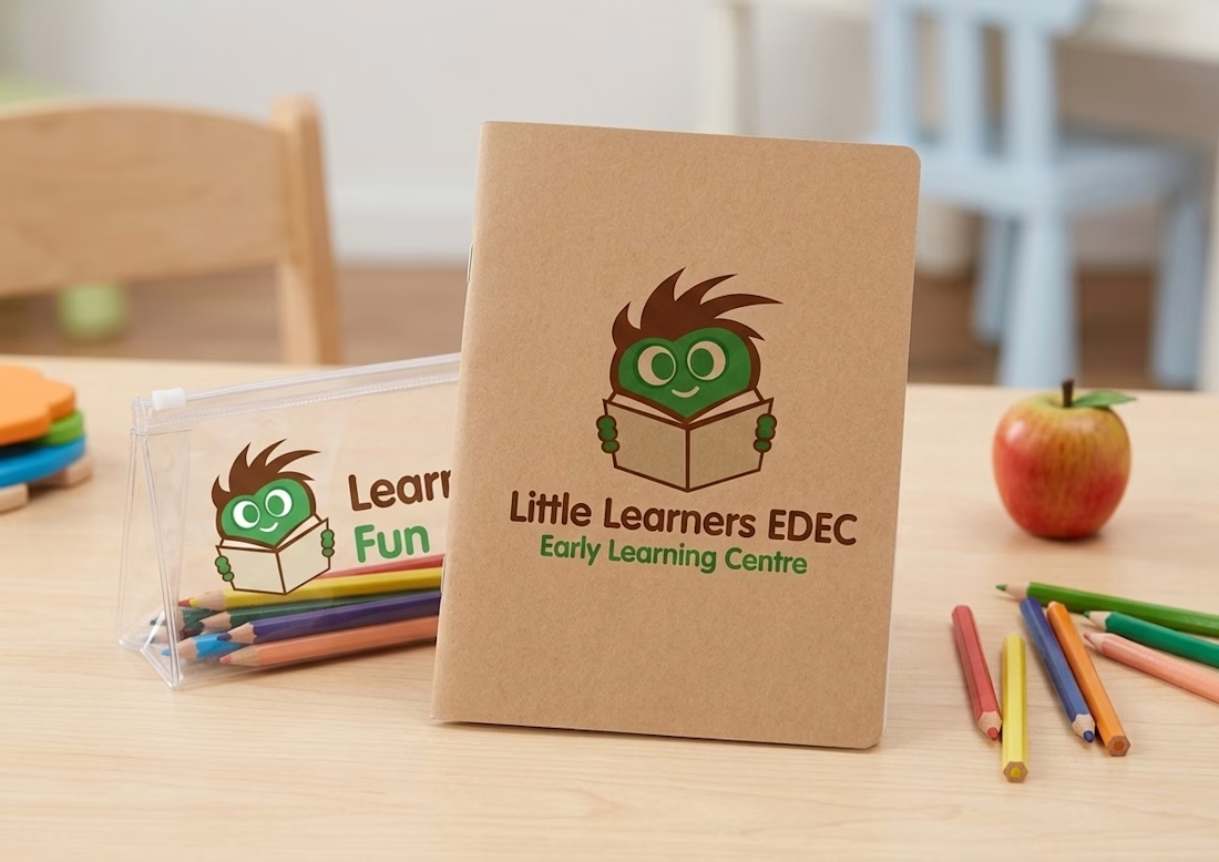
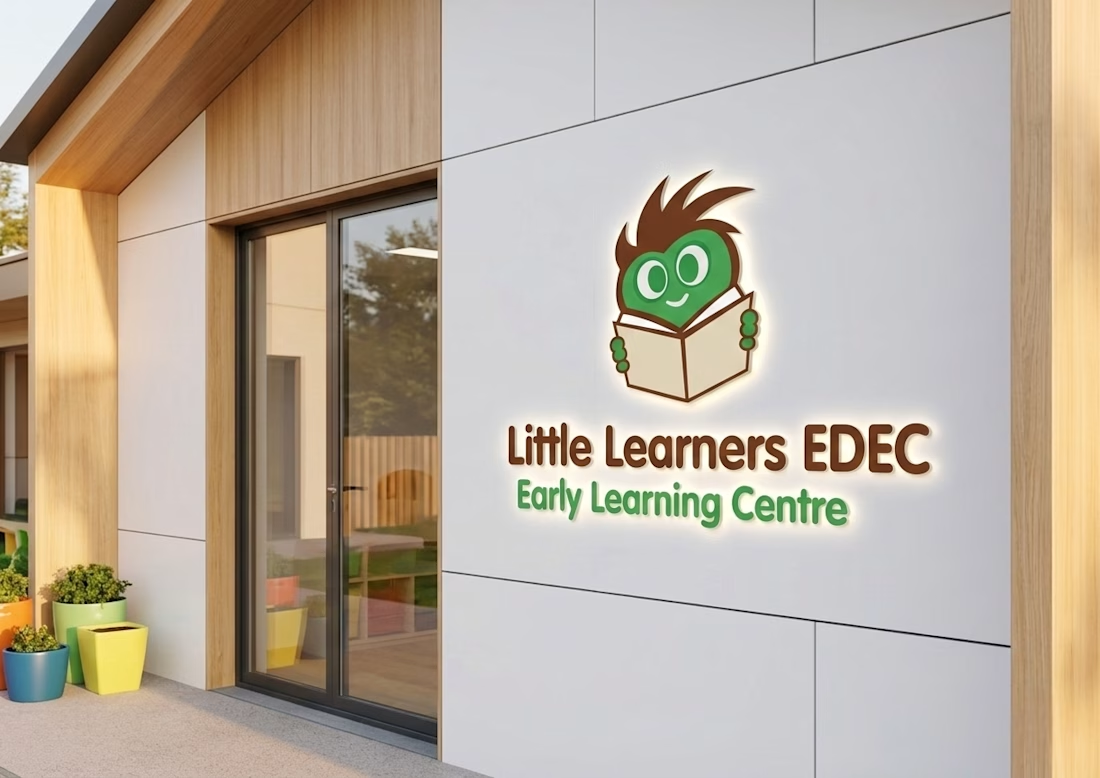
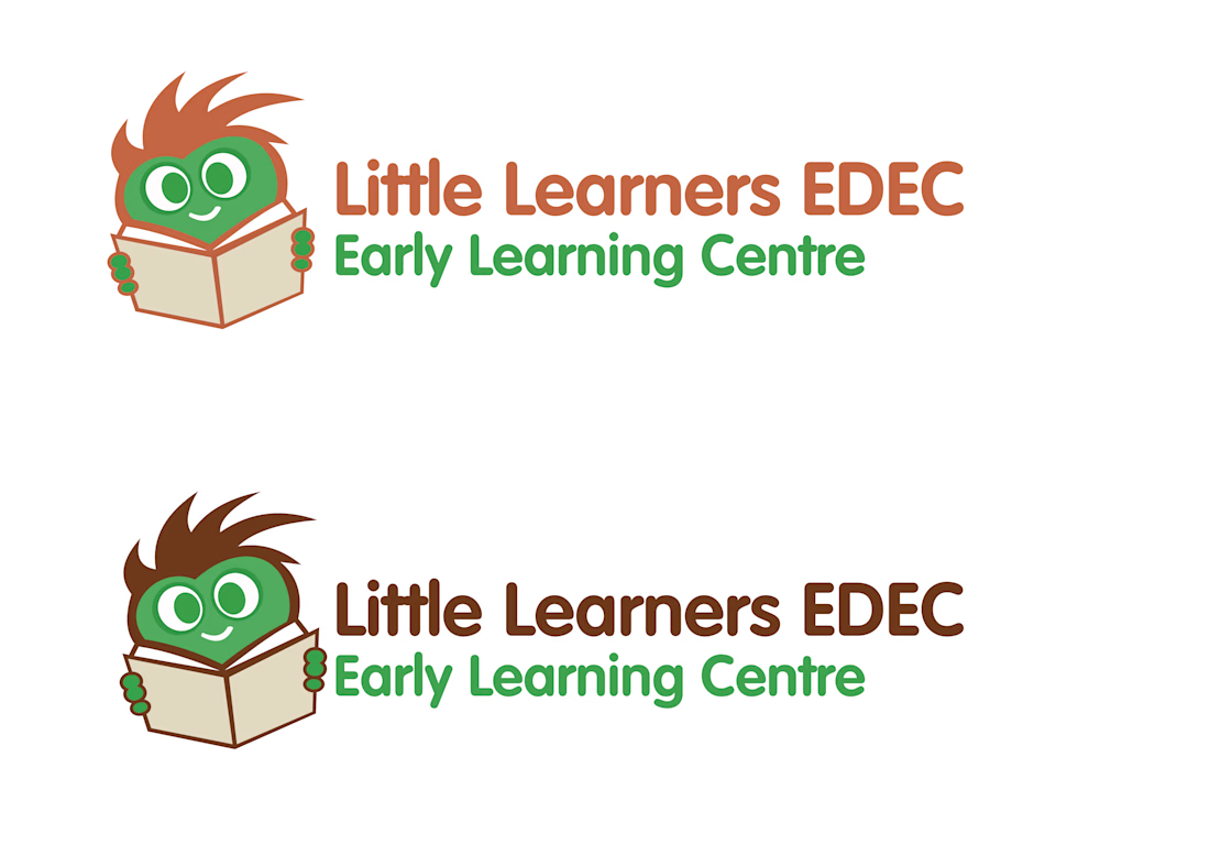
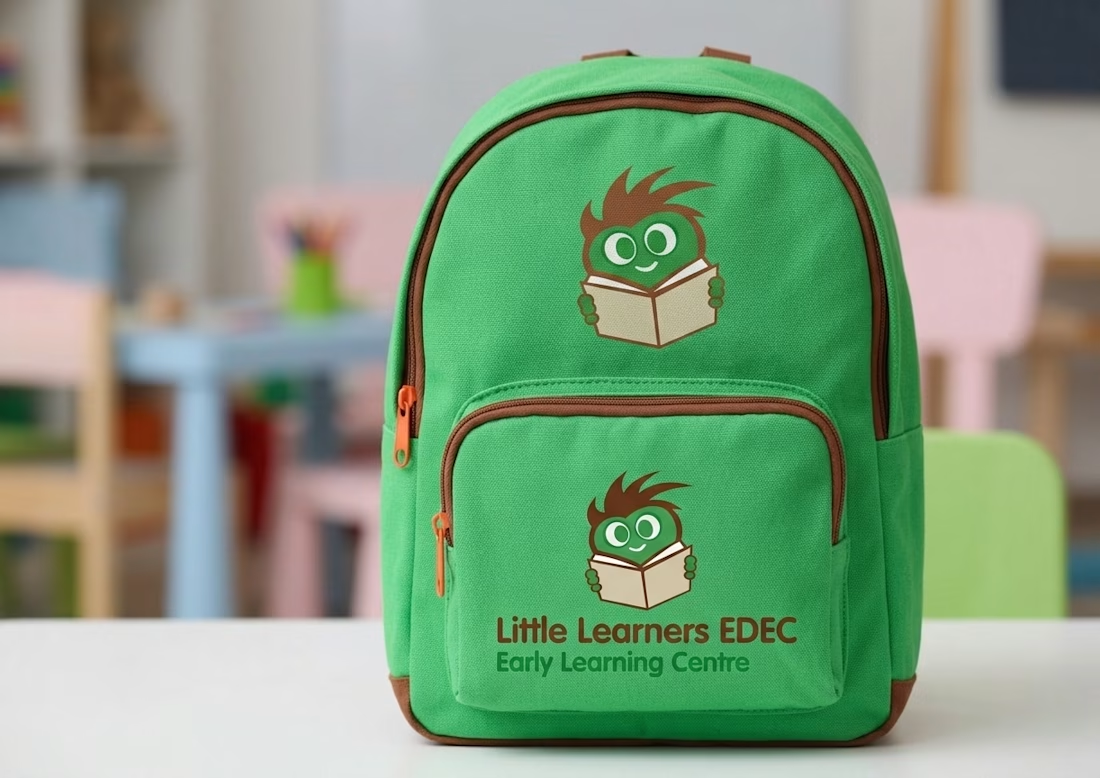
I developed a custom mascot logo (see my sketching process) featuring a cheerful, studious character. I used a vibrant green and orange palette to evoke growth and energy. To show real-world impact, I applied the branding to merchandise like backpacks and stationery.
The Result
The new identity gave the brand a cohesive, trustworthy face. The client reported improved brand recognition and a professional edge over local competitors.


The network for creativity
Join 1.25M professional creatives like you
Connect with clients, get discovered, and run your business 100% commission-free
Creatives on Contra have earned over $150M and we are just getting started





Related posts

AMSW — Brand Art Direction & Visual Identity
A visual direction developed for AMSW, combining premium sportswear with a dark, minimal, and performance-driven aesthetic.



Great.

Logo I’m working on.
feather + knife



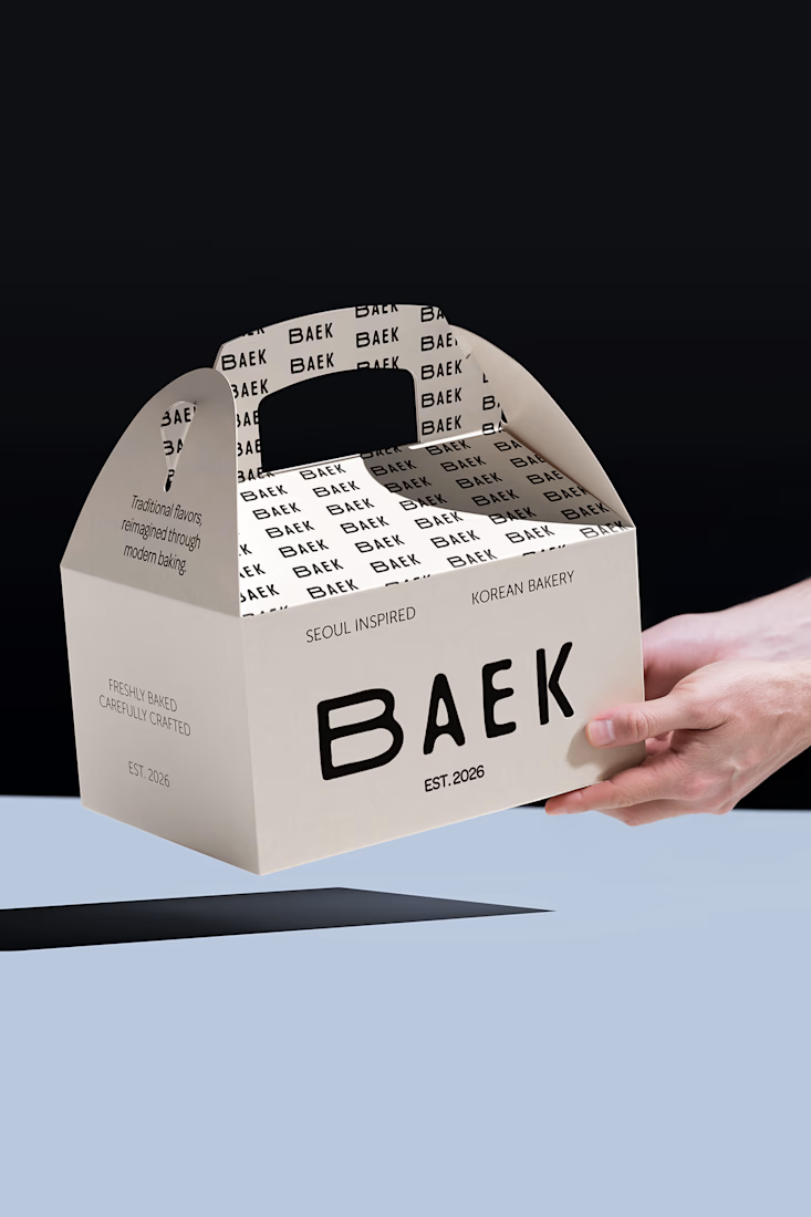
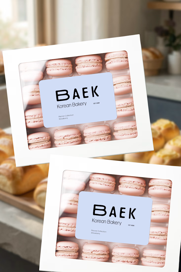
BAEK is a visual identity concept for a modern Korean-inspired bakery, designed around a soft, playful, and contemporary visual language.
I developed the brand identity from the initial concept into a cohesive visual system, including the logo, typography, color palette, graphic elements, and branded applications.
Scope: Brand Identity · Logo Design · Visual Identity · Art Direction · Brand Applications