The network for creativity
Join 1.25M professional creatives like you
Connect with clients, get discovered, and run your business 100% commission-free
Creatives on Contra have earned over $150M and we are just getting started
Back to feedPost

Paw & Care — From “I need an appointment” to “You’re booked.” 🐾
I built a complete booking experience for a boutique dog grooming studio where the goal wasn’t just to make the website look good — it was to remove the appointment back-and-forth for a solo business owner.
Customers can:
• Explore grooming services
• See real-time availability
• Choose a date & time
• Add their dog’s details
• Pay securely online
• Get instant booking confirmation
Behind the scenes, the owner gets an admin dashboard for appointments, availability, services, revenue, blocked dates, and cancellations/refunds.
The result is a self-service booking flow that turns a customer inquiry into a confirmed, paid appointment without the owner manually coordinating every step.
Designed and built with a calm, premium visual system, responsive interactions, and a strong focus on reducing friction.
Website: https://paw-and-care.lovable.app/
#LovableChallenge #ProductDesign #UXDesign #WebDesign #SaaS


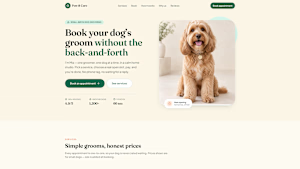
paw-and-care.lovable.app
Paw & Care — Book your dog’s groom online
Independent dog grooming studio. Pick a service, choose a real open slot, pay online and get instant confirmation — no phone calls, no waiting for a reply.
The network for creativity
Join 1.25M professional creatives like you
Connect with clients, get discovered, and run your business 100% commission-free
Creatives on Contra have earned over $150M and we are just getting started


Related posts

EchoMind is live on the Framer Marketplace.
It’s a calm, editorial shop template for brands that make physical things: hardware, objects, small product lines. I designed the brand, generated the product photography and built every page in Framer.
What’s inside:
20 pages, each designed for desktop, tablet and phone
CMS-driven shop with working price sort
Product pages with gallery, specs and FAQs
A build-your-own configurator with live pricing
A bag with quantities and discount codes
Journal with hover image previews
Launch, studio, support and gift card pages
The product itself is fictional: a modular mixing desk where one core listens to your mix and suggests one fix at a time. I wanted the template to feel like a real brand from day one, so it’s been built and photographed like one.
Get the template: https://www.framer.com/marketplace/templates/echomind/


Congrats on the launch, Jonathan. Designing the brand, the photography and every page yourself gives it a clear voice. What was the hardest part of building a shop template in Framer?

Back with another landing page redesign, Round 03

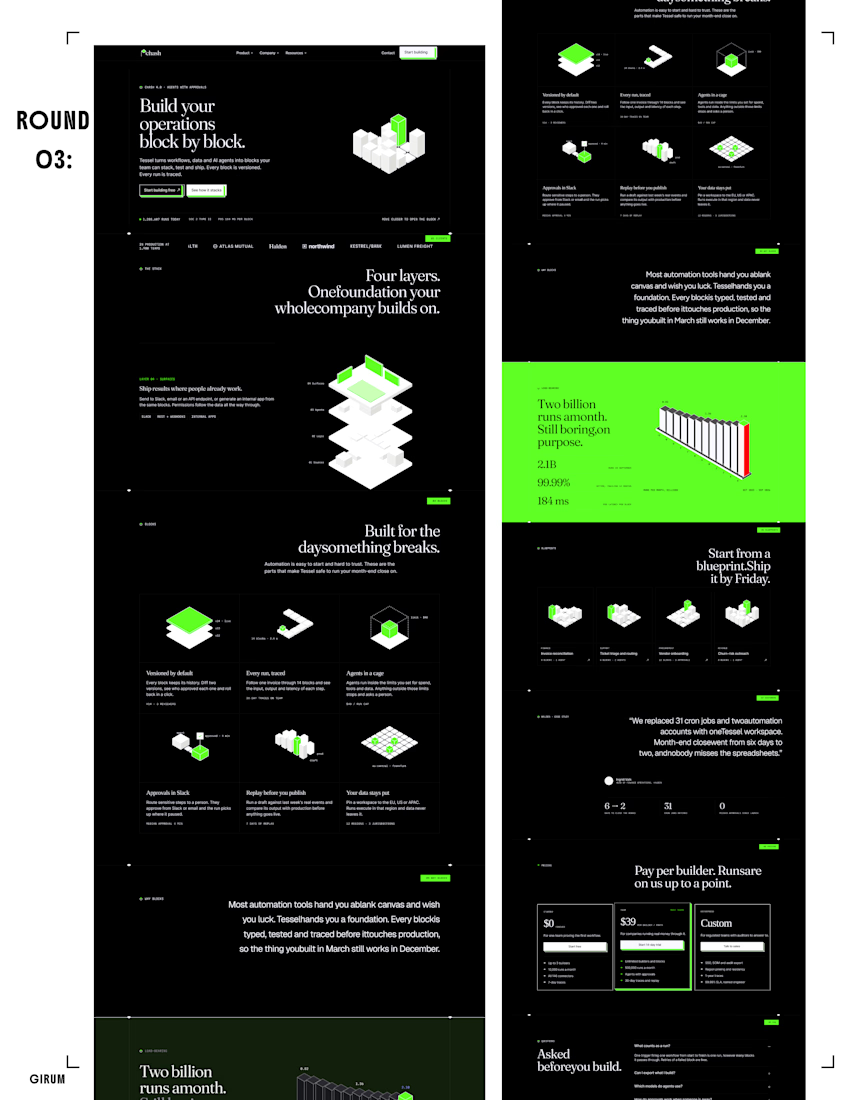

That full-width neon green band is a great scroll break against the black, and the isometric blocks fit the "block by block" headline. What changed the most since Round 01?

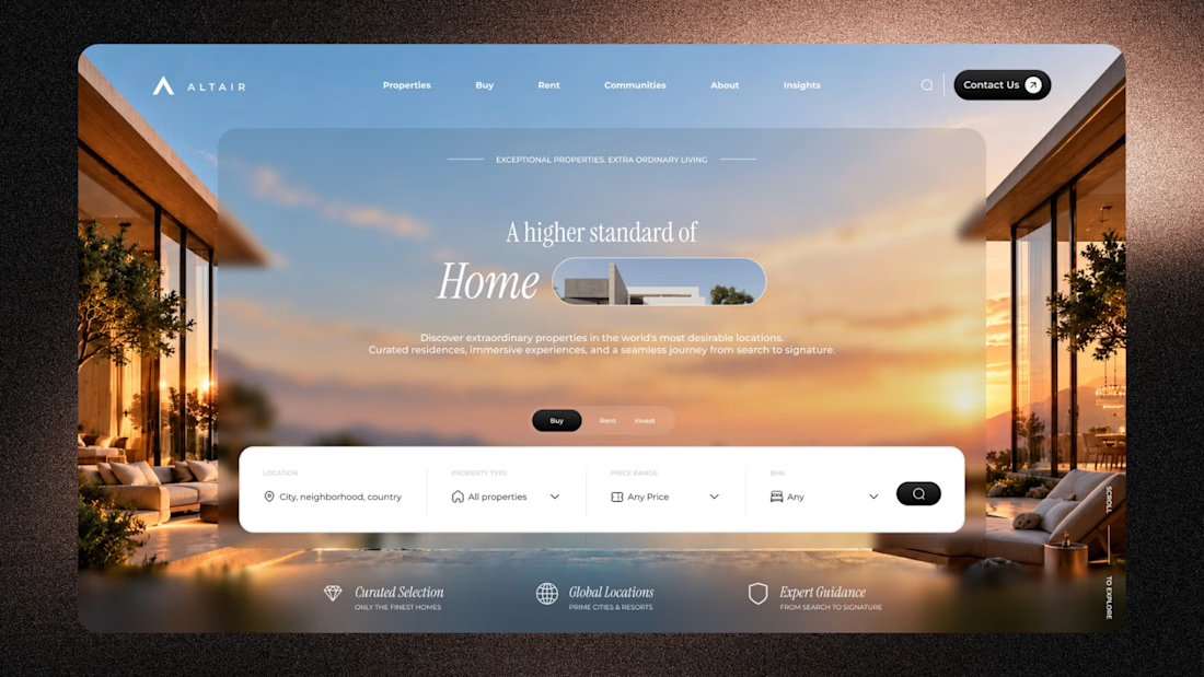
ALTAIR - Luxury Real Estate Website Design & UI/UX
A premium real estate website concept combining cinematic architecture, refined typography, and intuitive property discovery.
Designed to make property exploration feel effortless, immersive, and exceptional.
Designed by The DA Designs.

Beautiful art direction.