The network for creativity
Join 1.25M professional creatives like you
Connect with clients, get discovered, and run your business 100% commission-free
Creatives on Contra have earned over $150M and we are just getting started
Back to feedPost


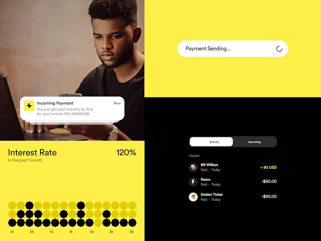
Mime® — Website UI
—
A quick breakdown of the grid contrast. The aggressive canary yellow backdrop provides immediate visual anchor points, letting the rounded white action pills pop naturally without relying on complex shadows or unnecessary gradient fills.
—
Credit - SquidX Agency
—
Case-study link in comment💬
The network for creativity
Join 1.25M professional creatives like you
Connect with clients, get discovered, and run your business 100% commission-free
Creatives on Contra have earned over $150M and we are just getting started











Related posts

Squarespace Website Design, Development & Redesign
Looking for a professional Squarespace website that reflects your brand, communicates your services clearly, and makes it easier for visitors to take action?
I specialize in Squarespace website design, development, and redesign, helping businesses establish a strong online presence through visually appealing, user-friendly, and responsive websites.
From building a new website to improving an existing one, I focus on clean layouts, intuitive navigation, mobile responsiveness, and clear calls to action that guide visitors toward the next step.
Services I Offer:
Squarespace 7.1 Website Design & Development
Squarespace Website Redesign and Customization
Responsive and Mobile-Friendly Design
Landing Page Design
Service Pages and Contact Form Integration
Website Navigation and User Experience Optimization
Custom Styling and Squarespace Fluid Engine Layouts
Basic On-Page SEO Structure
Whether you are a consultant, coach, entrepreneur, or service-based business, I can help create a Squarespace website that aligns with your brand identity and business goals.
Let's build a website that presents your business professionally and gives your audience a clear reason to take the next step.




The lime and purple pairing with the mono type works nicely for Remotlin.

A landing page should continue the conversation started by the ad.
For Corpus, a Pilates and physiotherapy studio, I designed campaign-specific entry points. Pilates, physiotherapy and RPG each needed a relevant starting point, while sharing one visual system.
The page keeps the brand’s warm, editorial character through typography, photography and movement. Clear service information and WhatsApp calls to action give that visual experience a practical next step.
My role covered art direction, responsive web design, interaction and AI-assisted front-end development.
This clip shows the general version. The responsive layouts follow the same visual language across desktop and mobile.
When designing campaign landing pages, do you start with one master page or with the individual ad journeys?

Separate entry points per campaign under one visual system is exactly the right instinct. The warm editorial character comes through even in the clip. I tend to start with the individual ad journeys, then build the system around what they have in common. Did the WhatsApp CTA drive noticeably more bookings than a standard form?