The network for creativity
Join 1.25M professional creatives like you
Connect with clients, get discovered, and run your business 100% commission-free
Creatives on Contra have earned over $150M and we are just getting started
Back to feedPost

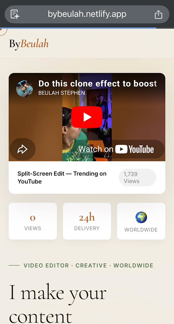
I've been building my video editing portfolio piece by piece, and I'm finally at the point where I'd love some honest feedback.
Also... yes, I built the entire portfolio website from scratch myself. 😄
I've worked with several clients over the past few months, and I recently added a typography animation project that I'm really proud of. But the more I look at my portfolio, the more I start questioning things:
Is the layout clear?
Is the order of projects right?
Does anything feel confusing or unnecessary?
Does it actually make me look like someone you'd hire?
So I'd love to get fresh eyes on it.
If you were:
• a potential client looking to hire a video editor, or
• another creative reviewing portfolios,
what would immediately turn you off? What would you change, remove, or improve?
Please don't hold back—I genuinely want constructive criticism. Every comment will help me make it better.
Drop your thoughts after taking a look:
https://bybeulah.netlify.app/


The network for creativity
Join 1.25M professional creatives like you
Connect with clients, get discovered, and run your business 100% commission-free
Creatives on Contra have earned over $150M and we are just getting started

Challenges
View all


Related posts

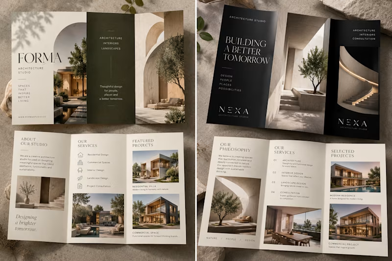
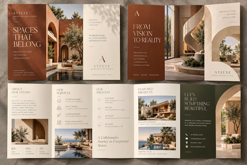
A two-post social media design set for ATELYE Architecture Studio showcasing its modern architectural work and design philosophy. The first post highlights a featured residential project, while the second communicates the studio’s approach to creating timeless, functional spaces, using a cohesive terracotta, cream, beige, and deep olive palette with elegant typography and architectural photography.

3 voted
43%
4 voted
57%
7 votes
Closed

Both works are great; which one do you like most?

Cinematic Apartment Tour | Real Estate Video
A cinematic real estate property showcase created for a modern apartment, featuring exterior reveal, location B-roll, detailed room presentations, realistic water effects, voice-over storytelling, and a service-focused CTA.
Created using AI-assisted video production with cinematic camera movement, controlled detail shots, and vertical 9:16 composition optimized for social media marketing.


Luxury

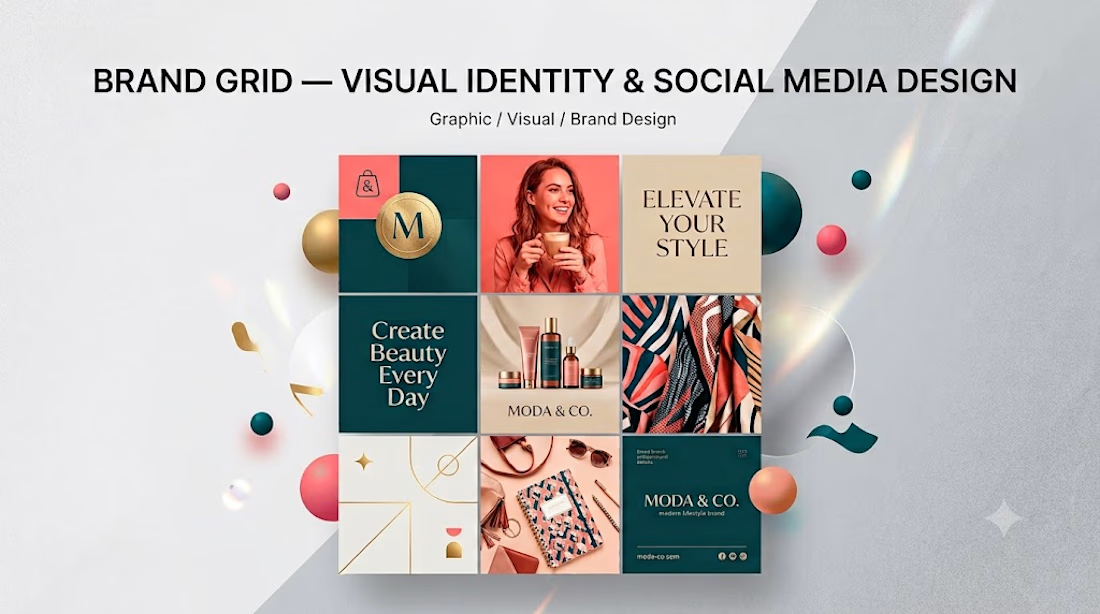
Brand Grid — Visual Identity & Social Media Design



Very nice