The network for creativity
Join 1.25M professional creatives like you
Connect with clients, get discovered, and run your business 100% commission-free
Creatives on Contra have earned over $150M and we are just getting started
Back to feedPost

Hi, I'm Vishakha — a UI/UX Designer from India 👋
I'm new to Contra and honestly so excited to be here — this feels like the right place to connect with people building real, meaningful products.
I help startups and businesses turn complex problems into clean, intuitive digital experiences — across apps, websites, and everything in between.
Here's what I bring to every project:
→ User-first thinking, not just pretty screens
→ Figma is my primary tool
→ I can design websites, landing pages, dashboard screens
→ Experience across fintech, travel, and B2B platforms
I'm currently open to new projects — if you're building something exciting and need a designer who actually gets the product side, let's talk.
You can checkout my work here - https://vdportfolio.framer.website
Drop a 👋 below or DM me — would love to connect!
vdportfolio.framer.website
VD | Portfolio
Made with Framer
The network for creativity
Join 1.25M professional creatives like you
Connect with clients, get discovered, and run your business 100% commission-free
Creatives on Contra have earned over $150M and we are just getting started





Related posts

Which hero direction feels right for this founder-focused brand?
While working on the homepage for Sean Parsons, a brand focused on empowering non-technical founders to launch tech startups, I explored two different visual directions for the hero section. Same message, same structure, just a different mood and color system.
Option 1 - Warm Olive. Dark, grounded, and editorial, giving a warm, established, expert feel.
Option 2 - Light Purple. Clean, modern, and vibrant, giving a fresh, SaaS-like, approachable feel.
Would love your honest UX/UI take, which direction feels more trustworthy, engaging, and aligned with a founder-focused brand, and why?
25 voted
69%
11 voted
31%
36 votes
Closed

I like worm Olive most because it has different personality

Cleann🔥

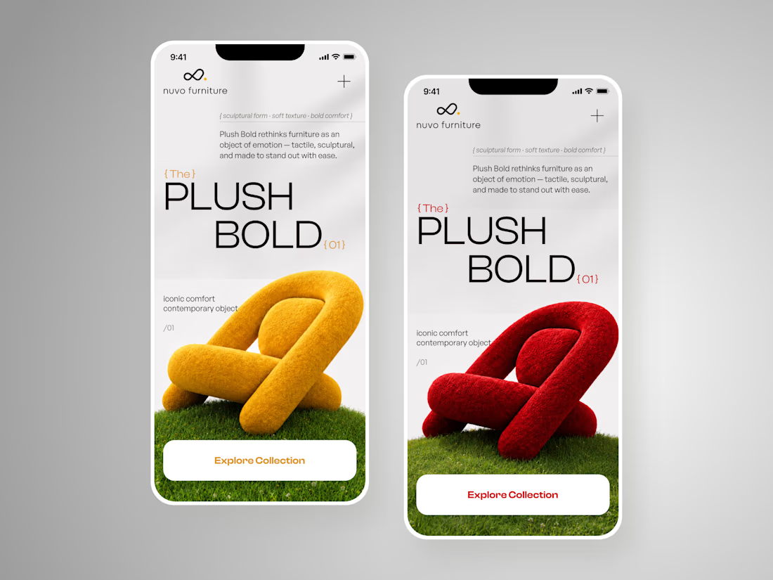
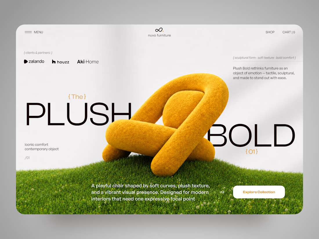
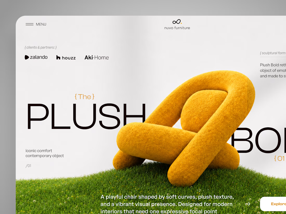
NUVO Furniture — Sculptural Furniture E-commerce Concept 🪑✨
NUVO is a contemporary furniture website concept built around one idea: let the product become the experience.
At the center of the concept is Plush Bold — an expressive statement chair designed to feel more like a...

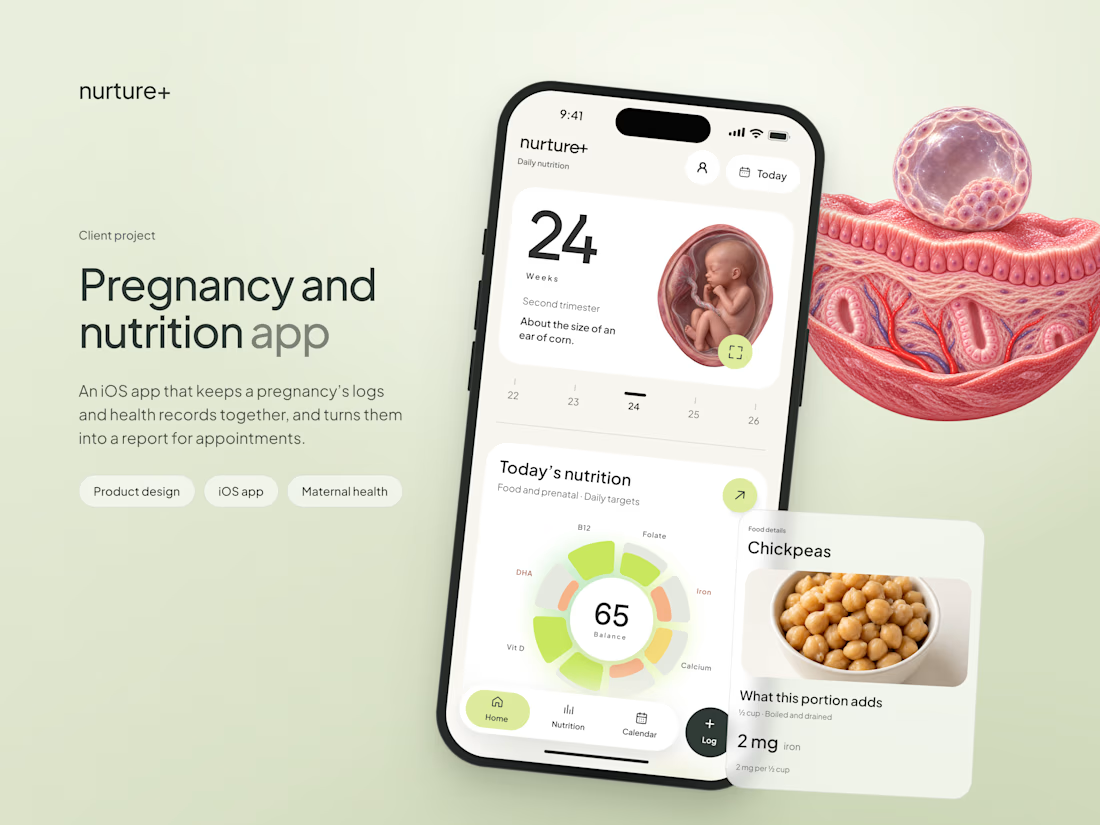
A very elaborate app study is out, I share my entire process and a lot of fun UI details along the way! Done this for https://nurtureplus.app/