The network for creativity
Join 1.25M professional creatives like you
Connect with clients, get discovered, and run your business 100% commission-free
Creatives on Contra have earned over $150M and we are just getting started
Back to feedPost

Last week, I set myself a challenge:
Could I give a well-known brand a visual refresh in just a week? We live in a world where brands need to move faster than ever before to stay ahead of the competition.
By limiting this project to just a week, I was able to focus on what really matters.
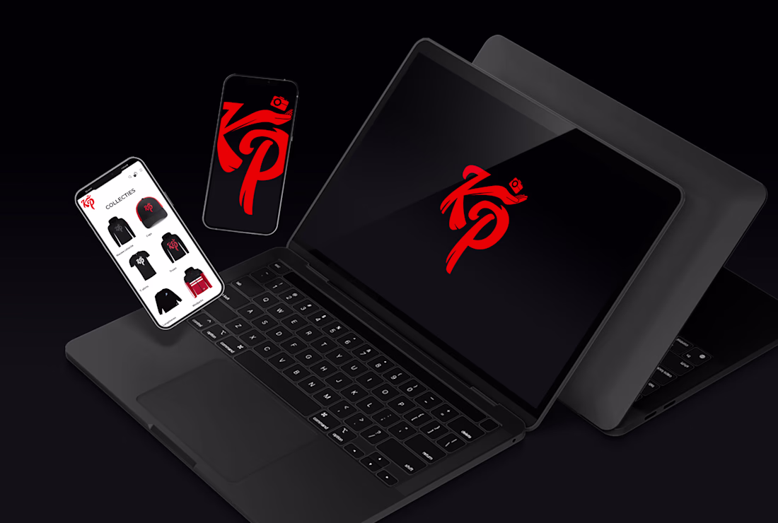
The brand I chose for this challenge was Capacities, a note-taking and personal knowledge management tool, with a similar structure to Notion.
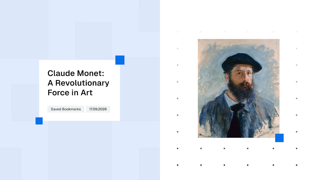
Capacities describes itself as ‘A Studio For Your Mind’ an idea which I decided to lean into whilst designing the identity, utilising grids to make connections between their content.
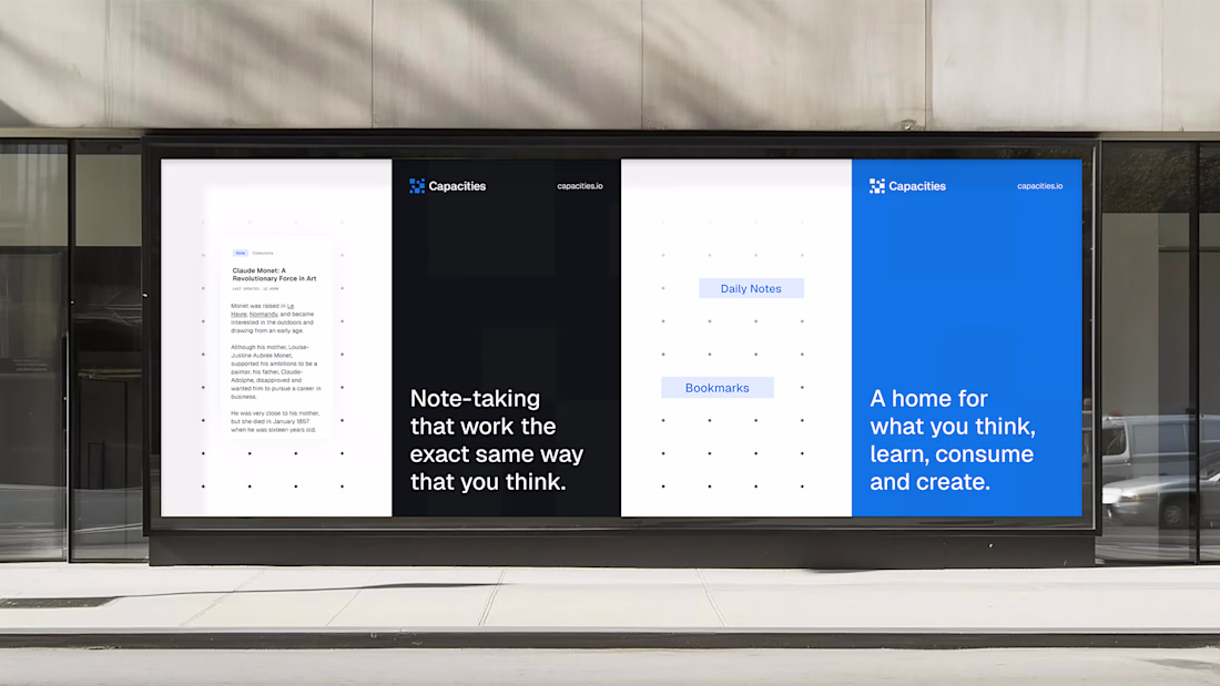
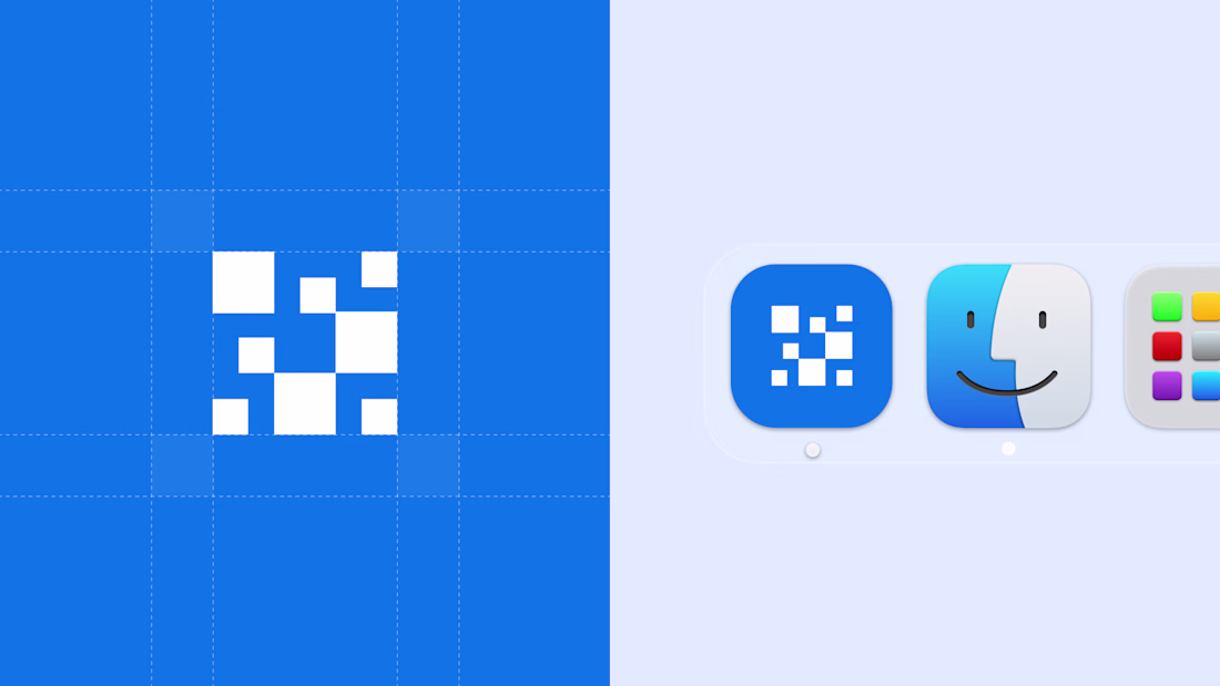
My primary goal for this project was to redesign their logo into something more scalable, recognisable and flexible across different applications, turning their current circular logo into a more structured and solid symbol.
It turns out that by giving myself just a week to complete this project, I was able to make more decisive design decisions when it came to colours and typography, allowing me to build out a simple but effective system.
Disclaimer: This project was not commissioned by Capacities and is not associated with the real Capacities brand in anyway.


The network for creativity
Join 1.25M professional creatives like you
Connect with clients, get discovered, and run your business 100% commission-free
Creatives on Contra have earned over $150M and we are just getting started
Related posts


colour Scheme 🔥


Great work!

One Click Lemonade is a small incremental clicker microgame built in Omma by Spline, where players harvest lemons from a handcrafted paper tree, fill a pitcher with lemonade, and sell each cup for one click while gradually growing their tiny lemonade empire. The project is designed as a calm, tactile interactive diorama rather than a large simulation, focusing on a simple resource loop polished with playful progression, clear interaction, and a strong visual identity. Its style combines a monochrome papercraft world, soft paper textures, sculptural white forms, and bright yellow lemons as the main accent, making the whole experience feel like a handcrafted interactive object that is quick to understand, visually memorable, and enjoyable in a short session.
Play the game: https://omma.build/p/lemon-stand-isometric-game-7bmq2d


Such a cool concept! How long did it take to dial in those soft paper textures in Spline? They look so realistic.


Trending


FLORA
Reusable workflows are replacing one-off prompts in creative AI. Share what you're building in FLORA.
portfolioreview
The best portfolios tell a story, not just show a grid. Share yours for feedback.
brandguidelines
Brand guidelines are becoming living systems. What are you building for your clients?
freelancerlife
Freelancer life is wins, pivots, and everything in between. What’s yours right now?
aivideo
AI video tools are moving at warp speed. Which ones are you experimenting with?