The network for creativity
Join 1.25M professional creatives like you
Connect with clients, get discovered, and run your business 100% commission-free
Creatives on Contra have earned over $150M and we are just getting started
Back to feedPost
Hey everyone! I’m Gustavo, a designer and founder of EGO LAB®, a creative studio focused on branding, visual identity, and graphic design.
I’m just getting started here on Contra and excited to connect with other creatives, discover new work, and share some of the projects we’ve been building.
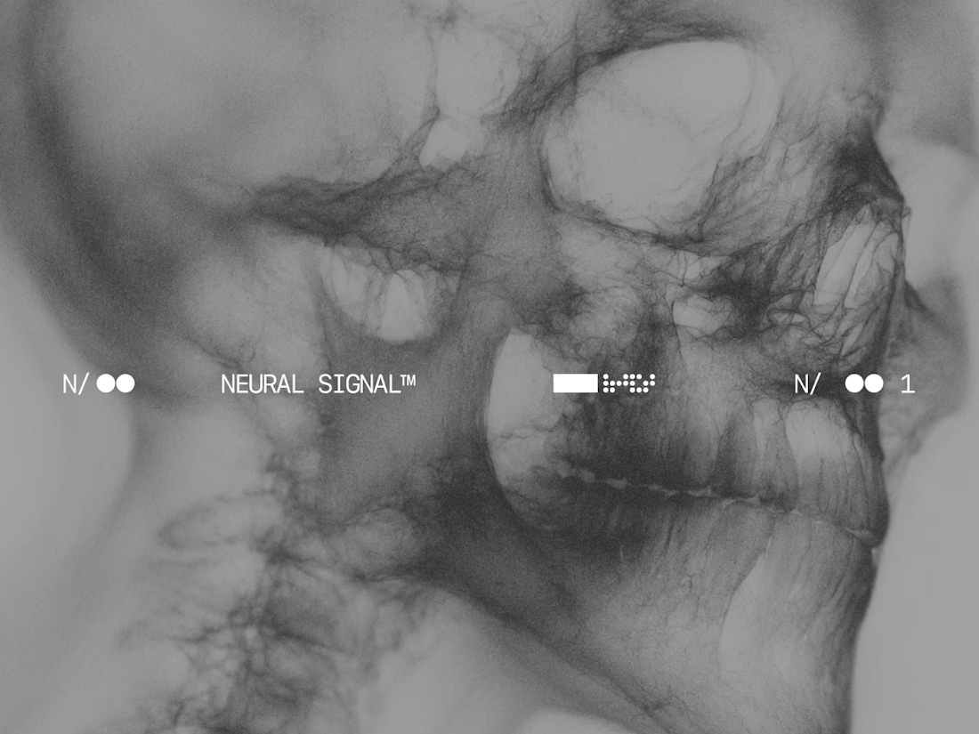
I’ve just published Norvex®, a branding project created for a neurotechnology and cognitive research company based in Cambridge, Massachusetts.
Would love to hear your thoughts on the project, feel free to check it out, leave some love, and connect. Always happy to support great work from the community as well.


the norvex typography hits hard gustavo. SHARP identity.


Thanks man, really appreciate it! Love your work too.
The network for creativity
Join 1.25M professional creatives like you
Connect with clients, get discovered, and run your business 100% commission-free
Creatives on Contra have earned over $150M and we are just getting started





Related posts

Exploring Brand assets. Which one feels good?
24 voted
80%
6 voted
20%
30 votes
Closed

stack is cool but linear is doing the job better :)

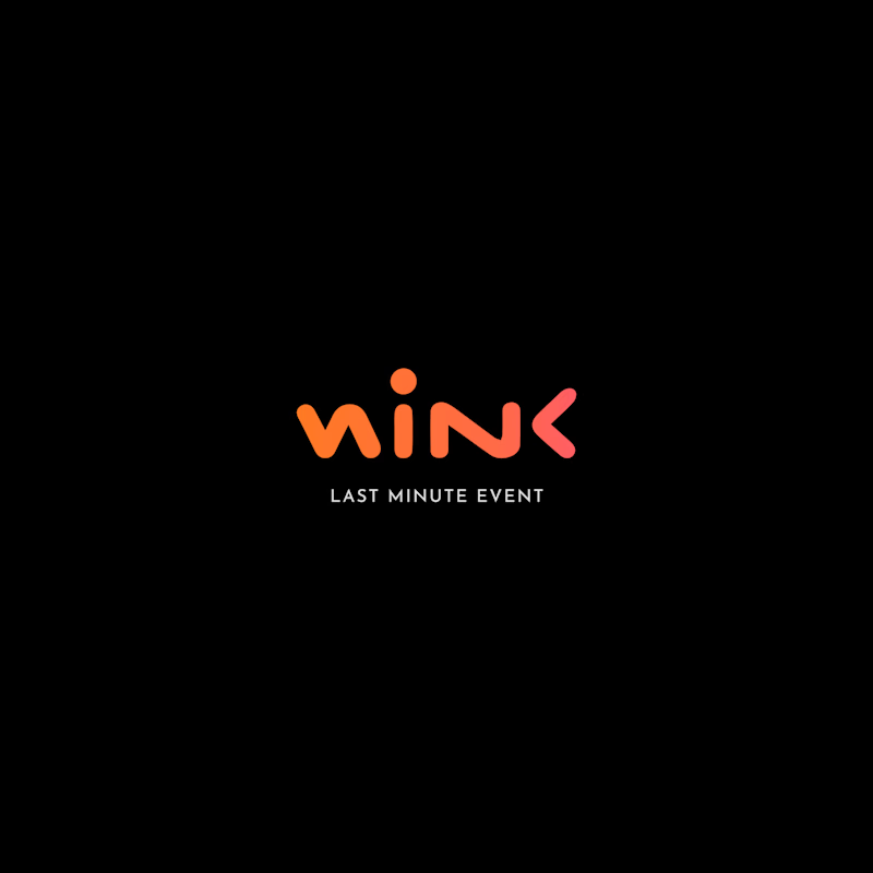
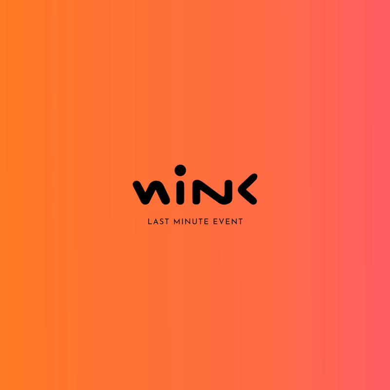
Two different colour directions, one brand identity. 🎨
Which version feels more impactful for this event brand?
🖤 Dark & Bold
🧡 Warm & Vibrant
What's your pick?
5 voted
71%
2 voted
29%
7 votes
Closed

Dark & Bold definitely takes the win for me. For an event brand, that high contrast gives off solid nightlife/exclusive vibes, and the coral accent pops really well against black.

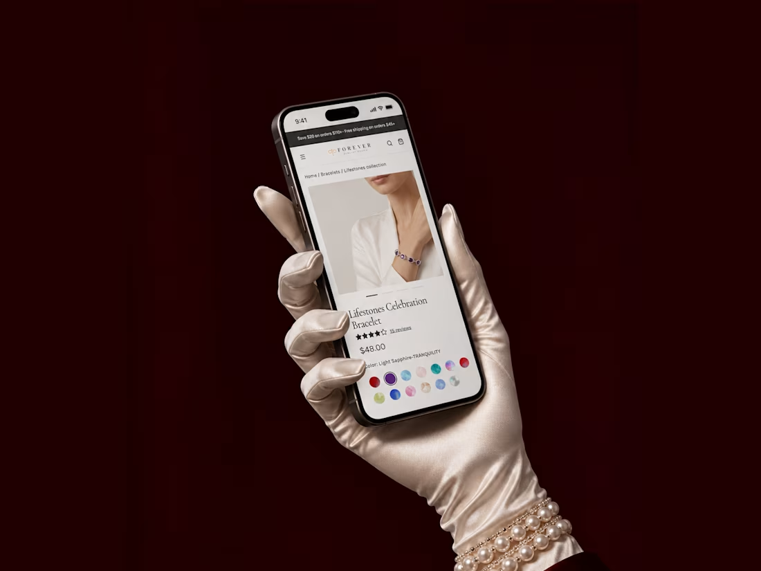
Just added a new case to my portfolio - a redesign focused on improving the user experience and making the shopping journey smoother


The satin glove with the pearl bracelet against the burgundy curtain makes a jewellery product page feel like a stage reveal. Do the colour dots change the main photo?