The network for creativity
Join 1.25M professional creatives like you
Connect with clients, get discovered, and run your business 100% commission-free
Creatives on Contra have earned over $150M and we are just getting started
Back to feedPost
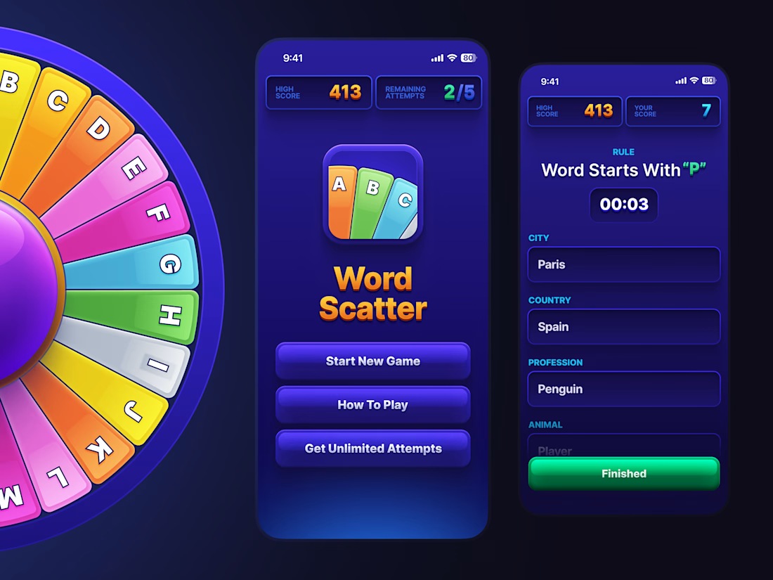
One letter. Five categories. Under a minute.
I designed a word game where the whole tension sits in the timer – so the interface had to get out of the way. Dark screen, one bright wheel, score chips you can read without stopping.
The wheel and the icon are hand-built in Figma.
Full case in my profile 👇
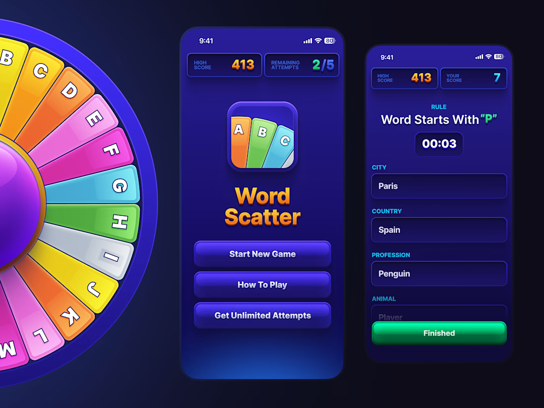

The color coded letter wheel against that dark screen is such a smart way to keep the tension readable under a timer, the score chips staying out of the way is a nice touch too. Was the under a minute pacing something you landed on through playtesting, or mostly gut feel from the start?

Thank you – that is exactly what I was aiming for, so it is good to hear it lands.
Honest answer: the minute was a given, not something I found. It came with the game itself, so the design question was never how long the round should be. It was making sure nothing on the screen...
The network for creativity
Join 1.25M professional creatives like you
Connect with clients, get discovered, and run your business 100% commission-free
Creatives on Contra have earned over $150M and we are just getting started






Related posts


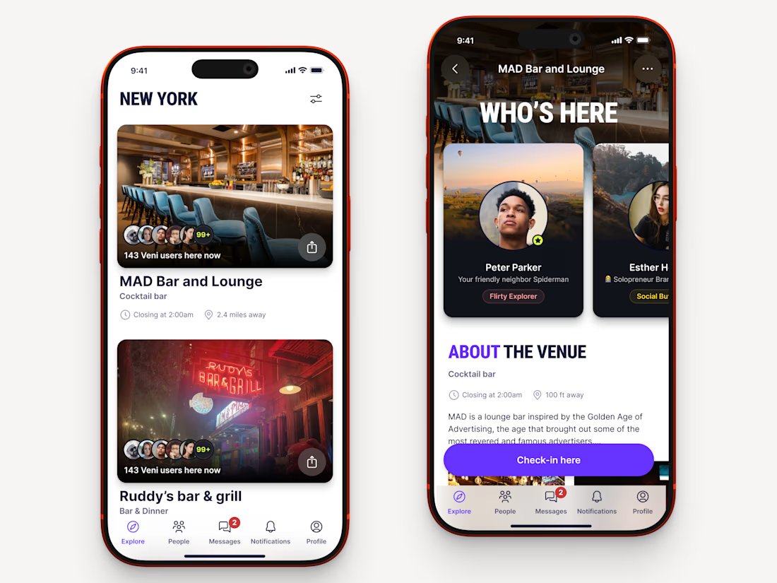
Recently worked on a mobile app for local networking.
Find venues (bars, clubs, conference halls, etc..) nearby, see who's there and connect.




Great!


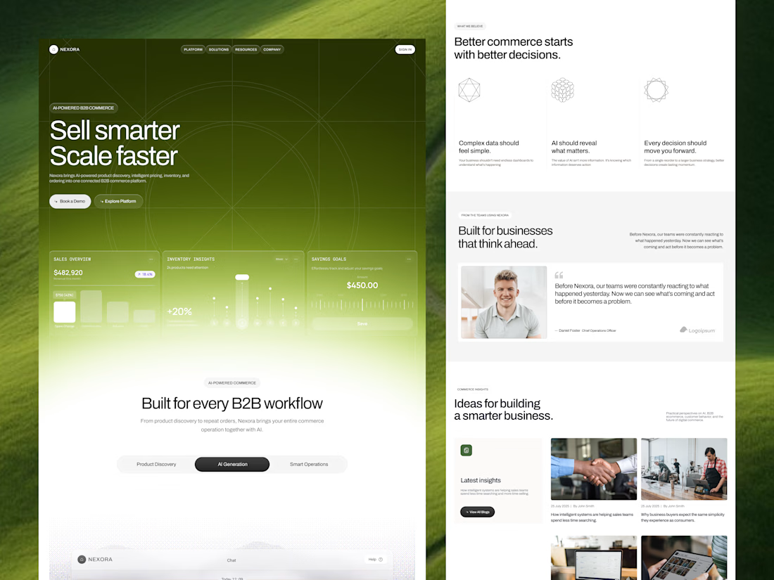
Our goal was to make pricing, inventory and ordering data feel simple and human for an AI-powered B2B commerce platform. We'd love to hear your thoughts!

Engaging background and nice gradient to not make the section look seprate 🔥