The network for creativity
Join 1.25M professional creatives like you
Connect with clients, get discovered, and run your business 100% commission-free
Creatives on Contra have earned over $150M and we are just getting started
Back to feedPost
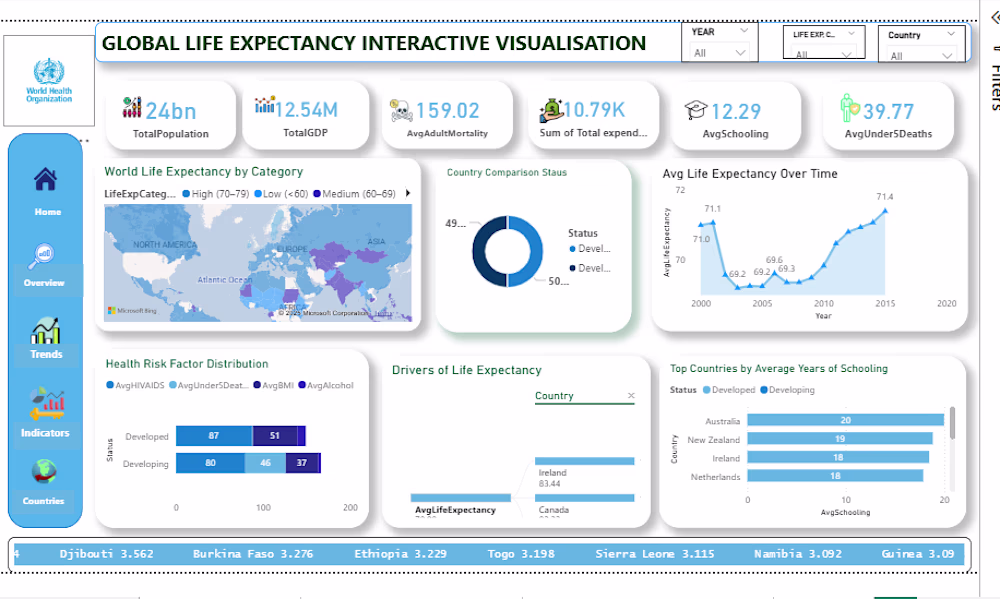
Every component of this Global Life Expectancy Interactive Dashboard was designed to visualize how health, education, and economic indicators influence life expectancy across countries. Using WHO data, the dashboard highlights key patterns such as adult mortality rates, under-five deaths, and schooling years to compare developed and developing nations. Through interactive visuals, policymakers and researchers can explore global trends, assess risk factors, and identify opportunities to improve health outcomes and quality of life worldwide.
The network for creativity
Join 1.25M professional creatives like you
Connect with clients, get discovered, and run your business 100% commission-free
Creatives on Contra have earned over $150M and we are just getting started
Trending
Claude
Claude has entered the design space. How are you using Claude Design?
Contra University
Learn from expert creatives how to earn more using next-gen AI tools.
creativeaiflow
Creative AI workflows are evolving. What tools do you use, and what are their strengths and weaknesses?
freelancerlife
Freelancer life is wins, pivots, and everything in between. What’s yours right now?