The network for creativity
Join 1.25M professional creatives like you
Connect with clients, get discovered, and run your business 100% commission-free
Creatives on Contra have earned over $150M and we are just getting started
Back to feedPost


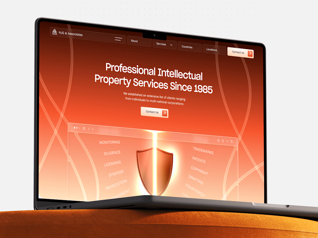
Most law firm websites read like a PDF that learned HTML - beige, safe, forgettable. NJQ & Associates broke that mold: a 40-year IP practice with a homepage built around a literal glowing shield, an orange-to-black gradient that feels more high-stakes thriller than fee schedule, and a world map flexing their reach across the Middle East and beyond. Turns out "boring" industries just needed better lighting.
When's the last time a law firm's website actually made you want to keep scrolling?




Love the design idea and execution. Looks really cool!
Thank you!

That glowing shield against the orange-to-black gradient really does read more thriller trailer than fee schedule, in the best way. Did NJQ push back at all on going this bold, or were they the ones asking you to break the mold?
They've been actually pushing back but we actively defended the direction)
The network for creativity
Join 1.25M professional creatives like you
Connect with clients, get discovered, and run your business 100% commission-free
Creatives on Contra have earned over $150M and we are just getting started


Related posts

XPlace — Crypto-Backed Visa Card Website design
Designed the interface for XPlace — a platform that lets users borrow against their crypto holdings and spend through a Visa card, without selling assets or triggering taxable events.
The challenge:
Create a product that feels both trustworthy and premium — avoiding the typical "startup" look, and steering clear of the neon/gradient clichés so common in crypto design.
The solution:
A dark, cinematic mood built around a monochrome landscape backdrop, bold expressive typography, and a metallic Visa Platinum card as the central visual anchor. Minimal elements, maximum focus on one action: get the card.
What's in the interface:
— Full-bleed hero section with an atmospheric background
— Large-scale headline that communicates value in seconds
— 3D card render as a trust-building element
— Transparent glass-effect header
Built in Framer — this isn't just the landing page, there are several more screens and flows I'll share case study separately 👀

That design, scroll transitions and color palette is very well designed with a great presentation. I like how you blend different type of scroll animations in different sections. Fits my dark sci fi aesthetic, good work!

A large set of components will be dropping soon on the framer marketplace.
We go all in on templates and components
Stay tuned

Waiting to explore


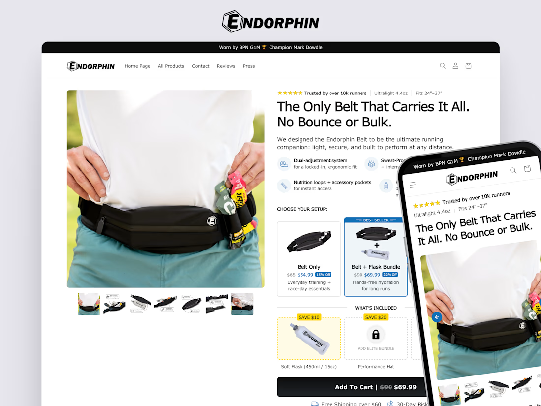
Conversion-focused product page (PDP) I designed for Endorphin Belt.
The goal was to create a premium buying experience beyond Shopify’s default theme limitations.
The redesign introduced strategic UX and CRO improvements designed to increase average order value (AOV) while strengthening buyer confidence.
Breaking out of Shopify's default theme constraints for something this detailed (bundle builder, cross-sell flasks, the whole setup flow) is a solid amount of custom work. Did you build the bundle logic natively in Replo or lean on a separate app for that?









Trending

Claude
Claude has entered the design space. How are you using Claude Design?

Contra University
Learn from expert creatives how to earn more using next-gen AI tools.
creativeaiflow
Creative AI workflows are evolving. What tools do you use, and what are their strengths and weaknesses?
freelancerlife
Freelancer life is wins, pivots, and everything in between. What’s yours right now?