The network for creativity
Join 1.25M professional creatives like you
Connect with clients, get discovered, and run your business 100% commission-free
Creatives on Contra have earned over $150M and we are just getting started
Back to feedPost

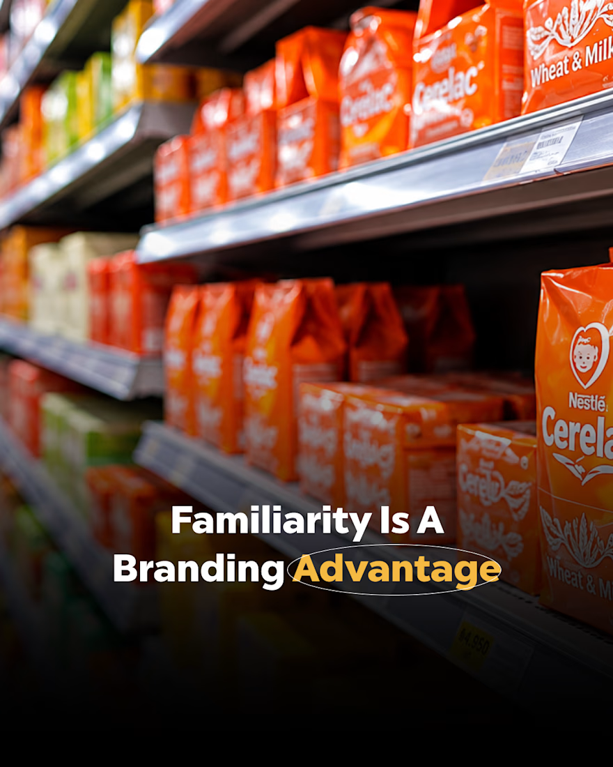
Think about how quickly you recognise a familiar product on a shelf.
That recognition comes from seeing the same visual identity across different places and over time.
A redesign can be a smart move when a brand has outgrown its look or needs a fresh direction. Just make sure every change has a clear reason behind it.
Your brand needs room to evolve, and your audience needs something familiar to remember.
The network for creativity
Join 1.25M professional creatives like you
Connect with clients, get discovered, and run your business 100% commission-free
Creatives on Contra have earned over $150M and we are just getting started


Related posts

This is what the start of a logo actually looks like.
Dozens of rough ideas, crescents, stars, shapes that go nowhere. Most of this page won't survive. A few circled ones will.
Messy first, clear later.
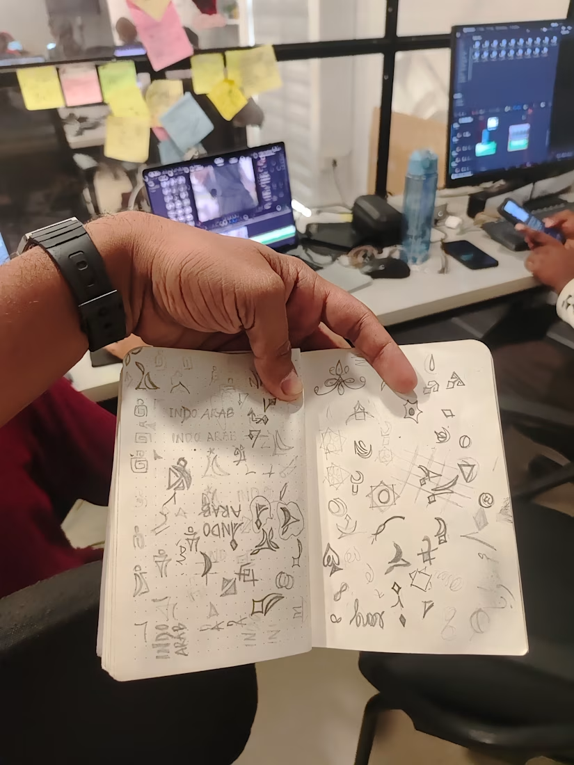

Great to see the full sketch page. The circled ones already stand out.

A logo is only one part of the job.
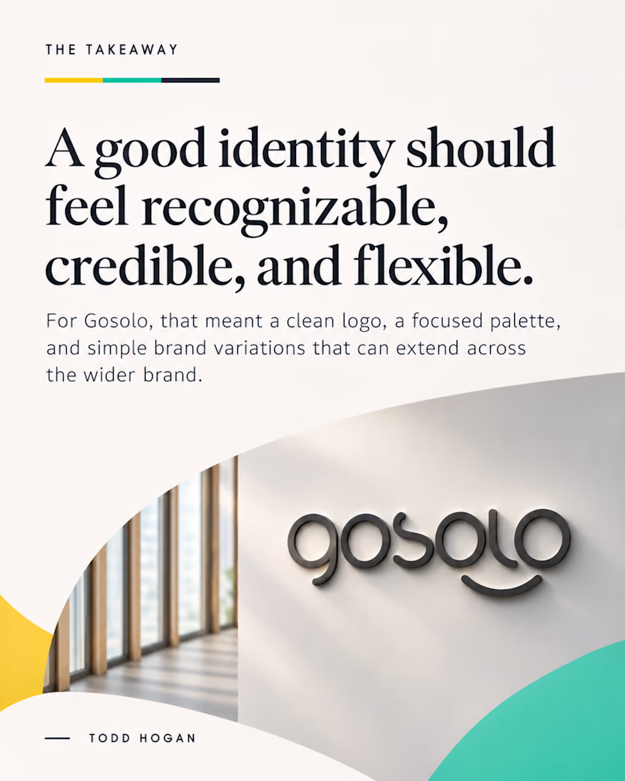
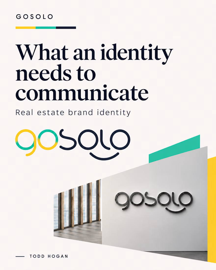
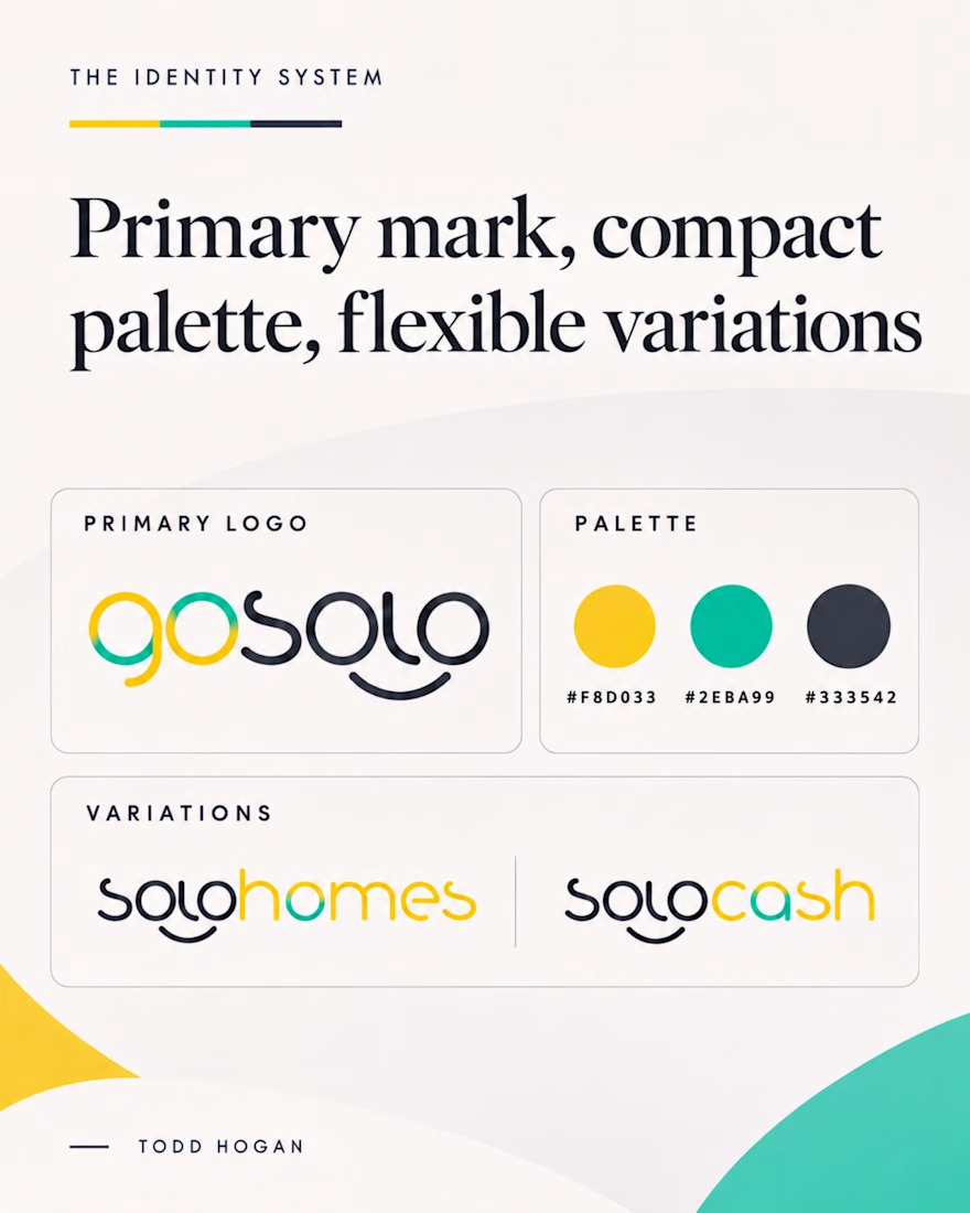
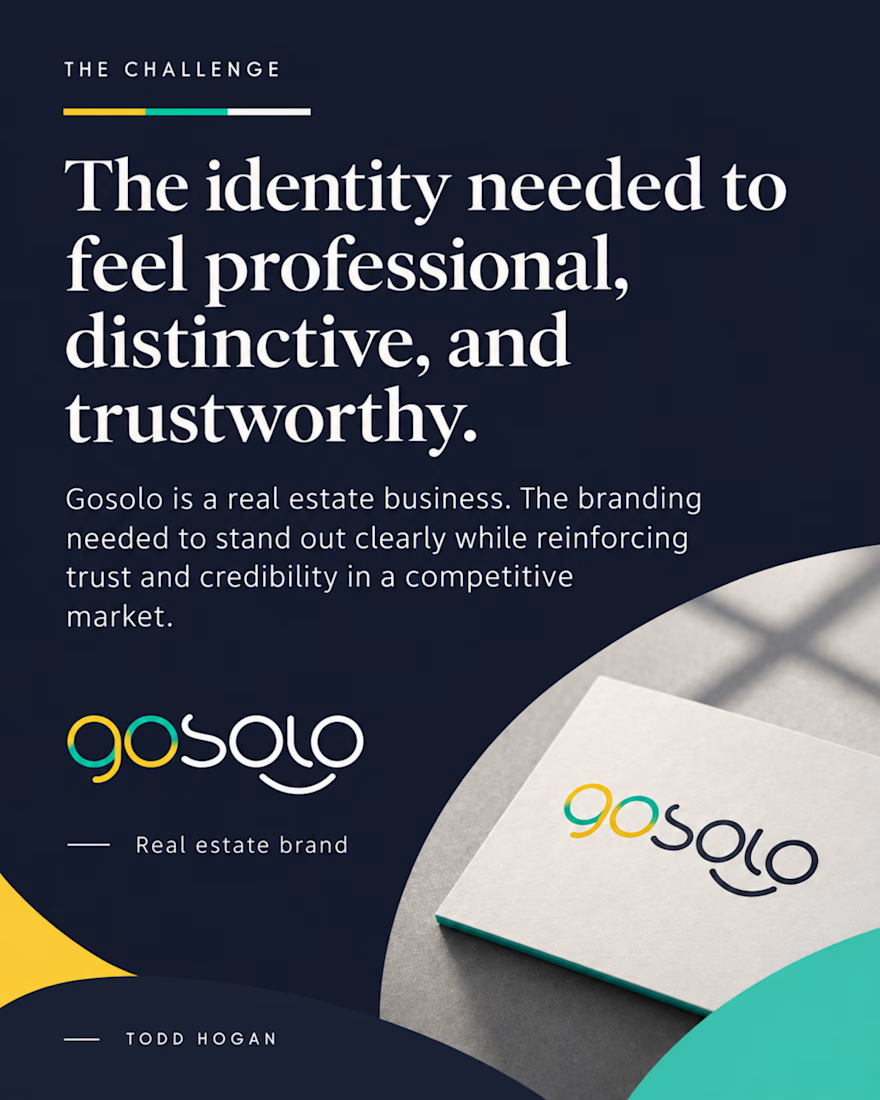
For Gosolo, a real estate business, the bigger question was how the identity could feel distinctive while still giving people a sense of professionalism and trust.
That's a balance I think about a lot in branding. You want something people remember, but it also has to feel right for the business and the people it's trying to reach.
Sharing a few pieces from the identity work our studio developed for Gosolo.
When you're looking at a new brand, what tends to register first for you: the overall personality or the little details?