The network for creativity
Join 1.25M professional creatives like you
Connect with clients, get discovered, and run your business 100% commission-free
Creatives on Contra have earned over $150M and we are just getting started
Back to feedPost
Two banners. One warm, premium brand. Designed to turn walk-by customers into first-time sippers.
What makes someone walk into a café? Often it's a single glance. ☕✨
Meet CHOCOCHAI, and the two roll-up banners I designed to make people stop, look, and sip.
🧋 Banner 1: "Real Taiwanese Bubble Tea in Bahria Town"
Creamy milk tea, chewy boba pearls, and a message that tells customers exactly what they'll get.
🍵 Banner 2: "Pakistan's Most Unique Matcha Collection"
A rich matcha latte, soft florals, and a calm, premium feel that says this is something special.
The design idea:
✔ Warm cream and gold palette for a cozy, premium look
✔ Food-first photography, so the drink does the selling
✔ Clear layout that's readable from across the street
✔ One consistent style across both banners
A good banner is a silent salesperson: it works all day and never takes a break. 💛
Own a café, restaurant, or local business? Let's design visuals that make people choose you.
📩 DM me to get started.
#print #design #creative #Standee #Creative #Design #modern #design #standee #design

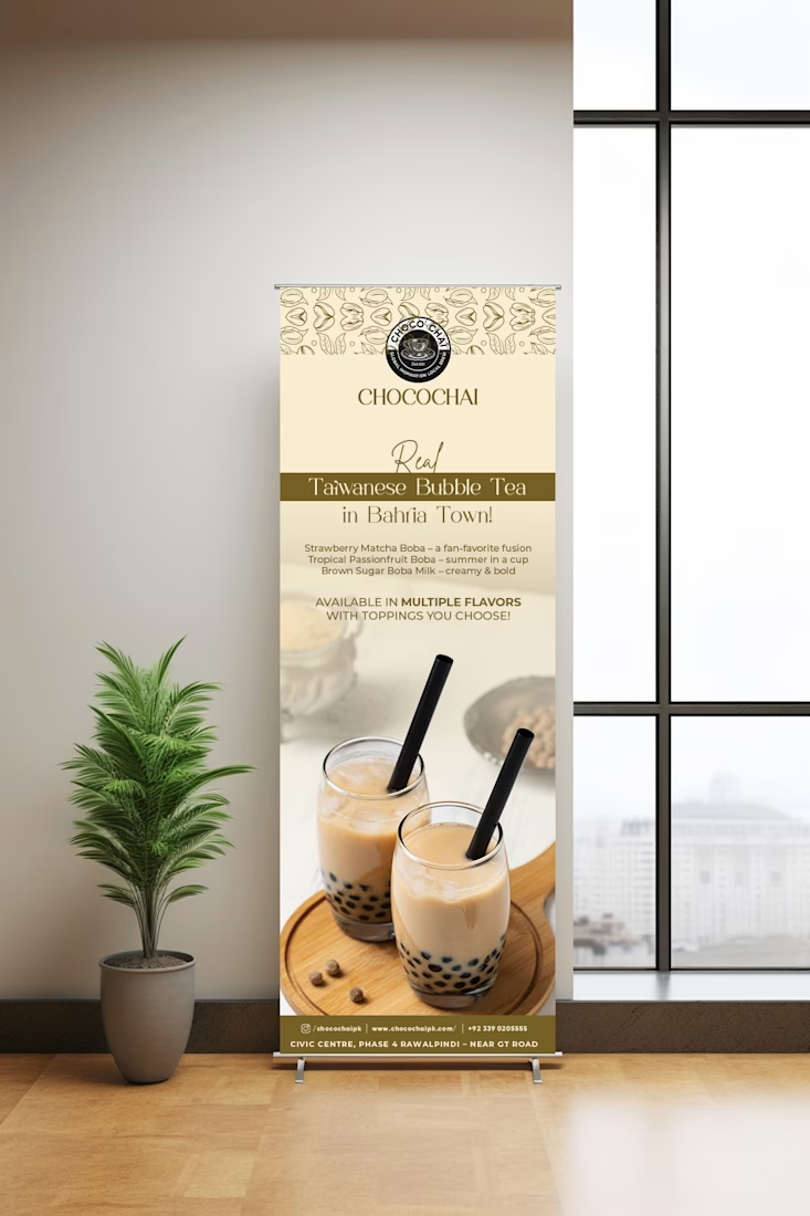
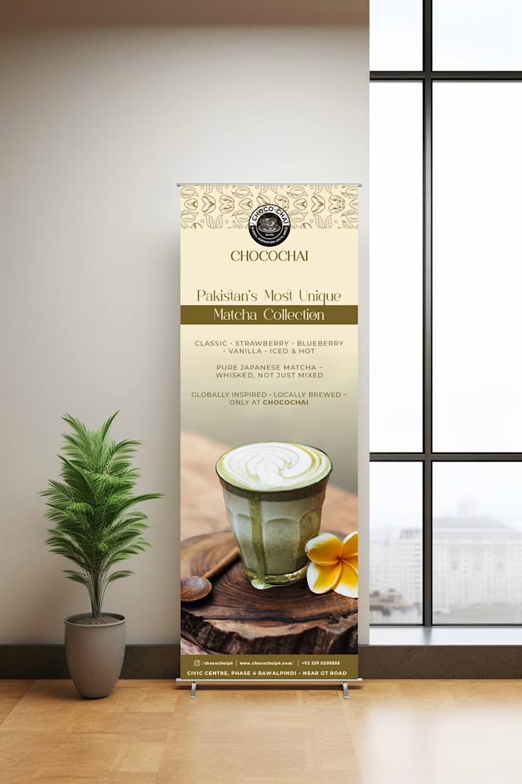

Roll-ups get read at two very different distances - once from across the street, then again by whoever is standing right beside it in the queue. Did you plan the lower third for that second read, or keep it quiet on purpose?

Deliberate, yes. I split the banner by reading distance rather than by thirds. The top carries the brand and headline for the across-the-street read. The lower third is the hero photo, which reads as colour and shape at distance and stays clean up close. The fine print...
The network for creativity
Join 1.25M professional creatives like you
Connect with clients, get discovered, and run your business 100% commission-free
Creatives on Contra have earned over $150M and we are just getting started





Related posts

Brand identity work for WesoftAI



✨ Modern Fashion Poster Design - STYLE ✨
Designed a clean, high-fashion poster concept focusing on bold typography and minimalist aesthetics.
Concept: Modern Fashion | Define Your Style
Tool: Canva / Photoshop
Style: Luxury, Minimal, Editorial
Open to feedback and freelance work!
#GraphicDesign #PosterDesign #FashionDesign #Canva #ContraCommunity


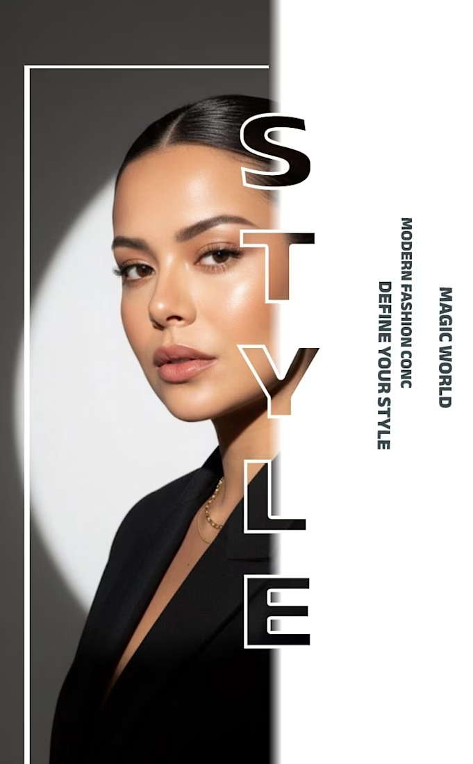
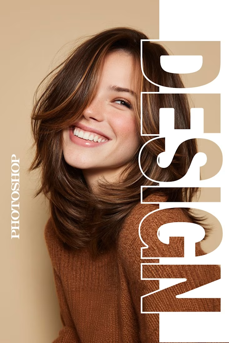
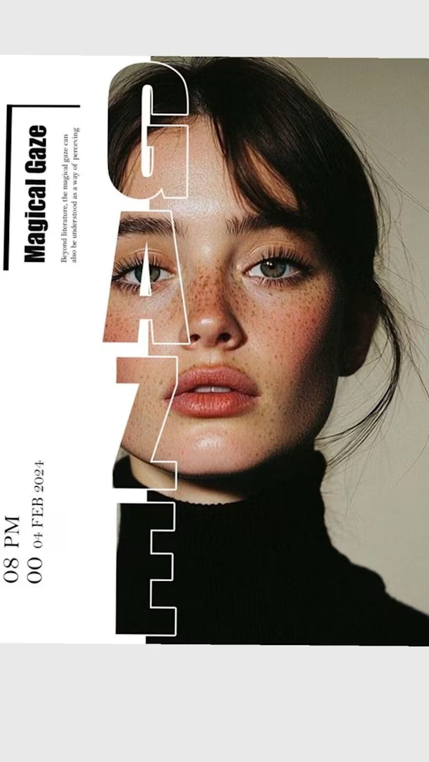

The way you let the bold type dominate the empty space really drives the luxury feel.

A new visual direction for Friedrich Naumann Foundation - Jordan.
I developed a visual sub-identity for the “Nau Media” project, a media training initiative focused on digital communication, human rights-sensitive media, and combating misinformation.
The goal was to build a distinct visual system that could stand on its own while remaining connected to the broader FNF Jordan identity.
This is an initial look at the project. The full visual identity and its applications will be shared soon.
