The network for creativity
Join 1.25M professional creatives like you
Connect with clients, get discovered, and run your business 100% commission-free
Creatives on Contra have earned over $150M and we are just getting started
Back to feedPost

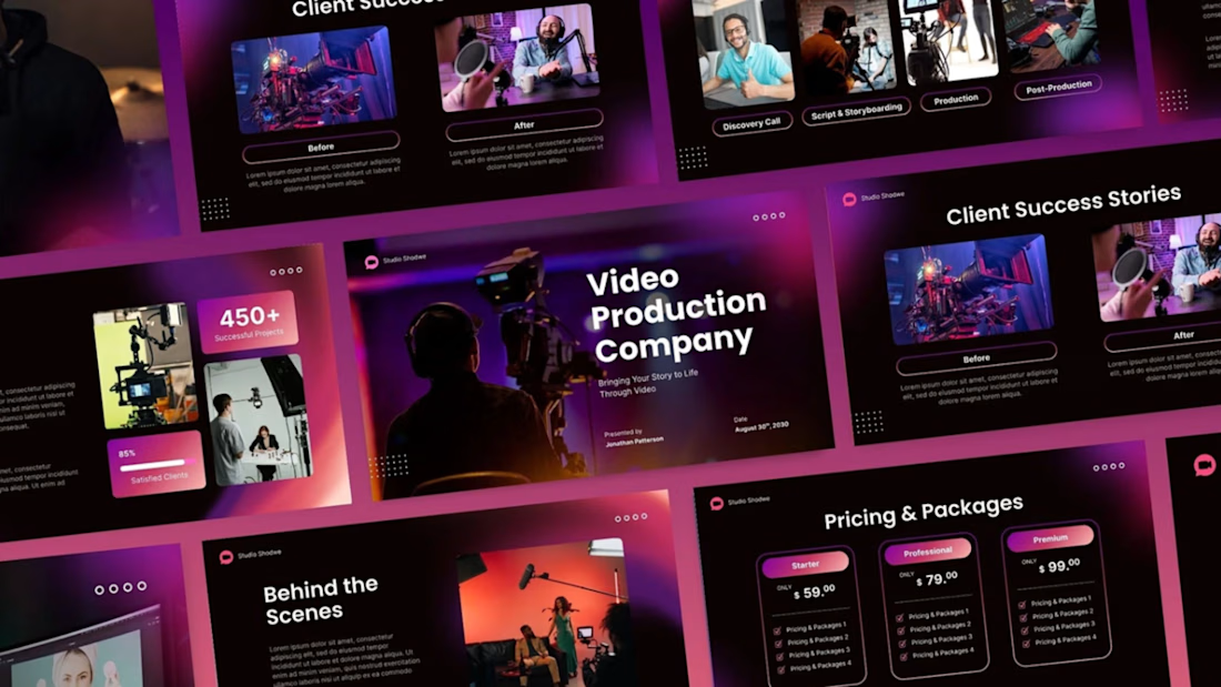
Video Agency Deck
A cinematic presentation design crafted for a modern Video Production Company. This concept blends bold typography, immersive lighting, and a sleek corporate layout to reflect the creative energy of the film and media industry. Inspired by studio environments and cinematic color grading, the design focuses on strong hierarchy, clean spacing, and premium visual storytelling. The goal was to create a presentation theme that feels dynamic, modern, and visually engaging while staying professional and easy to navigate across all devices. Tools Used: Adobe Photoshop, PowerPoint Style: Cinematic • Modern • Corporate • Creative Agency


The network for creativity
Join 1.25M professional creatives like you
Connect with clients, get discovered, and run your business 100% commission-free
Creatives on Contra have earned over $150M and we are just getting started

Challenges
View all


Related posts


Another visual experiment from Sherry AI Studio. 🎬
Our goal is simple: take an idea and turn it into something that feels bigger, more cinematic and more memorable.
From the initial concept to the final visual, we create content tailored around the identity and message of each brand.
🎥 Commercial Videos
🤖 AI-Powered Production
📦 Product Ads
👤 Digital Humans
✨ Cinematic Visuals
📱 Reels & Promotional Content


Perfect


I’ve been razzmatazzing and flibbertigibbeting with Claude Code and somehow ended up with a new yels.dev.
It finally feels like me: simple on the surface, slightly complicated underneath, and very much alive.
You can see who I am, what I do, the work behind Herodot, RaptorLabs, CyberLink Security and Solmint, plus a selection of projects I’ve built across AI, cybersecurity, Web3, product systems, education, archives, and experimental digital spaces.
Built to be explored


The simple-on-the-surface, layered-underneath idea comes through so clearly in the presentation. I especially like how the project archive turns the site into something to explore rather than just a résumé of links.

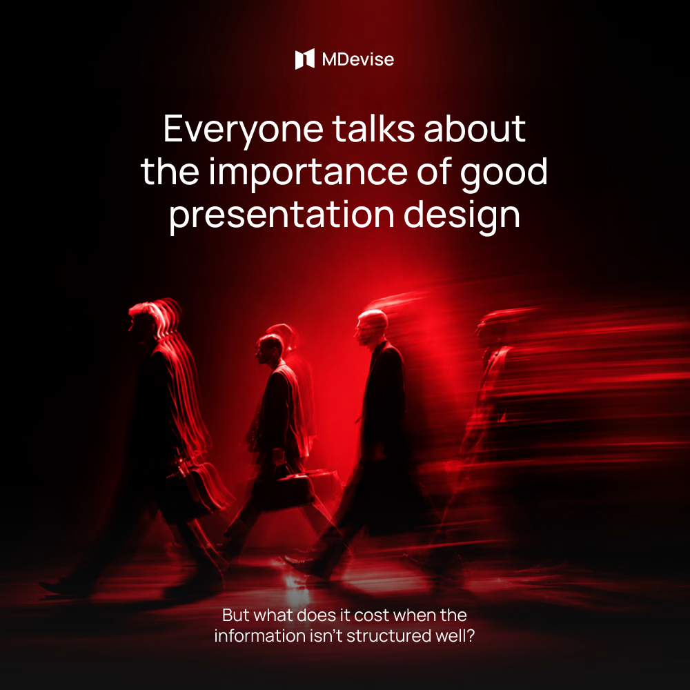
Even strong content can be difficult to understand when it’s presented without a clear flow. The audience may lose track of what really matters or simply stop paying attention.
Before creating the slides, I would first define the key message. Then I would decide which ideas are essential and which ones can be left out.
I would organize the content so each part naturally leads to the next. This makes the presentation easier to follow and keeps the story clear.
Another thing I would focus on is the amount of information on each slide. Too much text, too many charts, or too many visuals can make the content overwhelming and distract from the message.
A strong ending is just as important. I would leave the audience with a clear takeaway and a simple understanding of what they were meant to remember.
For me, good structure is about making ideas clear, keeping people engaged, and making the message easy to remember.

Great work