The network for creativity
Join 1.25M professional creatives like you
Connect with clients, get discovered, and run your business 100% commission-free
Creatives on Contra have earned over $150M and we are just getting started
Back to feedPost
Day 13 of Roasting 30 bad Websites in 30 days to earn $4K.
Onyx Accountants helps businesses understand their numbers.
Their website doesn't add up.
What's broken:
10 navigation items. I need an accountant just to count the menu items 😅.
Contact form sitting in the hero section. A 4 field form before I even know who you are. That's a first date proposal. 💍
Italic green text mid page. "Please select your business below." Why is this styled like a handwritten note in the middle of a corporate website? 😭
What I fixed:
Clean dark premium layout that actually feels like a firm you'd trust with your money. One headline. One CTA. Real humans visible. No form ambush.
"Est. 2012" as a trust signal, simple and effective.
Want me to do the same for your website?
DM me "Roast" and I'll tell you exactly what's hurting your conversions.
The network for creativity
Join 1.25M professional creatives like you
Connect with clients, get discovered, and run your business 100% commission-free
Creatives on Contra have earned over $150M and we are just getting started
Related posts
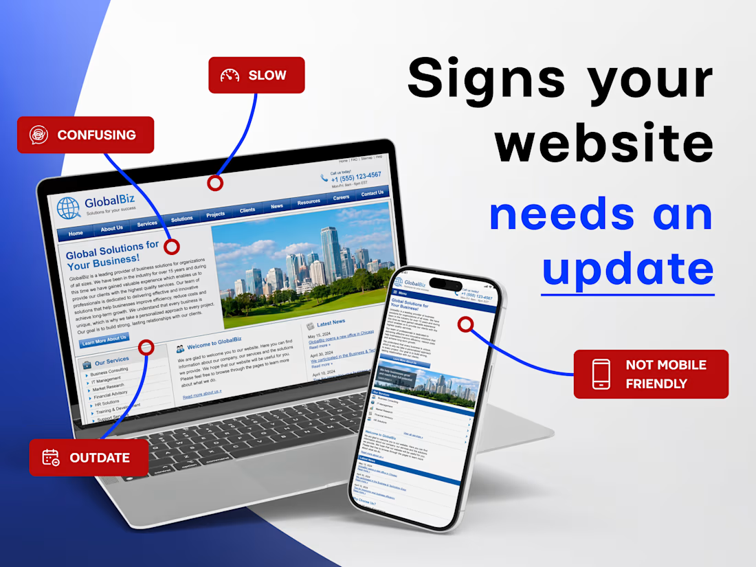
How to know your business needs a new website
A website doesn’t have to be broken to stop working for your business.
Often everything technically works – the pages open and the contact form is there – but the experience for visitors slowly becomes outdated.
Here are a few signs it might be time for a redesign:
📱 The site looks bad on mobile
Most visitors browse from their phones. If the layout breaks or buttons are hard to tap, people leave quickly.
🤔 Visitors don’t understand what you offer
Your homepage should explain your business within seconds.
🐢 The website loads slowly
Even a few extra seconds can make users leave.
🎨 The design feels outdated
An outdated interface can make a strong business look less trustworthy.
Sometimes a redesign isn’t about starting over – it’s about making the experience clearer, faster, and easier.
Most online stores lose sales for a dumb reason:
They turn buying into an exam.
Long forms, pop-ups, unnecessary steps, hidden buttons…
Every extra click between the visitor and "pay" is money walking out the door.
That's why I built my new template obsessed with one single metric: the conversion rate of whoever uses it.
One-click add-to-cart. Frictionless checkout. No distractions.
You don't sell more with more design. You sell more by removing obstacles.
Challenges
View allFuser Co-create
$5K14h 43m left333 participants
Morphic Workflows
$10K3d left257 participants
Zo Computer Challenge
$10K3d left551 participants
Anything Ship & Sell Remixathon
$10K10d left151 participants
Impossible UI with Rive
$10K10d left102 participants
Runway $100k Big Pitch Challenge
$100K10d left180 participants
Trending
Runway
AI video generation is exploding. What are you dreaming up in Runway?
Contra University
Learn from expert creatives how to earn more using next-gen AI tools.
creativeaiflow
Creative AI workflows are evolving. What tools do you use, and what are their strengths and weaknesses?
portfolioreview
The best portfolios tell a story, not just show a grid. Share yours for feedback.
freelancerlife
Freelancer life is wins, pivots, and everything in between. What’s yours right now?