The network for creativity
Join 1.25M professional creatives like you
Connect with clients, get discovered, and run your business 100% commission-free
Creatives on Contra have earned over $150M and we are just getting started
Back to feedPost
Did a little bit of interior today, basically gym setup
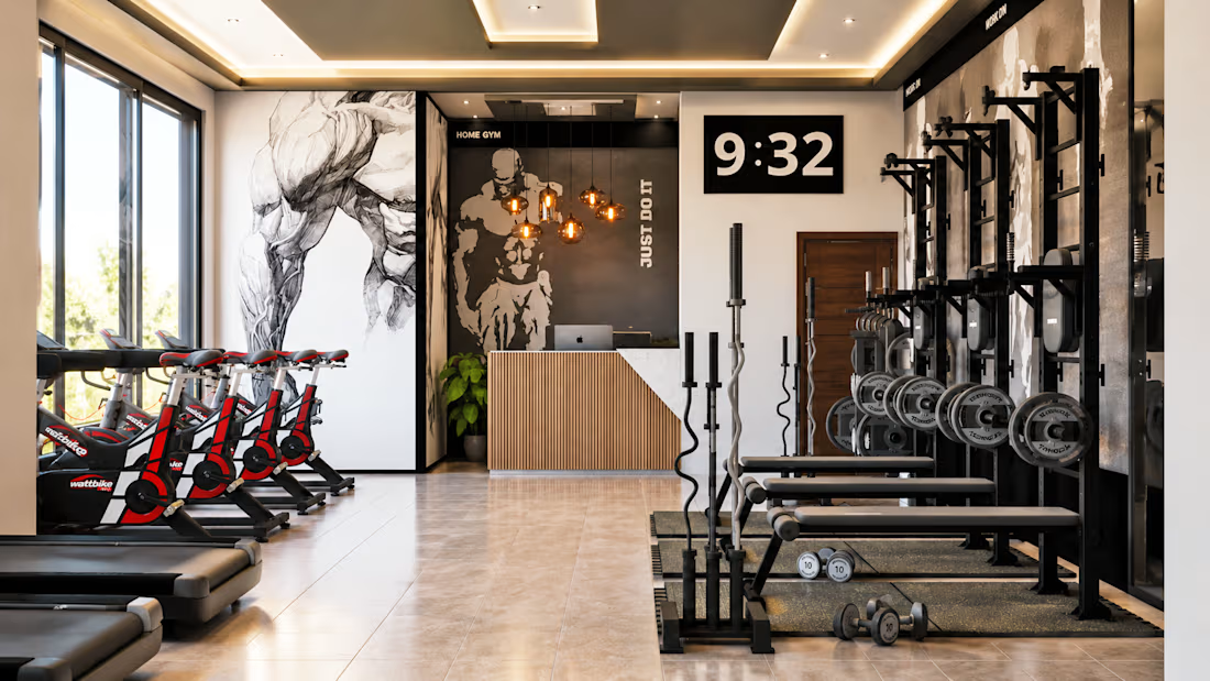
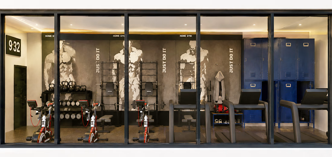
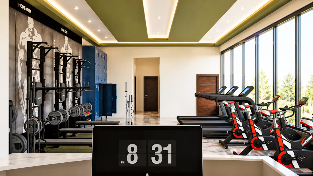
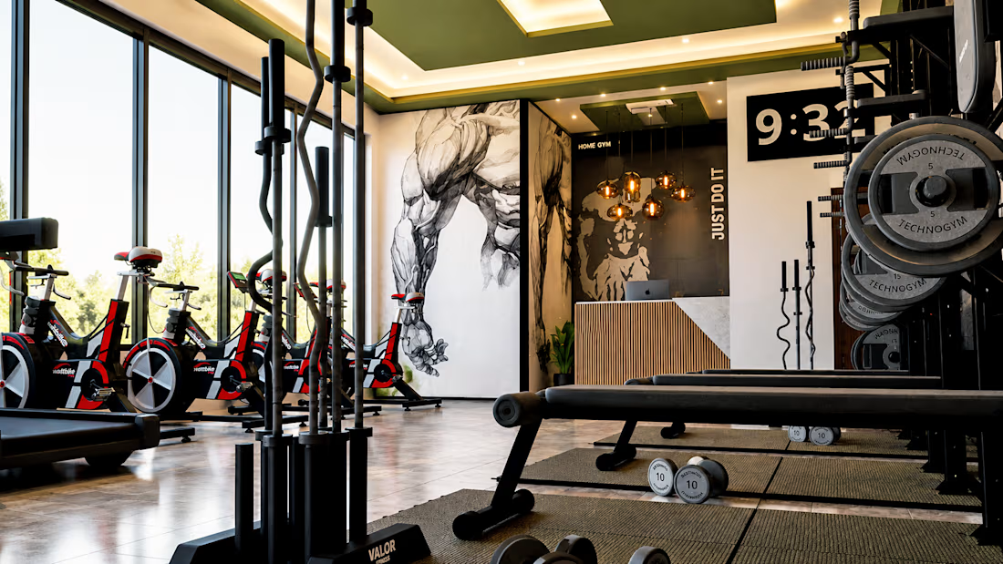

Nice work as usual! The spatial layout, lighting balance, and asset placement look solid. Seeing beautifully organized physical environments always gets my brain spinning on how to translate structure and depth into web layouts.

Thank you, really appreciate it

look good
thank you
The network for creativity
Join 1.25M professional creatives like you
Connect with clients, get discovered, and run your business 100% commission-free
Creatives on Contra have earned over $150M and we are just getting started





Related posts


Working on apple watch experience. How else do I keep myself from getting bored when there’s interaction design involved? That’s honestly one of my top priorities.
Can’t wait to share the full case study for this project. For now, here’s a little sneak peek at some of the animated screens I’ve been working on for the fitness experience. ⌚️


This deserves only praise. wonderful execution

Kajabi Gym & Fitness Website Design
The client needed a modern fitness website that could present their gym, training programs, and membership options in a clear and engaging way. Their goal was to create a stronger online presence while making it easier for potential members to understand the services and take the next step.
I designed and built the website in Kajabi with a fitness focused visual direction, clear content hierarchy, intuitive navigation, responsive layouts, and strategically placed calls to action. I structured the key sections around the visitor journey from discovering the gym and its programs to understanding the benefits and getting started.
The result was a polished Kajabi gym website that gives the brand a more professional online presence and provides visitors with a clearer path from exploring the fitness offering to taking action.
#Kajabi #KajabiWebsite #KajabiWebDesign #KajabiFitness #KajabiGym #FitnessWebsite #GymWebsite #FitnessWebsiteDesign #GymWebsiteDesign #FitnessWebDesign #FitnessBusiness #GymBusiness #FitnessCoach #FitnessCoaching #PersonalTrainer #PersonalTraining #FitnessProgram #GymMembership #FitnessLandingPage #GymLandingPage

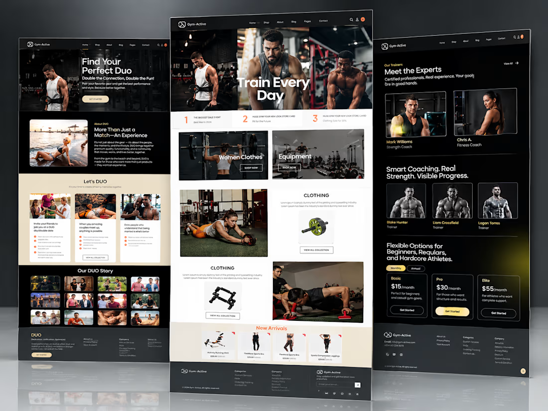


Well structured gym website

Small space, better organization.
A lifestyle focused product video showing how smart storage can help make a bathroom feel cleaner, more organized, and easier to use.
The focus was on simple product presentation, realistic home visuals, and clear storytelling that makes the benefit easy to understand.
AI Video Creation | Product Advertising | Lifestyle Content | Social Media Video
#AIVideo #AIAdvertising #ProductVideo #LifestyleContent
aivideoaivideoproducervideoproducerAI Video ProductionVideo EditingVideo ProductionCapCutChatGPTHeyGen

