The network for creativity
Join 1.25M professional creatives like you
Connect with clients, get discovered, and run your business 100% commission-free
Creatives on Contra have earned over $150M and we are just getting started
Back to feedPost

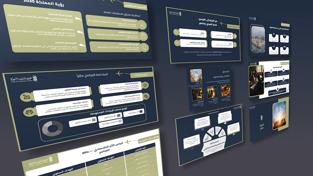
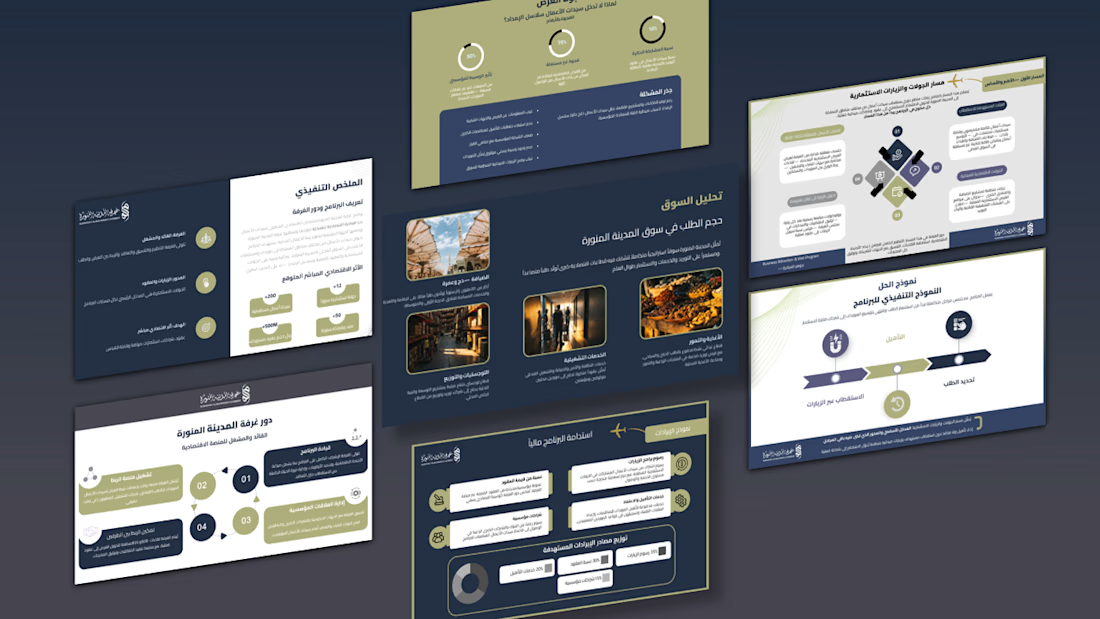
My latest presentation framework for the "Madinah Chamber"—engineered to turn complex financial models, KPIs, and corporate strategies into a clean, compelling visual story.
📩 Need a high-end pitch deck for your next big project? Let’s connect via DM!
#PresentationDesign #GraphicDesign #BusinessStrategy #SlideDeck

The network for creativity
Join 1.25M professional creatives like you
Connect with clients, get discovered, and run your business 100% commission-free
Creatives on Contra have earned over $150M and we are just getting started







Related posts

Criter.AI: Pitch Deck Cover, Two Design Directions
For an AI immigration advice platform serving Australia, I explored two cover directions to test how tone changes perception.
Direction 1, Olive gradient: warm, human and trustworthy, with a rounded image card and gold accents.
Direction 2, Dark and neon: high contrast, modern and investor-ready, with a bold split layout.
Both keep the brand mark, the tagline "Your Criteria, Our Intelligence" and the hero imagery, so the difference is purely in the design language.
Scope: pitch deck cover design and visual direction
Tools: Figma, PowerPoint, etc.
Available for pitch decks, presentations and brand design. Open to new projects.
Contra tags: , Presentation Design, Graphic Design, Branding, Startup Design
3 voted
50%

3 voted
50%

6 votes
Closed


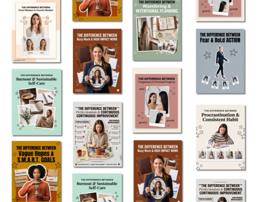
Looking to turn complex ideas into clean, engaging visual content? I specialize in designing high-converting social media carousels, infographics, and visual guides tailored to your brand’s voice. From strategic layouts to eye-catching visual storytelling, I help brands build authority and boost audience engagement. Send a proposal to discuss your next project!
#Contra #ContraCreator #ContraIndependent #GraphicDesign #SocialMediaDesign #ContentCreator #CarouselDesign #VisualDesign #BrandIdentity #FreelanceDesigner




My new Framer template is almost ready to launch.
Here’s a look at the infinite carousel I built with codex.
What do you think?


Infinite carousels live or die on the seam at the loop point, so that is the first thing I would stress-test, especially on a slow scroll or a paused hover. Since a template gets filled with other people's images, I would also check it stays smooth when the assets are heavier than your demo set. Looks clean so far.