The network for creativity
Join 1.25M professional creatives like you
Connect with clients, get discovered, and run your business 100% commission-free
Creatives on Contra have earned over $150M and we are just getting started
Back to feedPost

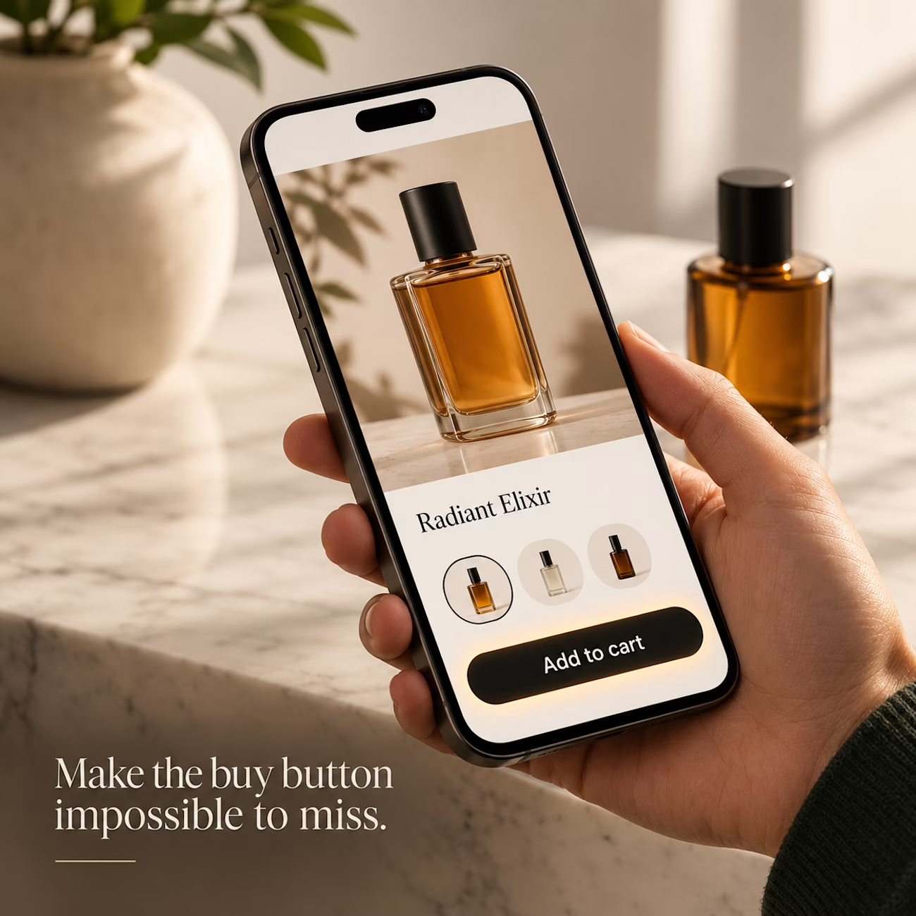
Three things I check first on every Shopify product page for mobile:
1. The variant selector. If a shopper has to scroll to find size or color, they’ll often bounce. Keep it above the fold, and make the selected option obvious.
2. The add-to-cart button. On a phone, it should stay visible while the shopper scrolls. If they can’t find it, they can’t buy.
3. Image size. Large photos look good on a desktop but slow down mobile. Serve sized images so the page loads fast, and the product still looks sharp.
None of these need a redesign. They’re usually small changes in the theme, and they make a visible difference on mobile.
If you want me to check one of your product pages against these three, send me the link.

The network for creativity
Join 1.25M professional creatives like you
Connect with clients, get discovered, and run your business 100% commission-free
Creatives on Contra have earned over $150M and we are just getting started




Related posts

✨ A premium brand deserves a website that feels just as premium.
Here's my latest Shopify design concept for AZAD, focused on elegant visuals, refined product presentation, and a seamless shopping experience.
I'd love to hear your thoughts!
What's the first thing that catches your attention: the visuals, layout, or product presentation?👇
#ShopifyDesign #EcommerceDesign #WebDesign #UIDesign


Great work 👏🏻

A focused landing page helps visitors understand the product and explore the offer without unnecessary distractions.
For this project, the landing page presents the product through a dedicated shopping experience.
When building landing pages, I focus on the offer, page structure, product information, visual hierarchy, and clear calls to action.
Check out the landing page here:
https://lovenood.com/pages/landing-page-psk
Need a dedicated landing page for your product or campaign? Let's discuss it.
#LandingPageDesign #Shopify #EcommerceDesign #ConversionFocusedDesign
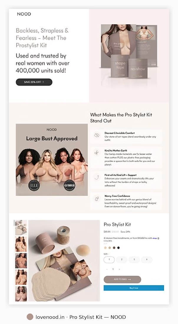

The four icon benefits next to the photo are easy to scan, and the ELLE and GLAMOUR badges add quick trust. Does the Add to Bag button stay sticky on mobile?


Smooth! Loaders like this make the wait feel like part of the brand. Is it kept short on mobile, so it doesn't slow down the first add-to-cart?