The network for creativity
Join 1.25M professional creatives like you
Connect with clients, get discovered, and run your business 100% commission-free
Creatives on Contra have earned over $150M and we are just getting started
Back to feedPost

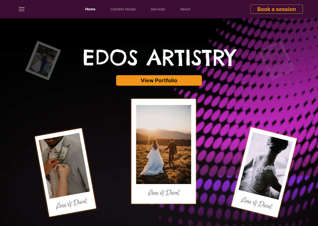
Edos Artistry Landing Page; A deep dive into dark-mode web design for the creative industry. This project focused on creating a "Content House" vibe-mixing high-end wedding photography with an edgy, halftone-inspired UI.
My Role: Visual Identity & UI Design,Layout Strategy,Asset Curation. Looking for a portfolio that stands out? Let’s collaborate.


The network for creativity
Join 1.25M professional creatives like you
Connect with clients, get discovered, and run your business 100% commission-free
Creatives on Contra have earned over $150M and we are just getting started







Related posts

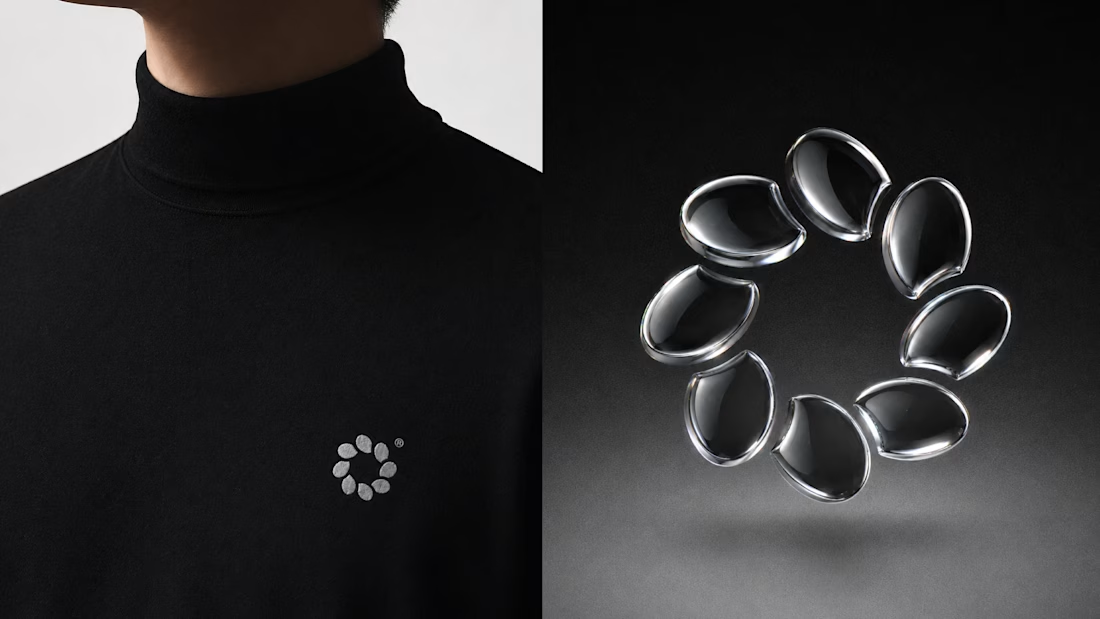
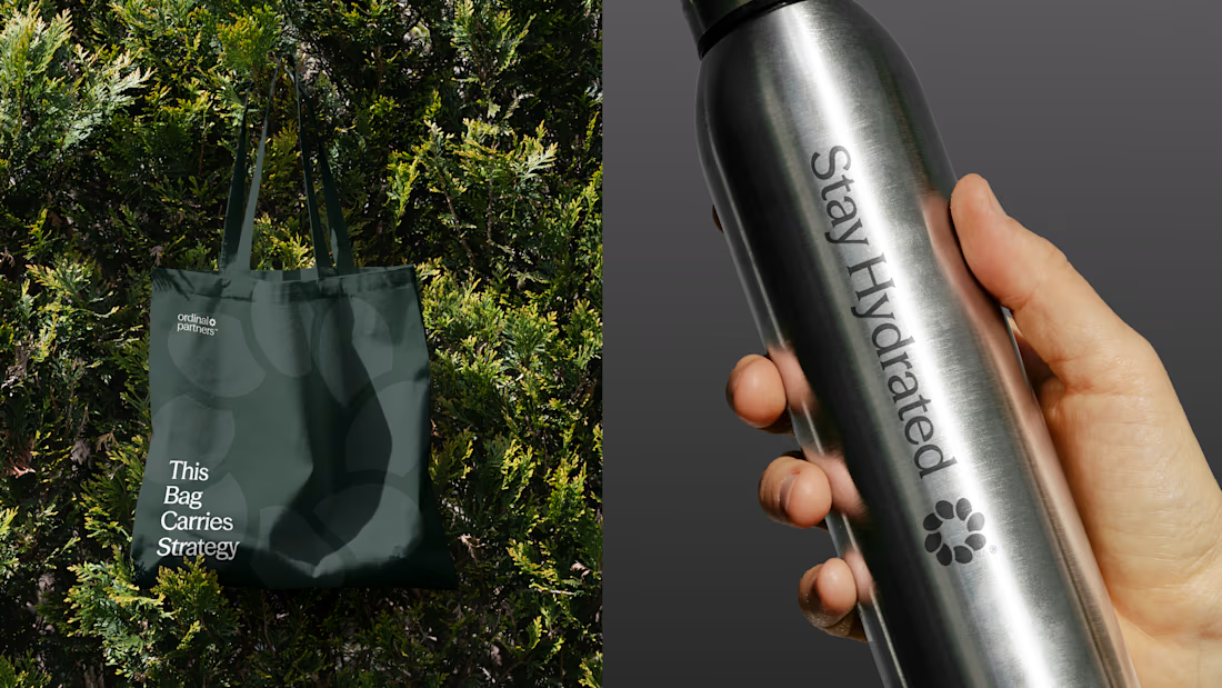
One brand, three different directions.
Sharing some of the logo exploration for Ordinal Partners.
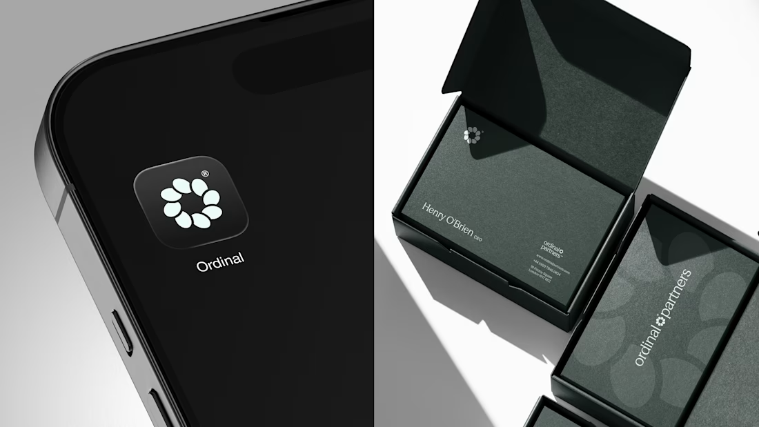
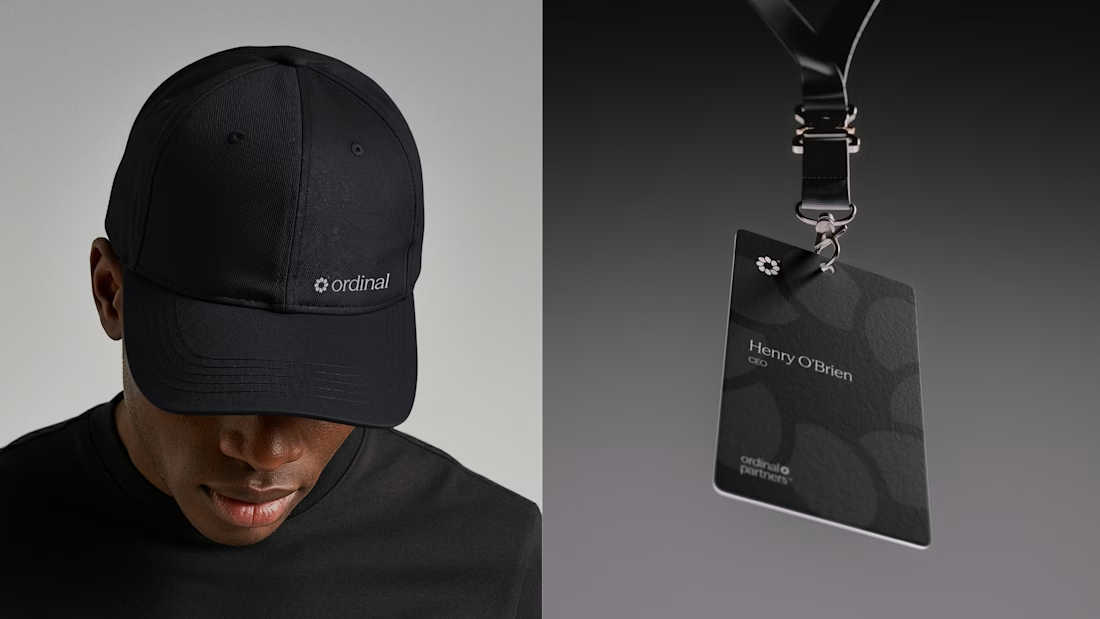

Visually appealing 🔥


Another set of mockups for Bakedwell


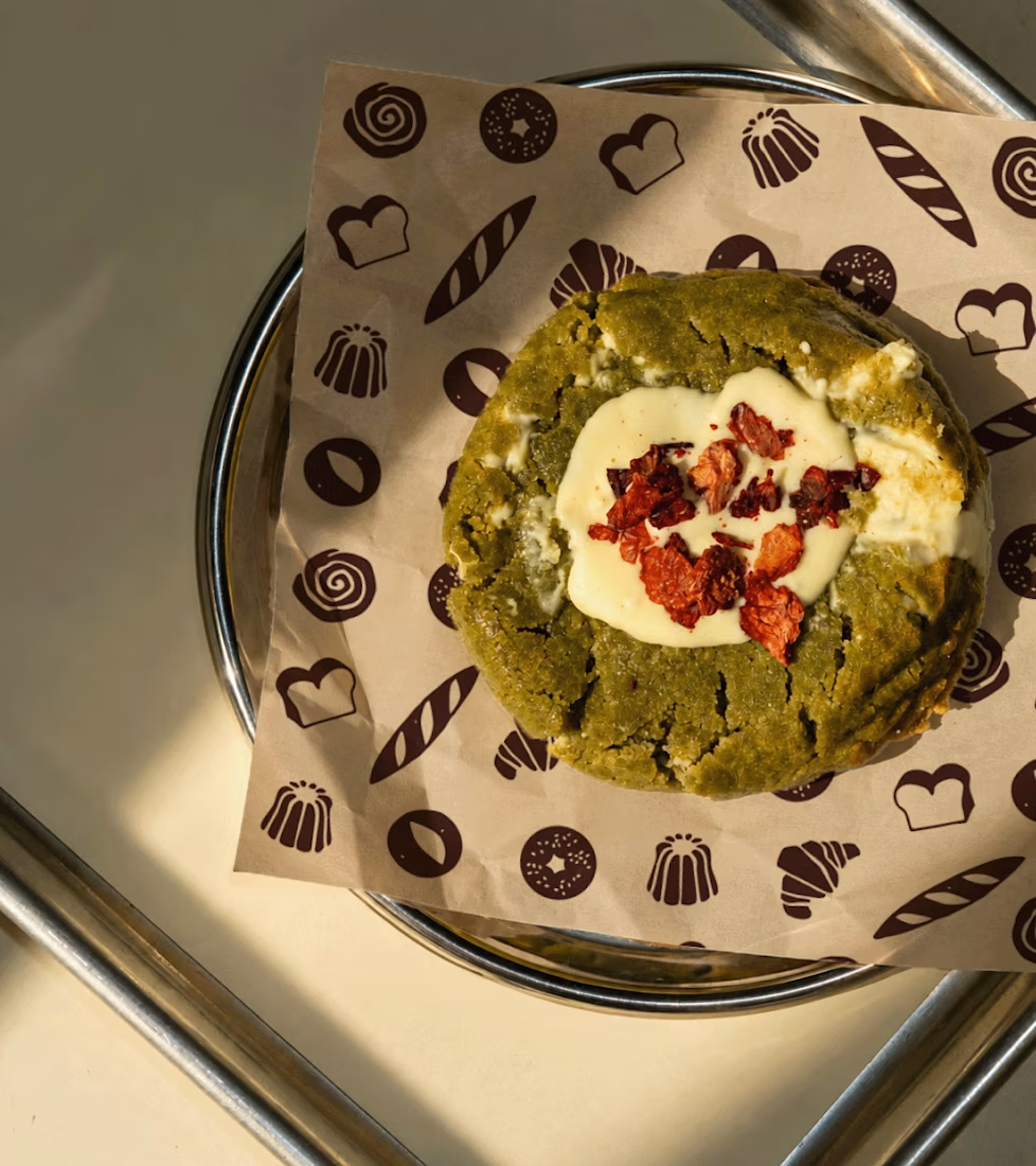
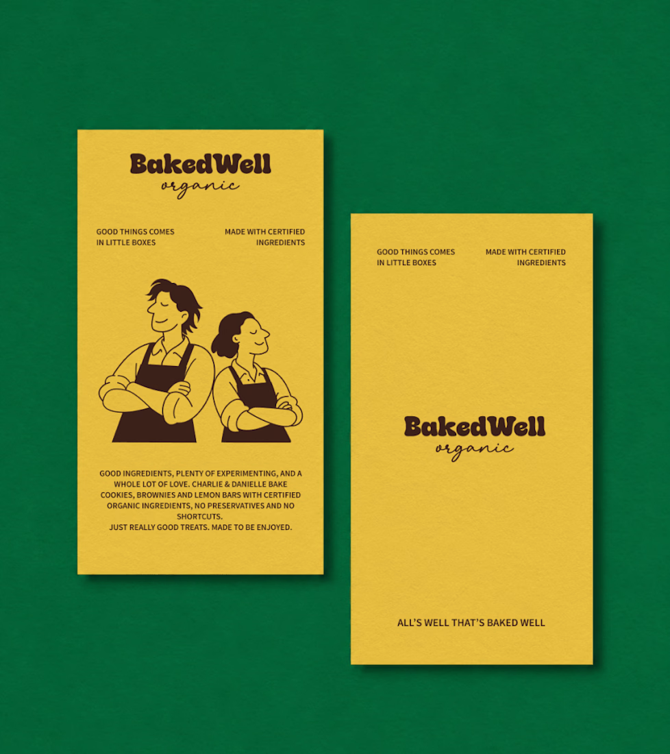
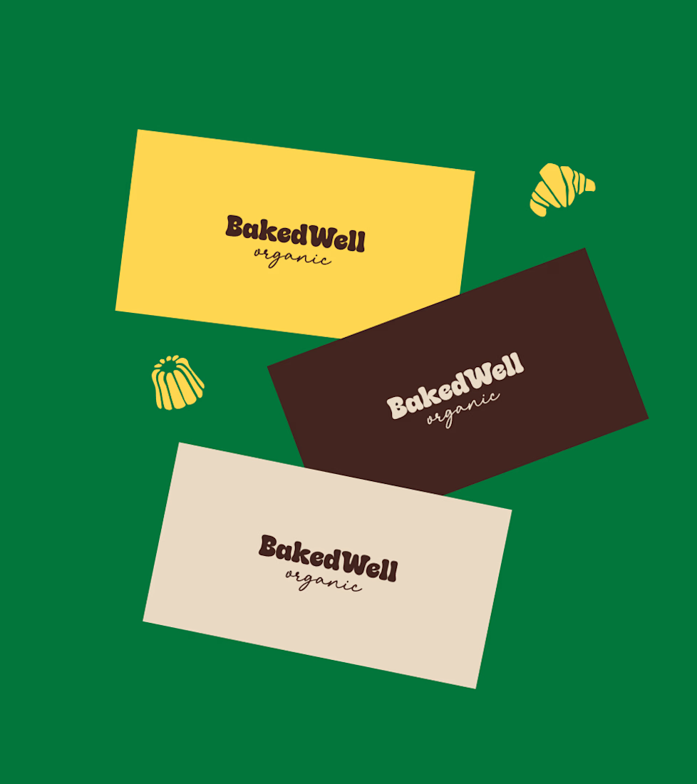
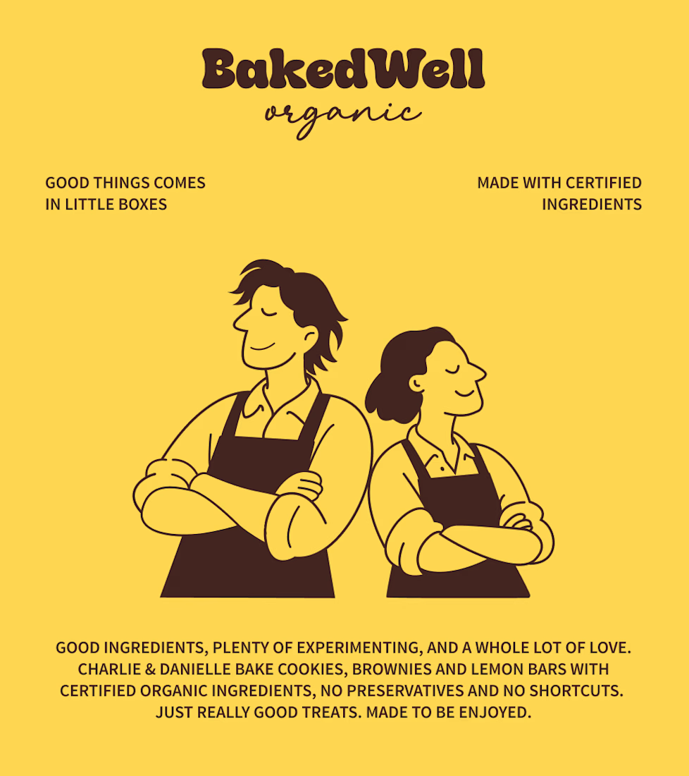

Forest green and mustard with the two bakers in flat illustration is a warm, confident pairing, and the cards read clearly. Contrarian take: the illustrated pair is the strongest asset here, stronger than the wordmark. If I owned BakedWell, I would put those two on the bag and the window and let the logo go smaller.

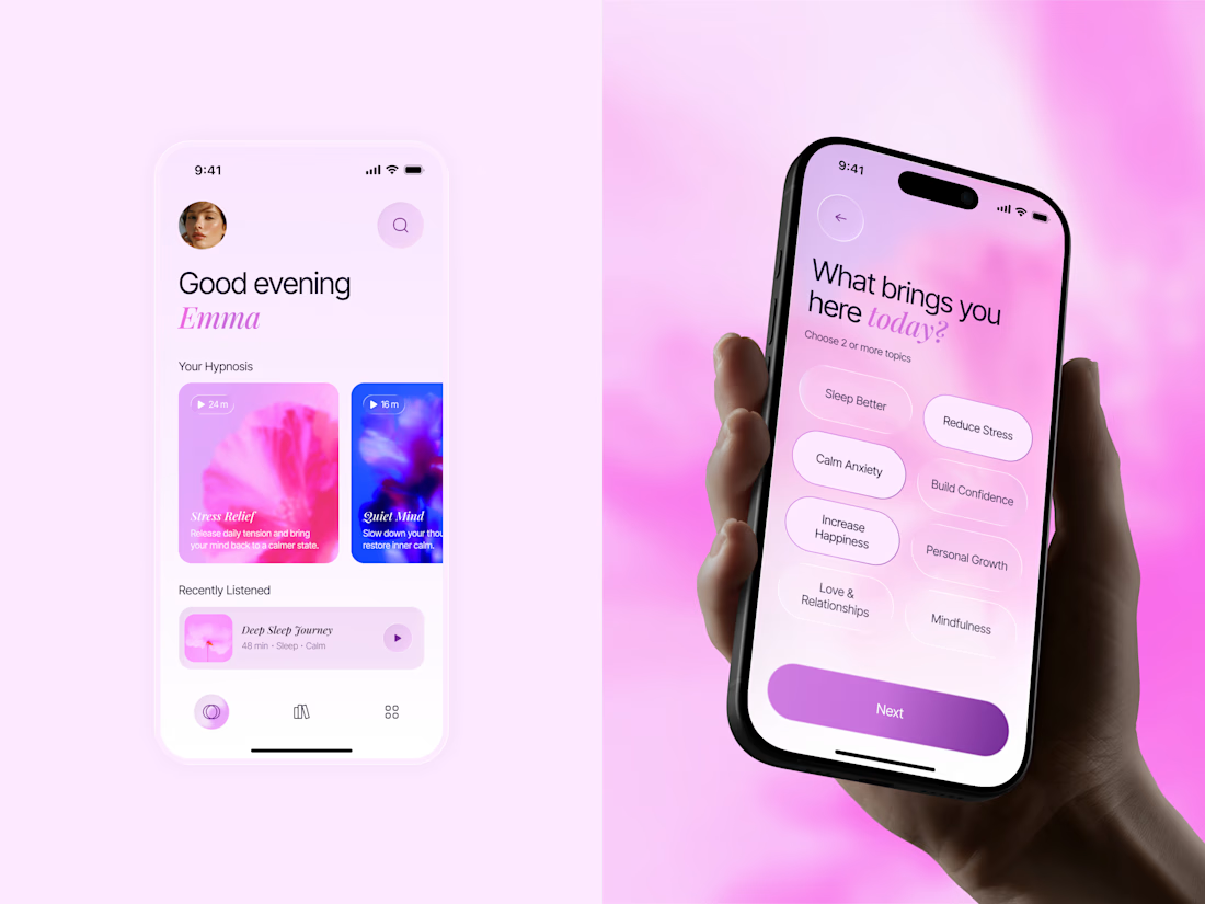
🌸 A little more calm, a little less noise.
Meet Inner Bloom — a hypnosis app concept designed to help people sleep better, reduce stress, and feel more confident.
For this project, I explored a softer visual direction with dreamy pink and lilac tones, frosted glass, and floral imagery to create a calming experience that feels warm and personal.

Great concept with soft colors ❤️🎉